
Our monthly market valuation updates have long had the same conclusion: US stock indexes are significantly overvalued, which suggests cautious expectations for investment returns. On August 4, 2020, the 10-year Treasury yield hit its all-time low of 0.52%. As of January 31, it was 3.99%.
P/E10 and Inflation
Here is a scatter graph with the market valuation on the vertical axis (log scale) and inflation on the horizontal axis. It includes some key highlights:
- The extreme overvaluation and irrational period of the tech bubble
- The valuations since the start of COVID recession
- The average P/E10
- Where we are today
The inflation figure in the highlighted box is year-over-year. I have also highlighted the inflation “sweet spot” in purple, which I discuss below. Note on inflation: The inflation figure is extrapolated for last month is based on the previous two months.
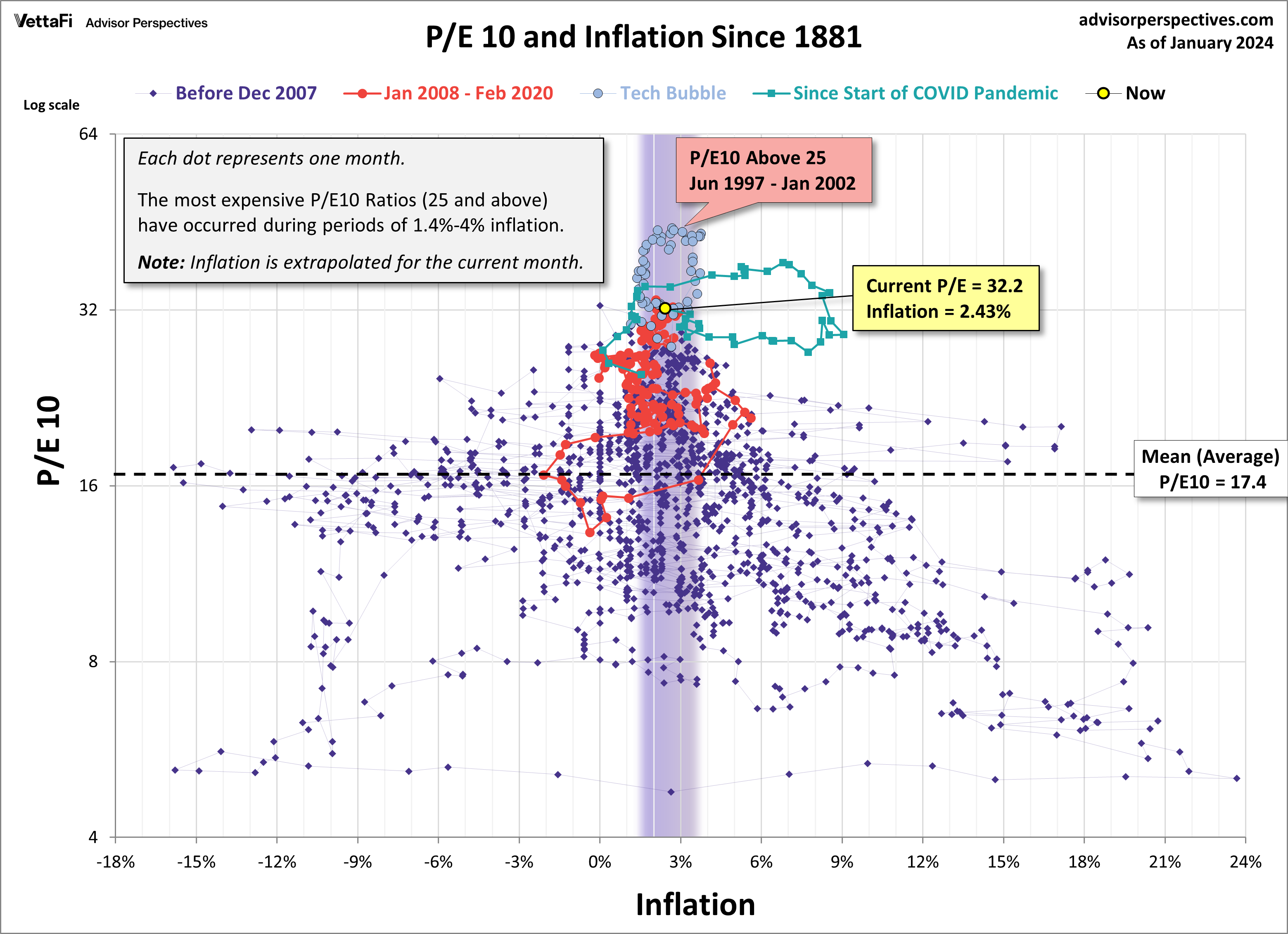
The inflation “sweet spot”, the range that has supported the highest valuations, is approximately between 1.4% and 3%. We highlighted the extreme valuations associated with the tech bubble, which we chose arbitrarily as a P/E10 of 25 and higher.
The latest P/E10 valuation is 32.2 at a 2.43% year-over-year inflation rate. The inflation rate is inside the sweet spot and the current P/E10 valuation is in the extreme valuation territory mentioned above. Again, a note on inflation: the inflation figure is extrapolated based on the previous two months. The Census Bureau’s CPI figure for the previous month does not come out until mid-month. These extrapolated figures are then updated to the current Census Bureau number when released.
P/E10 and the 10-Year Treasury Yield
A common question is whether a valuation metric such as the P/E10 has any merit in a world with Treasury yields at low levels. Investors who require portfolio growth might indeed be motivated to disregard historic indicators that warn of an overvalued market. But what does history show us about the correlation between the P/E10 and the 10-year constant maturity yield? The next scatter graph offers some clues. The horizontal axis has been switched to the 10-year yield. The chart uses a log scale to better illustrate the relative yields values.
On the recommendation of Ed Easterling of Crestmont Research, I have adjusted the chart to begin in 1960. Prior to the 1960s, bond yields did not respond consistently to changes in the inflation rate. We’ve highlighted the inflation “sweet spot” here as well. Note that the P/E10 valuation is in extreme valuation territory – the highlighting is only meant to spotlight the inflation interval.
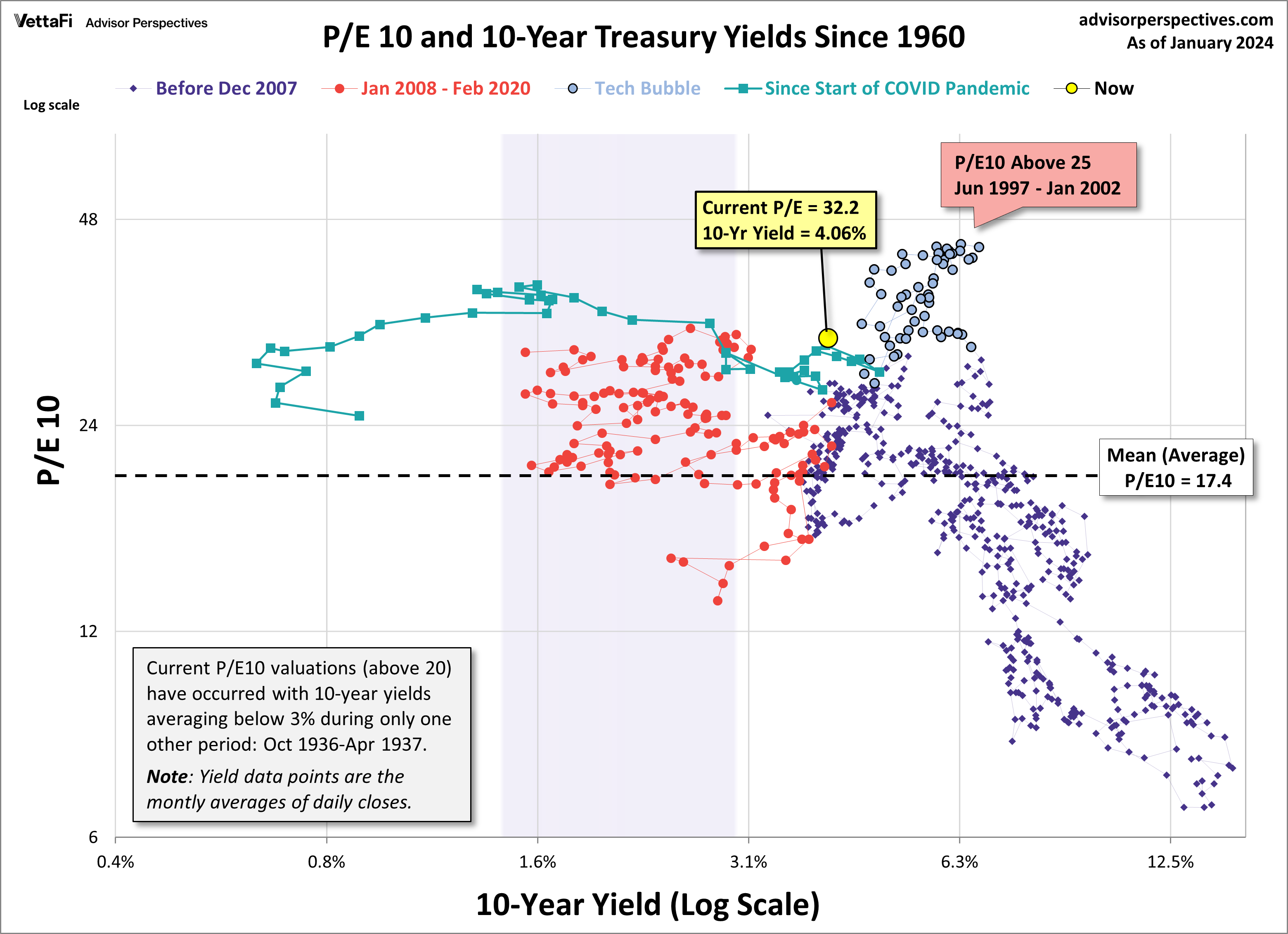
In the months following the great financial crisis (red dots above), we were in “uncharted” territory. Never in history have we had 20+ P/E10 ratios with yields below 2.5%. The latest monthly average of daily closes on the 10-year yield is at 4.06%, which is below its all-time monthly average of 5.3%.
ETFs associated with treasuries include: BondBloxx Bloomberg One Year Target Duration US Treasury ETF (XONE) and BondBloxx Bloomberg Ten Year Target Duration US Treasury ETF (XTEN).
