
By Doug Sandler, Chris Konstantinos & Rod Smyth, RiverFront Investment Group
THE HARBINGERS ARE NOT AS OMINOUS AS SOME MIGHT BELIEVE
The current bull market is long by historical standards, the yield curve is flat and concerns regarding a tech bubble have risen. Add trade tensions, mid-term elections and a number of recent bearish magazine covers like, Fortune magazine’s July 19th cover story ‘The End is Near for the Economic Boom’; and it’s not surprising that some investors are beginning to feel uneasy. This week we wanted to address why we believe the concerns are misplaced, which explains our portfolios’ full equity exposures relative to our baseline benchmarks.
1. OLD BULL MARKETS DO NOT CAUSE BEAR MARKETS: ‘After going 3,454 days without a drop of 20 percent or more (the longest in history), there’s bound to be cracks in the foundation of the graying bull.’ -Adam Shell, USA Today 8/24/18
While there is a debate about the ‘longest in history’ claim, we feel more strongly about disputing the claim’s implications. It is true that bear markets are generally preceded by lengthy bull markets, the same way car accidents tend to be preceded by braking. However, just like braking does not cause car accidents, long bull markets are not the cause of bear markets. Jumping to errant conclusions based on historical data is such a common trap that statisticians regularly remind their audience that ‘Correlation is not causation’. Bear markets have historically been caused by 1) an imminent recession, 2) overly tight monetary policy or 3) excessive valuations. As we have highlighted in recent commentaries, we do not believe any of these conditions exist today or will in the next twelve months.
2. A FLAT YIELD CURVE DOES NOT CAUSE BEAR MARKETS: ‘The so-called yield curve is perilously close to predicting a recession – something it has done before with surprising accuracy’ -Matt Phillips, New York Times 6/25/18
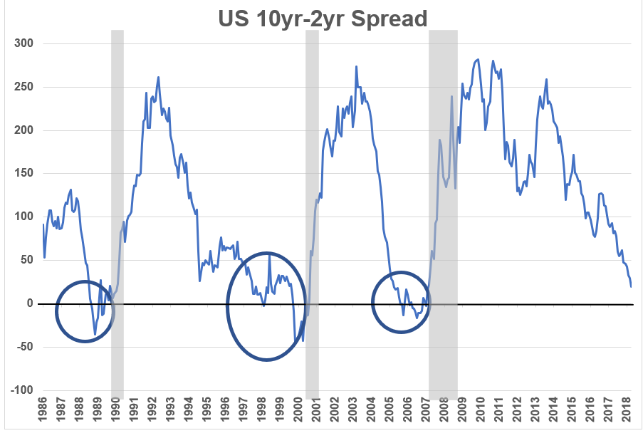
The yield curve is the relationship between shorter- and longer-term interest rates. Our Weekly Chart on page 2 is of the 10yr- 2yr spread with recessions denoted by the grey shaded areas. Most of the time during the last 30 years, the spread has been above the zero-line shown on the left-hand scale, meaning that 10-year interest rates have been above 2-year interest rates. However, preceding each recession, the upper line has dipped below zero as 10-year yields have fallen below 2-year yields (see ovals). Now that short-term interest rates are rising strongly, yield curve watchers are on high alert. The reason we are less concerned is that the current level of the spread is quite normal for a mature expansion. Furthermore, the Fed’s stated goal is to normalize interest rates and support growth, not to slow the economy; a philosophy Fed Chairman Powell reiterated last week at the Fed’s annual symposium in Jackson Hole, WY.
Additionally, due to quantitative easing we recognize that this monetary cycle is different, making traditional yield-curve signals potentially less predictive. For example, the unprecedented levels of money printing have led to German and Japanese 10yr interest rates that are below 0.5%, which may cap long-term US rates. Finally, this indicator has usually given at least a year’s warning of a recession. We will re-assess the risk of recession if the spread is negative for a sustained period, but our belief is that it will not do so in 2018. (For more discussion on the yield curve please see our 4/23/18 Weekly View).
THE WEEKLY CHART: YIELD CURVES OFTEN FLATTEN AS ECONOMIC EXPANSIONS MATURE
![]()
Source: Factset, RiverFront. Past performance is no guarantee of future results
- WE DO NOT BELIEVE THAT TECH STOCKS ARE IN A BUBBLE: When analysts and reporters raise concerns regarding a potential tech bubble they are often referring to the companies that make up the NYSE FANG+ index, which is an equal-dollar weighted index designed to represent a segment of the technology and consumer discretionary sectors consisting of highly-traded growth stocks of technology and tech-enabled companies. While the current average 51x forward Price-Earning Ratio (P/E) multiple for these companies seems expensive, we believe that two additional points should be considered. First, the NYSE FANG+ companies have been recently growing their earnings at an over 35% annual rate, which is more than twice the pace of other large technology companies and the S&P 500, in general. Second, the high P/Es of the companies in the NYSE FANG+ index are not necessarily reflective of market valuations in general. S&P 500 technology companies are currently valued at a more reasonable 20x forward earnings estimates versus 18x for the S&P 500.
Important Disclosure Information
