
The opening Quarter of 2019 offered the rare experience of seeing both risk assets (such as stocks and junk bonds) and safe assets (such as Treasuries) rally simultaneously. This unusual pattern can only be explained by understanding that those markets were interpreting the Fed’s dovish pivot in completely different ways.
The Treasury market, which had begun rallying in November (while the Fed was still on its rate hike and balance sheet shrinkage campaign), saw the Fed’s early 2019 abandonment of its hawkish “policy normalization” path as an acknowledgement that growth prospects are weakening.
Equity market participants interpreted the Fed’s pivot to mean that “the Greenspan/Bernanke/Yellen put” has been reactivated, with the Powell Fed proving to be “our friend and supporter” rather than “a threat to our prosperity”.
One of these interpretations will prove to be wrong.
The root cause of these two divergent views, we believe, can be found in the observation that monetary policy is much more effective in affecting prices of financial assets than prices of traded goods and services. “Traditional” consumer price inflation is constrained by a number of secular trends such as demographics, income insecurity and, importantly, technological change as illustrated by the soaring share of retail purchases now made online. Just recently, internet buying of general merchandise goods represented a larger share than purchases made in traditional retail stores as seen in Chart 1.
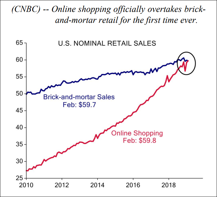
Chart 1 (Courtesy of Evercore ISI)
Not only do Amazon and other online outlets offer competitive prices, those prices are also readily available to shoppers even as they are considering purchases at Brooks Brothers or Macy’s.
Therefore, Central Banks are finding themselves ineffectual in their efforts to get consumer price inflation up to the 2% target. While there has been some chatter recently that the Fed might wish to allow inflation to “run hot” (= above the 2% target rate) for some time so as to compensate for the fact that it has been below 2% most of the time in recent years, this fails to recognize the Fed’s inability to control the rate of consumer price inflation.
The Fed’s preferred measure of inflation is the Personal Consumption Expenditures Deflator, shown in Chart 2, which has successfully resisted the Fed’s best efforts to drive it higher by launching a 0% Fed Funds rate and by repeated large scale QE programs.
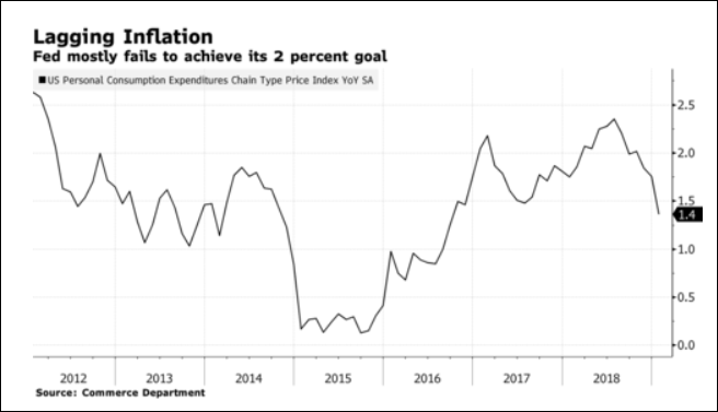
Chart 2 (Courtesy of Bloomberg)
The Fed’s and other Central Banks’ policies instead are having an impact primarily on financial markets and on prices of financial assets. Chart 3 depicts the Chicago Federal Reserve Bank’s National Financial Conditions Index, which, following an ever so modest tightening (=move higher) in 2018, now – after the surge in risk appetite seen in Q1, 2019 – is indicating the easiest financial conditions seen since 1993. This represents a major challenge for the Fed, as Mr. Powell has explicitly acknowledged that the 2001 and the 2008 recessions were triggered by abruptly deflating asset prices, which had been inflated by overly easy financial conditions provided by the Fed in prior years. He is intent on avoiding a repetition of that scenario, but so far markets are not cooperating.
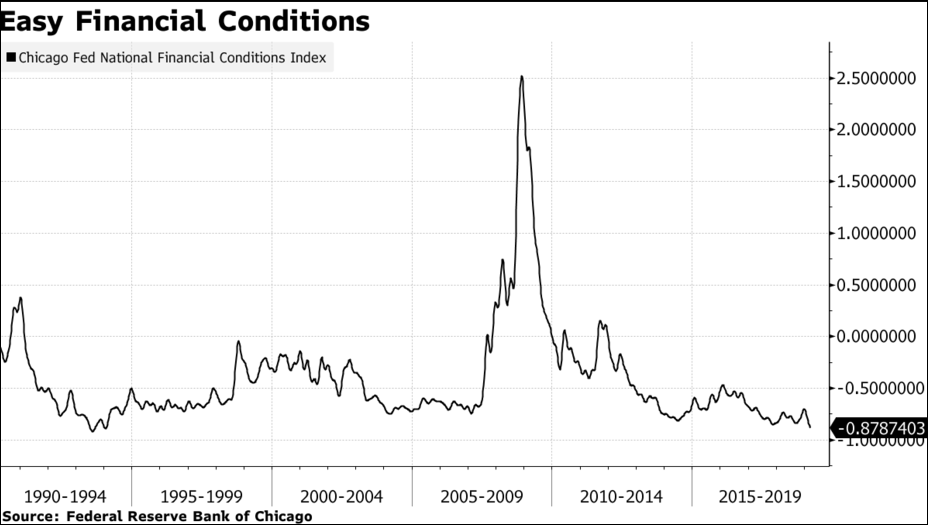
Chart 3 (Courtesy of Bloomberg)
This Central Bank dilemma is global and can be seen at an even greater scale in Europe and Japan, where Central Banks have launched even more aggressively stimulatory monetary policies than seen in the U.S. As shown in Chart 4 at the end of Q1, 2019 some $10.4 Trillion (=19.9% of total outstanding issues) of global investment grade bonds were trading at negative yields, thus guaranteeing the investor a loss if held to maturity.
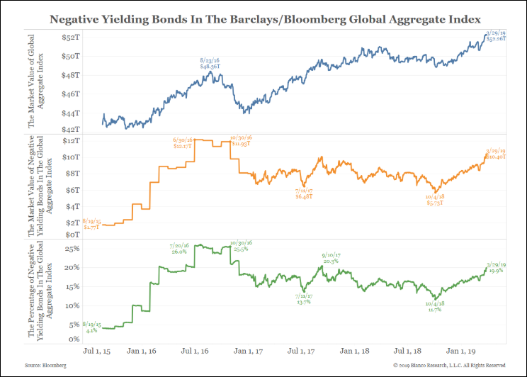
Chart 4 (Courtesy of Bianco Research)
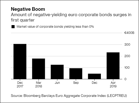
Most of these negatively yielding bonds are government bonds, but an astounding Euro $230 Billion of Euro-denominated corporate bonds were also traded at prices that represented negative yields to maturity as seen in Chart 5.
That clearly makes no fundamental sense whatsoever. It just goes to show the extreme degree to which prices of financial assets have been distorted.
This article was written by Hillswick Asset Management, a participant in the ETF Strategist Channel.
