
It’s time for our annual August report, “Charts for the Beach.” Each year we highlight five of our favorite charts we think consensus is currently overlooking. Remember to ask your RBA representative for your official RBA eyeglass cleaning cloth to keep your sunglasses spotless! Call by midnight tonight so you don’t forget. Supplies are…um…limited!
Leading indicators not lagging indicators
Leading indicators of the economy are those that lead GDP. Coincident indicators turn in tandem with GDP. Lagging indicators turn after GDP turns.
Although one would think that investors would follow leading indicators, they unexplainably have a fascination with lagging indicators. For example, inflation, the unemployment rate, and the Fed are all lagging indicators, but command a disproportionate amount of attention. Leading indicators, like initial jobless claims and building permits, rarely get mentioned.
At RBA, we follow leading indicators all around the world. Chart 1 shows the composite leading indicators for the US, Europe, Japan, and China. Note that China is the only one showing any positive momentum. This is one reason why our portfolios are significantly overweight Chinese equities.
CHART 1:
OECD Leading Indicators
(July 8th Release)

Source: Bloomberg Finance L.P. OECD
Is the Phillips Curve dead?
The Phillips Curve shows the relationship between unemployment and inflation. The theory is that inflation should accelerate as labor markets get tighter and wages increase potentially leading to a wage/price spiral.
Many analysts have suggested that the Phillips Curve is dead because the current labor markets are historically tight, but inflation is nowhere to be seen. A simple lack of patience might better explain the situation
rather than assuming the relationship is dead.
Chart 2 shows the relationship between the unemployment rate and the Atlanta Fed Wage Tracker. The relationship between unemployment and wages seems as robust as it ever was. If the formal Phillips Curve doesn’t soon begin to reflect this relationship (i.e., overall inflation does not increase), then it implies that corporate profits are under pressure as wages erode profit margins. There seems to be a tradeoff between companies gaining pricing power and inflation returning, or corporate profits increasingly disappointing. Our positioning of defensive equity sectors and shorter fixed-income duration attempts to take advantage of a normal transition to late-cycle stagflation.
CHART 2:
Unemployment and Wages
(07/31/1997 – 06/30/2019)

Source: Bloomberg Finance L.P.
Unprecedented levels of uncertainty
Many observers have commented that there are high levels of uncertainty, but few seem to realize that the levels of uncertainty by some measures are virtually unprecedented. Chart 3 shows the NFIB Uncertainty Index which attempts to measure uncertainty among small businesses. The last three years’ uncertainty is unprecedented according to the NFIB survey.
Chart 4 shows the Baker, Bloom, and Davis US Economic Policy Uncertainty Index for Trade1. The highest historical readings seem to be associated with NAFTA and the uncertainty about expanding global trade. Today’s levels seem to be from the exact opposite: perhaps the end of globalization. Uncertainty acts like a central bank raising hurdle rates within an economy, and higher levels of uncertainty can restrain risk-taking and capital formation. Many have suggested that the Fed lowering interest rates will spur on the bull market, but they may be ignoring the “tightening” effects of record levels of uncertainty.
CHART 3:
NFIB Uncertainty Index
(12/31/1974 – 6/30/2019)
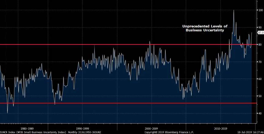
Source: NFIB, Bloomberg Finance L.P.
CHART 4:
US Economic Policy Uncertainty Index for Trade
(Jan 1985 – June. 2019)

Source: Scott R. Baker, Nicholas Bloom, and Steven J. Davis., Bloomberg Finance L.P.
Gold takes the gold medal While investors have been mesmerized by investments like fake meat and outer space vacations for the wealthy, gold has quietly outperformed both stocks and bonds over the past 12 months. Historic levels of uncertainty (see previous charts), the prospect for increased equity volatility, and other factors have likely contributed to this performance. RBA continues to have positions in gold within our multi-asset portfolios.
CHART 5:
Performance: Gold vs. Stocks and Bonds
(07/31/2018 – 07/31/2019)
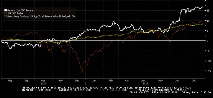
Source: Bloomberg Finance L.P.
Enjoy tanning on the beach, but remember your RBA representative is hard at work and ready to answer your questions relating to these charts and our current positioning. Of course, you could wait until after Labor Day.
Enjoy the summer everyone!
To learn more about RBA’s disciplined approach to macro investing, please contact your local RBA representative. For more information, visit: www.rbadvisors.com/images/pdfs/Portfolio_Specialist_Map.pdf.
Richard Bernstein Advisors is a participant in the ETF Strategist Channel.
