

This week’s update will feature several charts, each accompanied with commentary. Along with the usual written version of the update, a short video version can be found below.
Market Indexes
The first 3 months of 2023 have been almost the complete opposite of the market events that occurred in 2022. The markets, in large part, mostly exhibited high volatility, and a high degree of uncertainty for most of last year. The volatility was led by large technology stocks, which experienced substantial declines and bear market rallies throughout last year. To the surprise of many, bonds (especially longer-term bonds) also experienced high volatility and large declines in the face of rising interest rates.
In 2023, there remains a high degree of uncertainty, but volatility is declining. Most significantly, the retreaters of the market last year have been the chargers to start out this year, receiving bounces off their low points. The chart below features a few market indexes for both 2022 and the start of 2023:
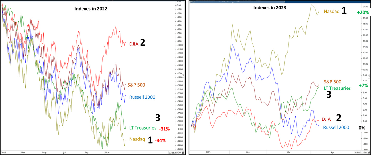
Source: Canterbury Investment Management. Charts created using Optuma Technical Analysis Software. ETFs used for indexes are QQQ, DIA, SPY, IWM, and TLT.
- The Nasdaq 100 (mostly technology-related stocks) declined significantly in 2022 (-34%). So far in 2023, the Nasdaq has been the best performing index (+20%). Nasdaq stocks account for more than 40% of the S&P 500’s market capitalization.
- The Dow Jones was the best performing index in 2022. This year however, along with small-cap stocks, the Dow has been almost flat and fluctuated sideways. In other words, the S&P 500 has been carried almost entirely by technology-related stocks.
- Of the index ETFs displayed, 20-year treasuries had been the second-worst performer in 2022 (-31%). Most conservative portfolios were dragged downward by bonds last year. Now, long-term treasuries have bounced to start 2023. Will that trend continue?
The Nasdaq & Technology
Now, let’s take a closer look at the Nasdaq. Last year, the Nasdaq displayed a textbook bear market pattern, characterized by both a series of lower highs/lower lows and significant declines/rallies. Each rally the index experienced last year occurred over a very short period of time and was subsequently followed by a large decline. Following each rally, investors were left asking themselves “is the bear market over?”. So far, answer has been “no.”
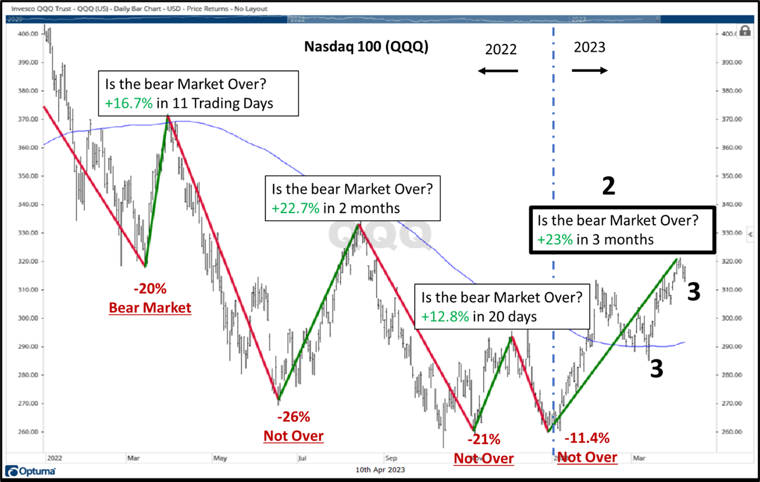
Source: Canterbury Investment Management. Charts created using Optuma Technical Analysis Software. ETF used for Nasdaq index is QQQ
- The Nasdaq (ETF: QQQ) experienced a few large rallies last year. Each rally took place over a short period of time– a few weeks or months. Each rally was followed by an equal or larger decline.
- To start out 2023, the Nasdaq has seen a +23% rally in about 3 months. Will this rally be different than the previous ones?
- One positive is that for the first time since early last year, the Nasdaq is above its 200-day moving average. In addition, while the index experienced many lower highs and lower lows, the Nasdaq appears to have put in a higher low and is now trying to maintain a higher high.
Technology stocks make up the largest percentage of the S&P 500. The S&P 500’s largest individual sector is information technology. We have mentioned that technology stocks have led the markets so far in 2023, while many other sectors have been relatively flat. Right now, the Information Technology Sector is at a point of resistance. See chart and points below.
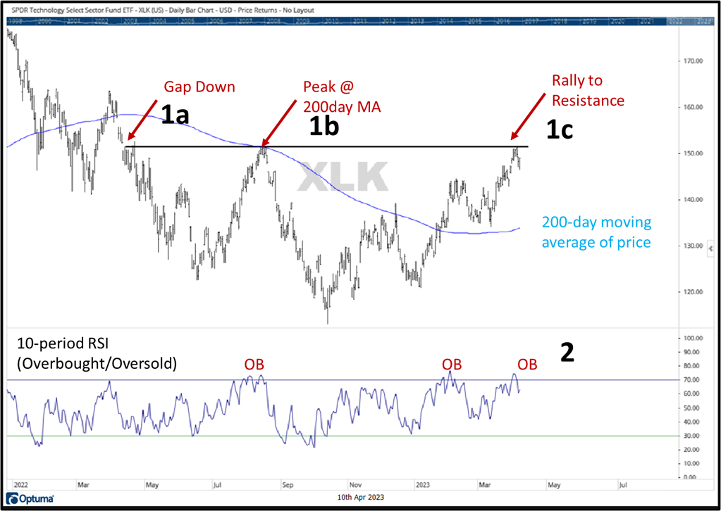
Source: Canterbury Investment Management. Charts created using Optuma Technical Analysis Software. ETF used for Information Technology Sector is XLK.
- The black horizontal line represents a line of resistance.
- You can see that the sector experienced a “gap down” (single day burst of selling and overhead supply) back in spring of 2021 (1a).
- After putting in a low, the sector rallied to that price level, which also intersected its 200-day moving average of price, before declining once again (1b).
- Now, the sector has hit that line once again (1c). Probabilities would say that the sector would experience a pullback.
- The lower third of the chart shows the sector’s RSI. This indicator measures overbought/oversold conditions. In short, when the blue line crosses above the upper horizontal line, the sector is “overbought” and climbed too far, too quickly. A pullback is normal and expected when this occurs.
- In order to move higher, it is normal for a sector or index to “pullback.” The duration and extent of the pullback is unknown. The best case would be a small pullback, before trying to break through overhead resistance.
International Stocks
We have pointed it out in several updates, but developed international stocks are leading US stocks on a relative basis. The chart below shows the EURO 50 Stoxx ETF, which is the largest 50 European stocks.
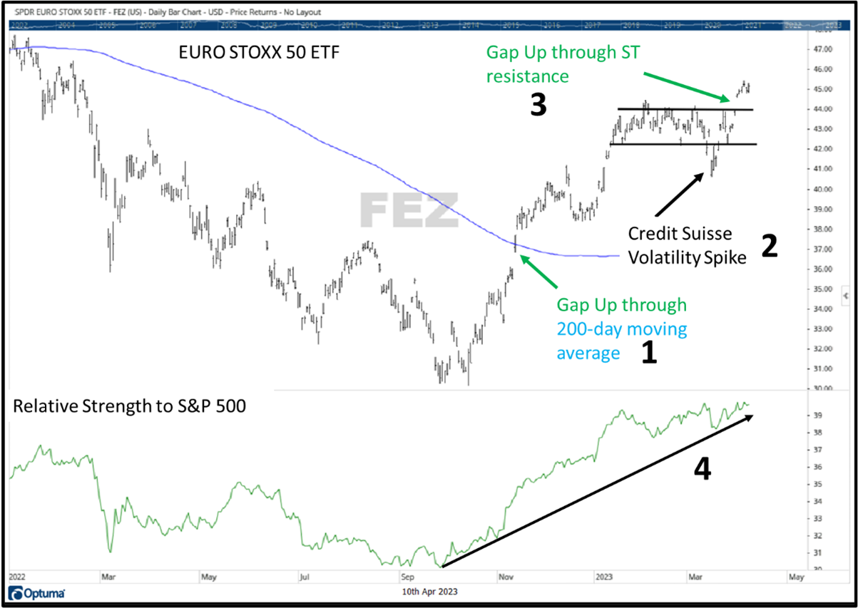
Source: Canterbury Investment Management. Charts created using Optuma Technical Analysis Software. ETF used for EURO STOXX 50 is FEZ.
- Prior to November 2021, this index had been trending below its 200-day moving average, and putting in a series of lower highs and lower lows (both bear market characteristics. Then, the index experienced a “gap up” (single day wave of demand) through its 200-day moving average, which is a positive, bullish sign.
- For most of 2023, the index had been trending sideways establishing lines of short-term support and resistance, points where supply and demand shift. Last month, with the Credit Suisse banking news, the index experienced a “volatility spike.” This decline was short-lived, and the index returned to normalcy within a few days, as if the event never occurred.
- Recently, the index approached overhead resistance and “gapped up” through it. In other words, rather than a wave of supply causing a decline off of resistance, a wave of demand came in and pushed the index higher.
- The lower third of the chart shows the index’s relative strength to the S&P 500. When the slope of the line is increasing, the European stocks are outperforming the S&P 500 on a relative basis. For the most part, this index has been outperforming US stocks since late last year.
Bottom Line
It was an interesting first quarter for the markets, but the bottom line is that the market’s strength can be a bit misleading. The two market segments that performed the worst last year, technology stocks and bonds, have led the markets this year. Meanwhile, the market’s leading index from last year, the Dow Jones, has been flat or sideways in 2023. There has been a large disparity between how technology stocks have performed (which represent the largest portion of the S&P 500) and how the rest of the market has performed.
Not shown in any charts, bonds have remained volatile, and are at a point of resistance currently. Technology stocks are also at a point of resistance and are slightly overbought. The Nasdaq index experienced several rallies last year, but all failed to be sustainable. Eventually, one of these rallies will return the market to a new high, but there is no prediction as to which rally will cause that to happen.
From a portfolio management view, the Portfolio Thermostat has rotated into technology-oriented sectors, which are leading the markets, and holds some more defensive holdings to stabilize fluctuations. Additionally, the portfolio has exposure to international and European stocks. The goal is to continue to adapt the portfolio to whichever environment comes next- Bull or Bear.
For more news, information, and analysis, visit the ETF Strategist Channel.