
![]()
The composition of Mr. Market has changed, which means the methods to take advantage need to change to keep pace.
Heavy indexing (plus implicit assumptions that central banks will step in should markets ever lower prices) have taken the idiosyncratic overreactions of each business and swept them under the rug into a giant pile of systematic risk. Importantly, the risks haven’t disappeared; they’ve just been reorganized. The opportunities may now come all at once in a big block like 2008, rather than on an individualized basis like 1963 AmEx.
Never forget that even passive money still rests on human decisions. How attached to an index fund is someone during a panic?
Truth be told, I liked the old Mr. Market better. This new game requires a lot more patience. But we don’t get to decide our investment climate. We only get to decide how we respond.
Shedding New Light on Today’s Valuations
Here’s another way to think about the expensive valuations in today’s market. If you’ve purchased solar panels for your house, you probably did some math on the payback period. The payback calculation is found by dividing the upfront cost by the savings per year (aka “yield”). A $20k outlay for panels that saved $2k per year in reduced energy bills would give you a 10-year payback ($20k/$2k). Thanks to advancements in panel efficiency and price reductions, solar’s payback has fallen from 20 years to 6-8 years on average today. Let’s use the same approach to value the S&P 500. The market currently trades at 35x price-to-free-cash-flow, implying a 35-year payback period! You probably wouldn’t buy solar panels that would take three decades to payoff. And yet that’s the math of owning a U.S. index fund today.
A 35-year payback equates to a 2.85% yield. Wait a second… isn’t the yield for a “risk-free” 10-year US Treasury over 3%? Yes it is. So you can get a 3% risk-free yield or 2.85% owning the index? Why would you accept a lower return for a higher risk product? As more realize the absurdity this simple math implies, they’ll ask themselves the same question and arrive at the conclusion: it’s time to sell.
It’s no coincidence that Jeremy Grantham’s GMO, a value-based firm which manages $80 billion, recently issued a 7-year real return forecasts of -4.90% for U.S. large caps. That compounds to a -30% total expected loss by 2025. GMO has a good track record with their 7-year forecasts, nailing both the Dot Com and Housing bubbles.
How’s the Setup?
As we’ve highlighted before, the overall valuation of the market is instructive, but is still just a single data point. More nuanced thinking is required. For instance, 1982 saw the average trailing P/E around 8x, when the historical average is 15x. You can throw a dart when stocks are priced at eight times earnings and find winners. And indeed, 1982 was a great time to buy as it marked the beginning of an incredible bull run.
Conversely, the Dot Com bubble in the late 1990s brought with it the most outrageously expensive valuations we’ve seen in the U.S. with a P/E north of 40x. It must have been a terrible time to invest, right? Alas, it’s not so simple.
The 40x multiple masked a swath of surprisingly high quality businesses priced on sale. If you remember the narrative of that time, new-economy internet stocks were all the rage and no one wanted anything to do with boring, money-making old-economy snoozers. Value investors were able to fill up their cups with great bargains, despite the market’s nosebleed valuations. This setup produced halcyon days for value: as investors realized cash flow still mattered, they repriced most of the market strongly downward and the typical value investor’s portfolio upward. To be up when everyone else is down is career-making performance, so it’s little wonder we see a large cohort of value investing gurus who cut their teeth in the 1999-2002 period.
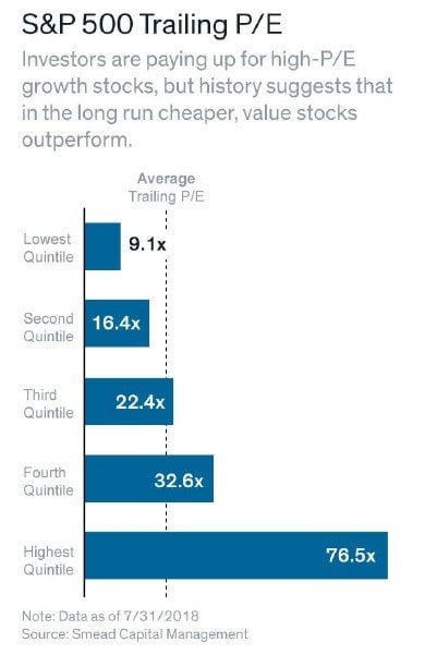
Does that same dream-for-value setup exist today? Sadly, no. As the embedded graphic shows, the cheapest quintile of the S&P 500 is still priced at 9.1x. Said another way, the cheapest 20% of the market today is more expensive than the average in 1982. The second cheapest quintile at 16.4x is above the long term average of 15x. Who’s buying that 76.5x quintile? Mr. Market via an index fund.
Looking around the store, there aren’t many markdowns and the discount bin has been picked through several times over. That’s OK, we’ll come back later.
Interesting side note: from 6/1/1999 to 2/29/2000, the final blow off of the Dot Com bubble, Warren Buffett was down -39%. The S&P 500 was +7% and QQQ (tech-based Nasdaq) was +110% in those 9 months. Even the greatest investor of all time had to stomach serious underperformance at points in his career. It makes today’s lagging of value investing feel tame by comparison. As you’d expect, the Oracle of Omaha knew what he was doing and bounced back in a big way.
During that difficult time period, Mr. Buffett had this to say:
“If they are in the strike zone at all, the business “pitches” we now see are just catching the lower outside corner. If we swing, we will be locked into low returns. But if we let all of the today’s balls go by, there can be no assurance that the next ones we see will be more to our liking. Perhaps the attractive prices of the past were the aberrations, not the full prices of today. Unlike Ted [Williams], we can’t be called out if we resist three pitches that are barely in the strike zone; nevertheless, just standing there, day after day, with my bat on my shoulder is not my idea of fun.”
Amen, Mr. Buffett.
Final Thoughts
If you’ll indulge me in an analogy, I view myself as the captain of a ship. Ideally, all of my passengers (clients) are planning to go to the same place. Scanning the horizon, I see foreboding skies and have plotted a course to steer us around the clouds. I hope you don’t mind that it could take a little longer to get to port because we’re avoiding the storm, but the primary goal is to make sure all souls on this vessel arrive safe and sound. As the saying goes, to finish first, you have to first finish.
“Investors should favor strategies and managers that emphasize limiting losses in declines above ensuring full participation in gains. You simply can’t have it both ways.” — Howard Marks
We’re looking forward to seeing all of you at the FSI Bash on Sunday, October 7th.
And as always, we’re thankful to have such great partners in this wealth creation journey.
Jake & Lonnie
Bonus Section

Fasten your seat belts as we breeze through a handful of crazy charts and statistics:
- The August budget report showed that U.S. government outlays (aka total spending) soared to $433.3 billion. In one month. That’s not only thirty percent higher than a year ago, but the highest government monthly outlay of any month on record. Winning!
- It’s not just the United States. Governments of advanced economies have really put themselves in hock since 2007 (see Figure 1).
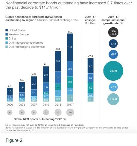
- Not to be outdone, the annual growth rate of debt by corporations around the world was an incredible 10.5% from 2007-2017. That’s almost 3x (see Figure 2). So. Much. Borrowing.
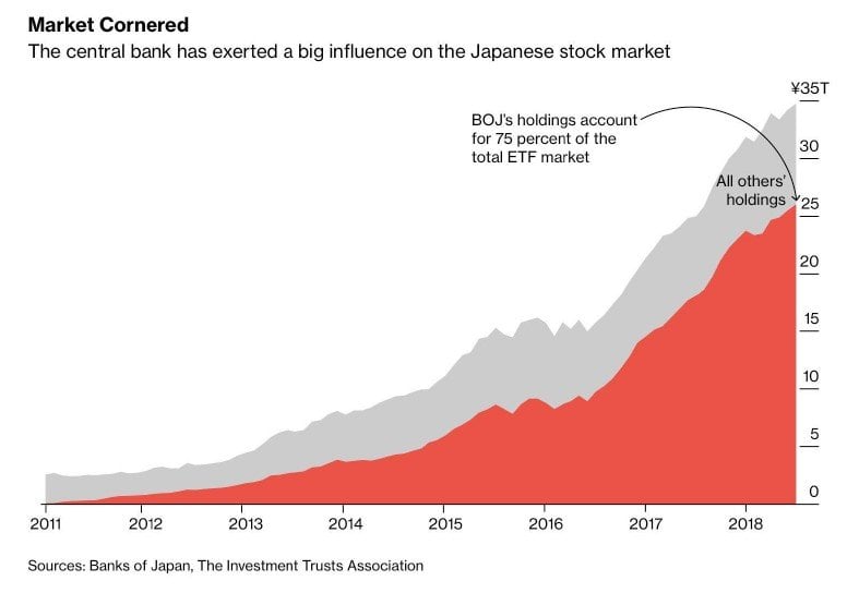
- Mr. Market in Japan deserves its own special mention. The Bank of Japan has now purchased seventy-five percent of the total ETF market. If you’ve sold anything in Japan in the last three years, it’s likely been to their central bank. That’s near-Soviet levels of intervention; can we even call this a “market” anymore? How do you unwind this craziness–does the BOJ sell ¥25 trillion worth of stocks someday? Bananas.
- The levels of fiscal stimulus (through government deficits) and monetary stimulus (through central bank action) have been without precedent. Government’s firm grip on the wrist of Adam Smith’s invisible hand is more than a little disturbing. We haven’t begun to understand all of the consequences. Yet the rest of the world might be starting to wake up to the thought that everything isn’t rosy. Here’s the percent below the all-time high we find various country ET Fs:
Turkey -67%, Russia -55%, Brazil -54%, Italy -42%, Indonesia -30%, Argentina -28%, South Africa -27%, Mexico -26%, China -23%, South Korea -14%, Germany -12%, India -9%, UK -8%, Japan -7%, Australia -6%, Canada -5%, France – 4%.
And the United States 0%.
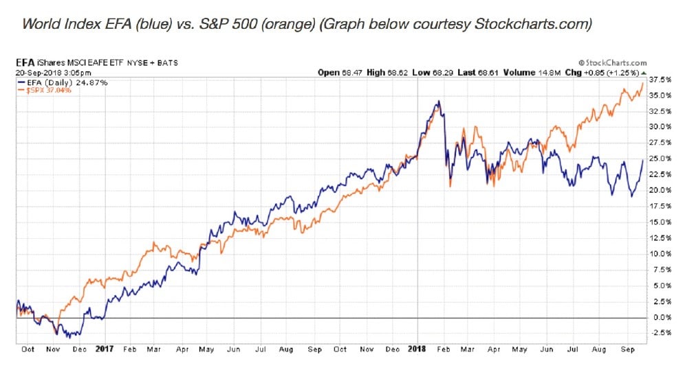
We own a Russia ETF already and are keeping an eye out for future bargain prices on assets around the world. The graph below shows most of Earth peaked in January of this year. We aren’t hearing much about it Stateside as the U.S. continues to do its best Wile E. Coyote impression. Don’t look down.
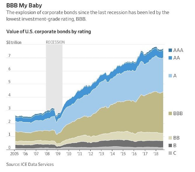
- U.S. corporations have borrowed a record amount of money. The biggest increase has been in BBB-rated debt. Investors have been starved for years by savings accounts which pay 0% and U.S. Treasuries giving them 1-2%. To scratch out more yield, they’ve loaned money to lower-quality companies while also relaxing covenants (terms of the loan that protect investors). This isn’t a problem when business conditions are favorable, the companies can meet their debt obligations, or rollover existing bonds into new debt. But there’s little margin of safety when default rates pick up and liquidity dries up. Sadly, many people who thought they were being conservative by choosing bonds over stocks are going to lose a lot of money.
“Observation over many years has taught us that the chief losses to investors come from the purchase of low-quality securities at times of favorable business conditions.” — Benjamin Graham
- What have the corporations done with all this borrowed money?
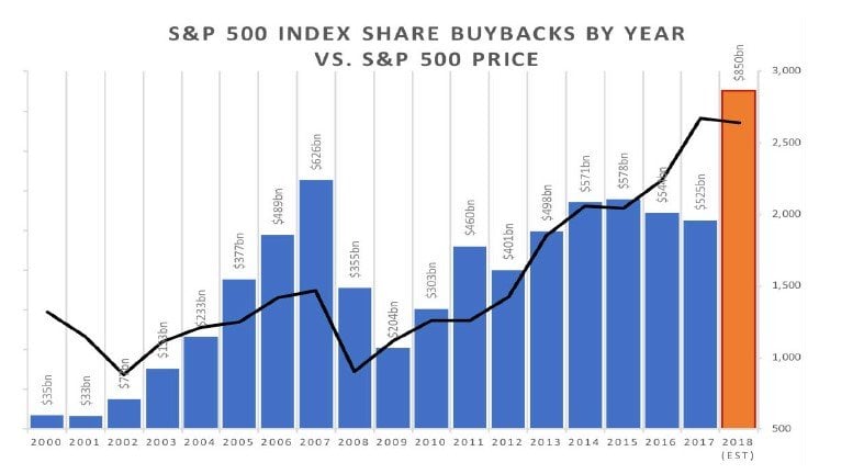
One answer is stock buybacks. We’ve already surpassed the previous high for record buybacks in a single year, and there are still a few months left in 2018. The previous peak? 2007. Whoops. Management teams of the S&P 500 don’t have the best track record when it comes to buying back their shares at bargain prices.
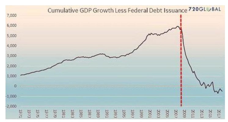
- All this debt makes me wonder how much of our historic economic “expansion” is just borrowed money. If you’re putting everything on credit cards, is that still considered good economic activity we should get excited about? The below chart attempts to address that question by showing U.S. GDP growth minus Federal debt issuance. That doesn’t look encouraging.
For more trends in fixed income, visit the Advisor Solutions Channel.