In the past 12 months, the S&P GSCI All Crude has lost almost 50% and has moved to the forefront of macroeconomic forces impacting the global economy. In the context of history, today’s oil price drop is not unprecedented in magnitude or duration as you can see in the chart below.
In fact, there has been a comparable oil price drop every five ten years that could be blamed on a demand crisis or a flood of supply – or some combination of the two. The gold:oil ratio that represents how many barrels of oil it takes to buy an ounce of gold is also telling a story about a supply driven drop. The very high gold:oil ratio now is clearly driven by the oil drop whereas gold has maintained its value. If oil prices remain low versus gold for an extended period of time, as was the case in the 1986 period, the elevated gold:oil ratio may indicate that the energy production boom (whether U.S. or Saudi Arabia) is much more responsible for oil’s price collapse than fears of global deflation, lack of demand, and recession.
Back then, oil prices had been stable at historically high levels of $30/bbl for nearly three years from 1983-1985 that resulted in weak demand and strong non-OPEC production growth. That drove OPEC to flood the market with oil in order to maintain market share rather than support prices. The result was oil prices collapsed to $10/bbl within 8 months. Notice in the graph below that superimposes today’s oil price on the 1985-1986 graph where the pre-crisis shows elevated oil prices to the left of the black line and the drop is to the right of the black line: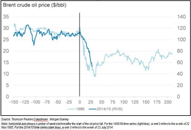
The similarity is clear and these conditions seem to be in place again today. The Oil Market Report (OMR) by the International Energy Agency stated oil price pressure in March was due to sharply higher supplies from Middle East OPEC producers, recording its highest month-on-month gain in nearly four years, despite a relentless build in US crude.
The big question that is weighing on analysts is about how the oil price drop is impacting the economy today. A helpful chart by Blackrock shows the incremental GDP impact from oil at $50/bbl as seen below where the green countries benefit and the blue countries lose: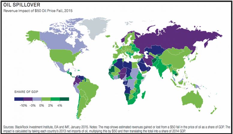
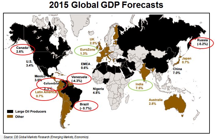
The winners and losers are divided by oil producers, importers and country specific policies. That seems fairly straightforward, but the oil economics are on a slippery slope right now as evidenced by the frequency and magnitude of recent GDP growth forecast changes. In just the first two months of the year Deutsche Bank had already made major changes to its global markets and economic forecasts because the markets were moving much more quickly than anticipated in response to lower oil, deflationary pressures, and a litany of unexpected central bank policy changes. In the chart below, DB illustrates the world GDP growth divided by large oil producers and other countries, and circled in red/green are big downward/upward revisions.