
By Clayton Fresk, Stadion Money Management
For the better part of five months, the S&P 500 Index has been in what can be described as a rather complacent environment. One measure of this that has been rather widely disseminated is the number of days since the S&P 500 closed greater than 1% lower. While the index was on an impressive streak, it finally ended on March 21. Here is a table of the top ten longest such streaks since 1928:
![]()
Even more impressive (or boring depending on how it is viewed) is that the S&P 500 went a whopping 64 trading days without having an intraday trading range of greater than 1%. Using data since 1982, this was nearly double the second longest streak of 34 trading days ending in September 1995.
While the S&P 500 is the common barometer for the broad market, it is also interesting to see what other market segments have done over this same timeframe to determine if this S&P 500 action was the norm or the anomaly.
An indicator we like to use to determine the strength in a rally is market breadth. A very easy measure of this is small cap relative strength, with the thesis being if small caps are outperforming, the market is speculating, which is positive. Conversely, if small caps are underperforming, this is generally a sign of a lack of breadth.
Here is a performance chart of the S&P 600 Index (small caps) relative to the S&P 500 Index since the last day of the aforementioned intraday trading range of > 1% – December 14.
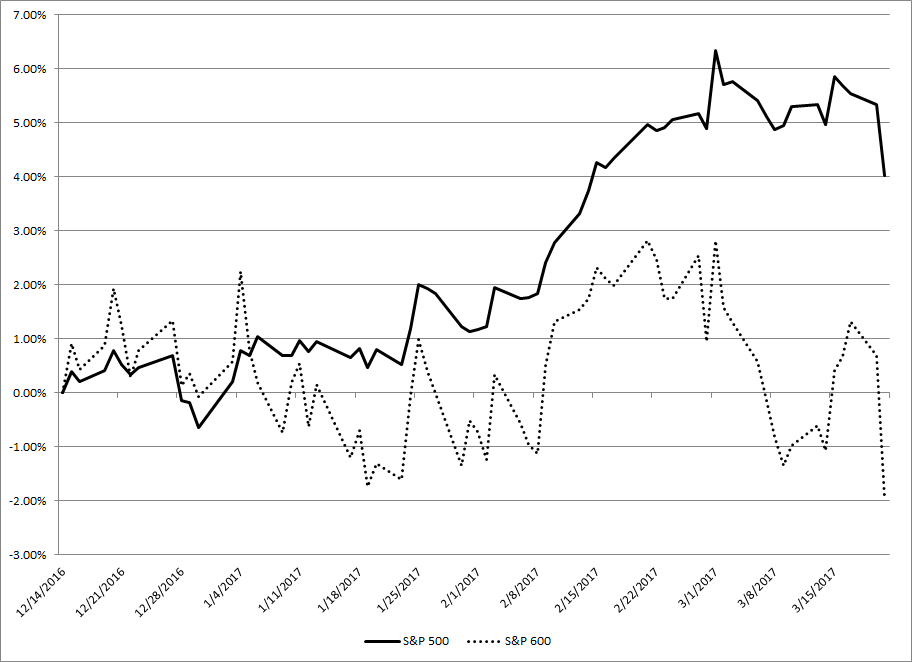
As you can see, there has been a rather large discrepancy, with small caps underperforming by nearly 6% on a price return basis since mid-December. While on the face this is a disheartening figure, other speculative-type trades are faring better, namely the Technology sector. Here is the same chart with the GICS Level 1 Technology Sector index added:
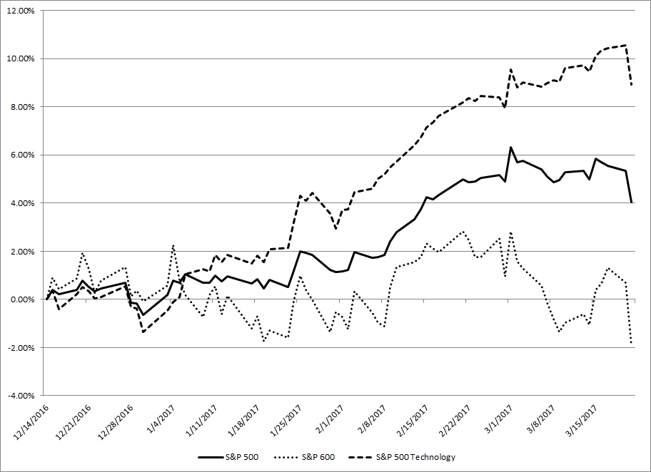
While small caps have lagged significantly, Technology has blossomed, outperforming the broad S&P 500 Index by nearly 5% over the same period. So why the somewhat conflicting signals in the speculation trade? One main culprit can be linked to the rampant selloff in oil and its effect on the energy sector. Despite the S&P 600 having nearly a 4% lower weighting to the Energy sector, it has seen an almost equal negative contribution to overall performance. Said differently, small cap energy names have bit hit significantly harder than their large-cap brethren have. Here is a relative performance chart of the Small versus Large cap sector performance since 12/14:
