A while ago I wrote two pieces called “Easy In, Hard Out.” The main idea was to illustrate the difficulties that the Federal Reserve will face in removing policy accommodation. In the past, the greater the easing cycle, the harder the tightening cycle. I don’t think this time will be any different.
In the last two pieces, I showed three graphs to illustrate how the Fed’s balance sheet has changed. I’m going to show them again now, updated to 11/11/2015. Here’s the graph showing the liabilities of the Federal Reserve — i.e. what the Fed eventually has to pay back, occasionally with interest:
I’ve added a new category since last time — reverse repurchase agreements (“reverse repos”) because it has gotten big. In that category, you have money market funds (etc.) lending to the Fed to pick up a pittance in interest.
As you might note — as the balance sheet has grown, all categories of liabilities have grown. The pristine balance sheet composed mostly of currency is no more — it is only around 30% of the liabilities now. The biggest increase in reserve balances at the Fed — banks lending to the Fed to receive a pittance in interest, because they have nothing better to do for now.
I’ve considered doing an experiment, and I might do it over the next few weeks. I went to my copy of AAII Stock Investor, and pulled out the contact data for 336 banks with market capitalizations of over $100 million. I was thinking of calling 10 of them at random, and asking the following questions:
- What has the Fed’s ZIRP policy done to your business?
- Do you have a lot of money on deposit at the Federal Reserve?
- When the Fed raises the short-term interest rate, what do you plan on doing?
- Then, the same questions asking them about their competitors.
- Finally, who has the most to lose in this situation?
It could be revealing, or it could be a zonk.
One more interesting note: reverse repos and my “all other” category have become increasingly volatile of late.
Here’s my next graph, with the asset class composition of the Fed’s balance sheet:
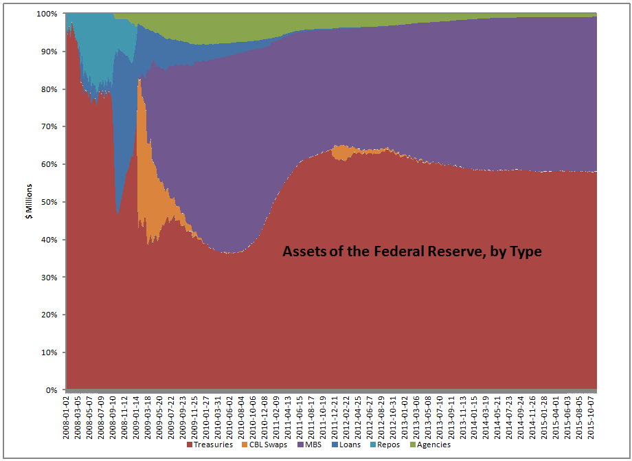
The Fed has gone from a pristine balance sheet of 95% Treasuries to one of 60/40 Treasuries and Mortgage-backed securities [MBS]. MBS are considerably less liquid than Treasuries, particularly when you are the largest holder of them by a wide margin — I’ve heard that it is 25% of the market. The moment that it would become public knowledge that you were a seller, the market would re-rate down in price considerably, until holders became compensated for the risk of more MBS supply.
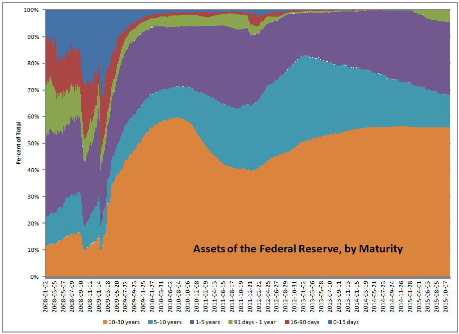
Finally, here is the maturity graph for the assets owned by the Fed: