Initial jobless claims measure the number of people who file for unemployment for the first time in a given week. In the week ending September 6th, initial jobless claims were at a seasonally adjusted level of 263,000, the highest level in nearly four years. This represents an increase of 27,000 from the previous week’s figure, the largest weekly jump since last October. The latest reading was much higher than the forecast of 235,000.
Here is the complete data series dating back to 1967. There is a good bit of volatility in this indicator, which is why the four-week moving average is a more useful number than the weekly data because it smooths short-term fluctuations to highlight the overall trend. The four-week moving average currently stands at 240,500, up 9,750 from the previous week.
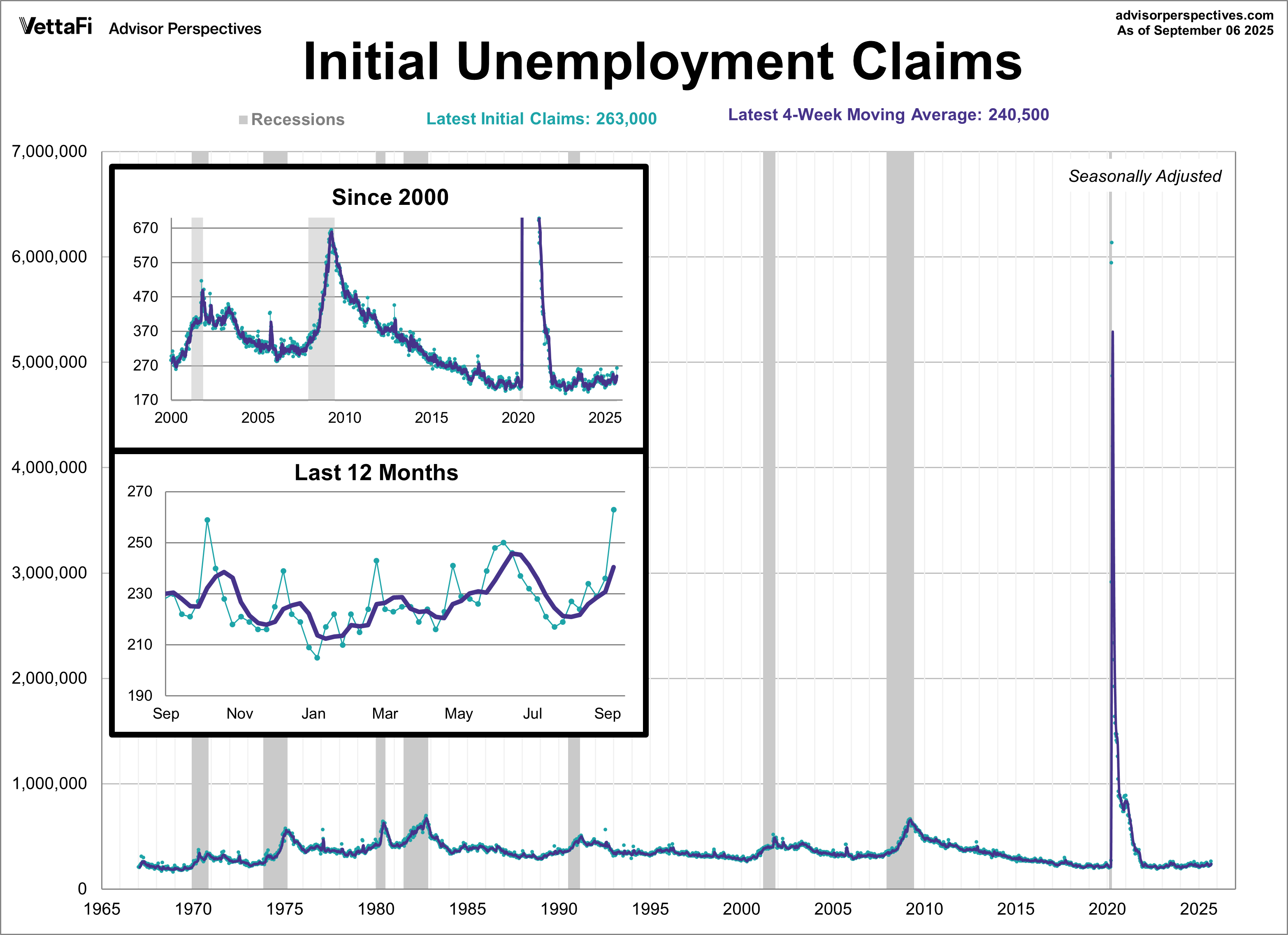
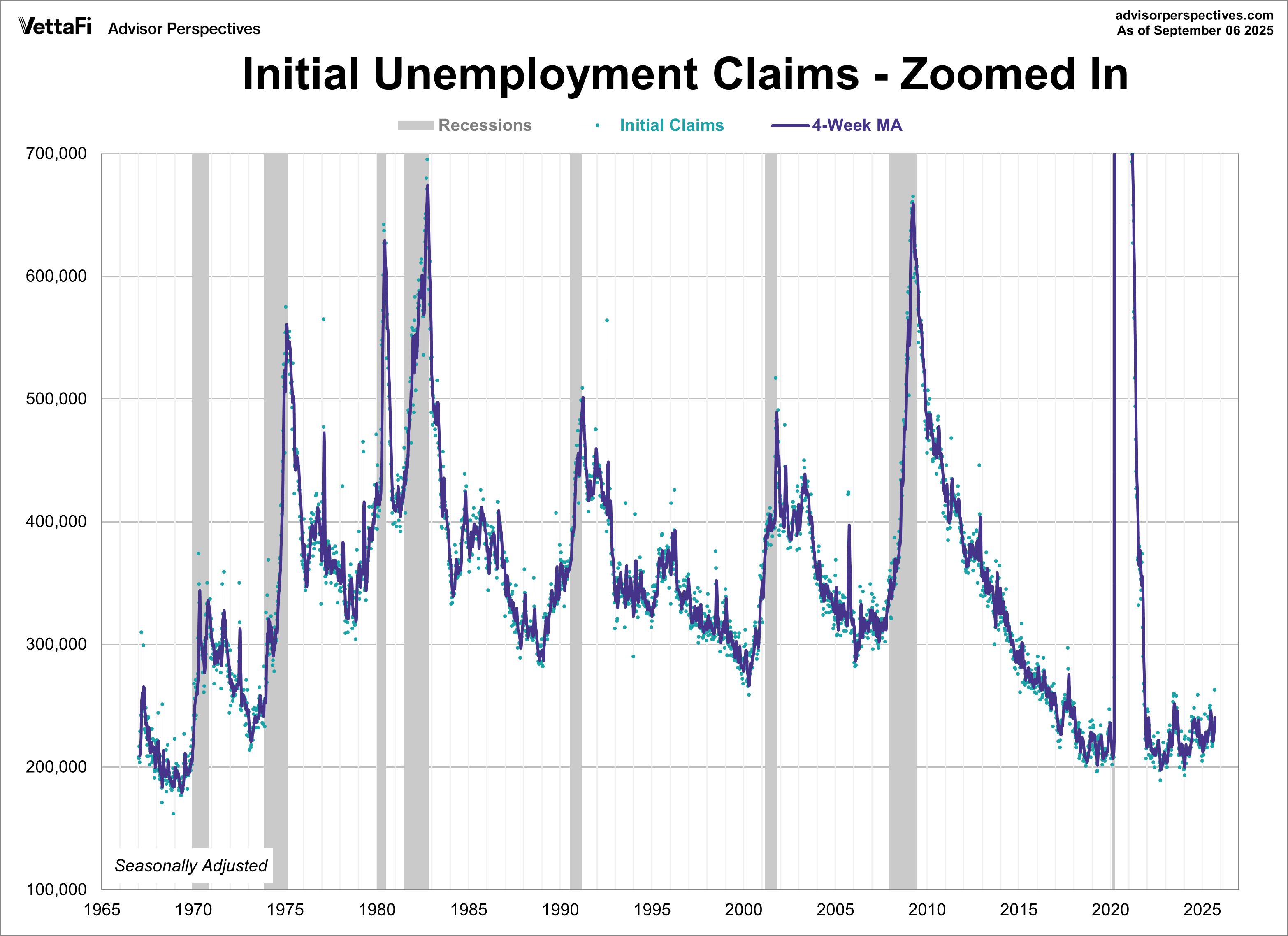
Outside of the COVID spike, initial unemployment claims have never been greater than 700,000 for a given week, making the chart above less useful for identifying trends. To address this, we’ve adjusted the y-axis on the chart below to provide a closer view of the data, minimizing the impact of the COVID surge. Notice the relationship between recessions and the rise in weekly unemployment claims. To no surprise, the 4-week moving average begins to rise at or before the start of a recession and peaks around its conclusion.
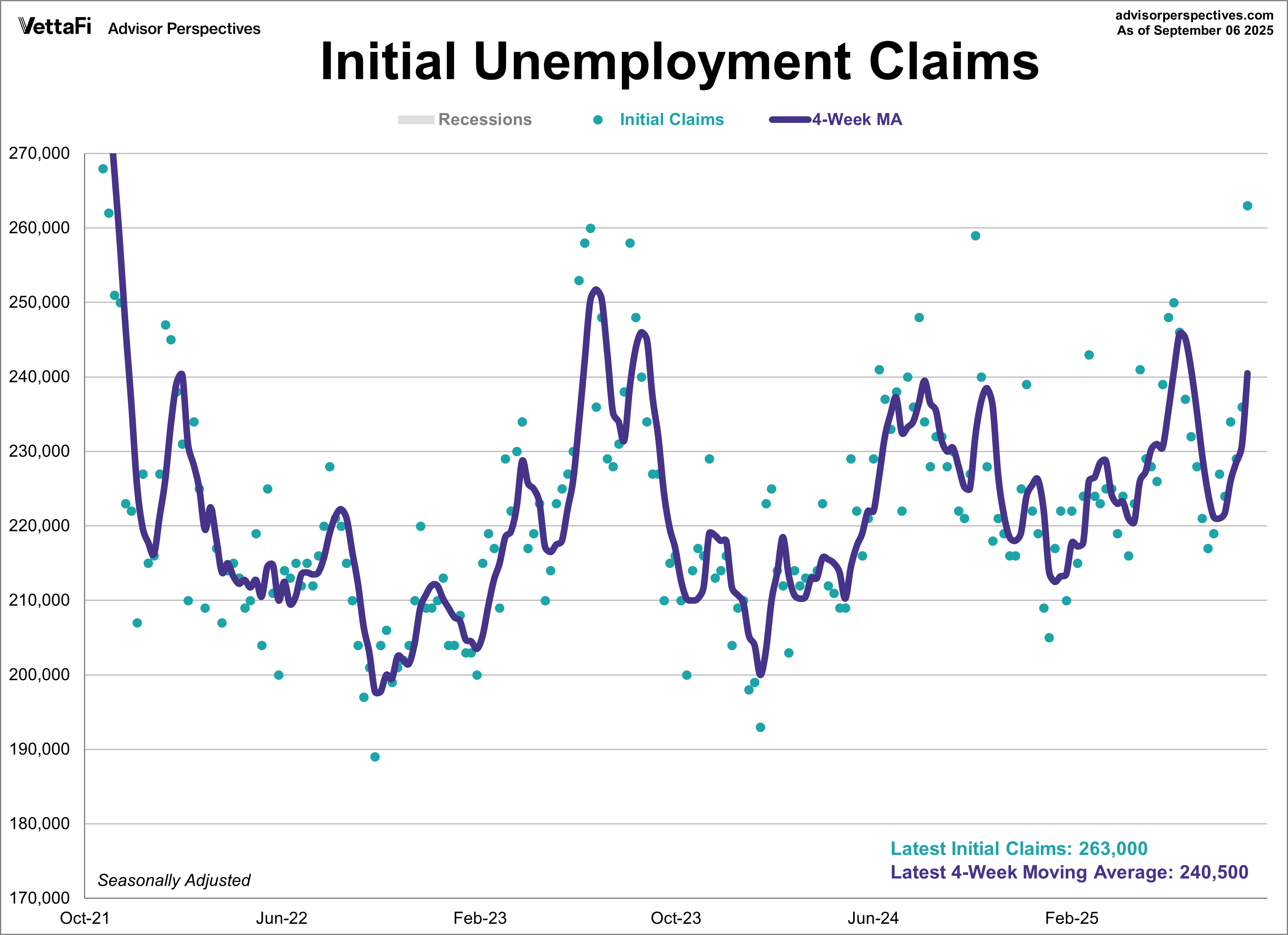
In another attempt to eliminate the COVID spike, the chart below shows initial unemployment claims starting in October 2021.
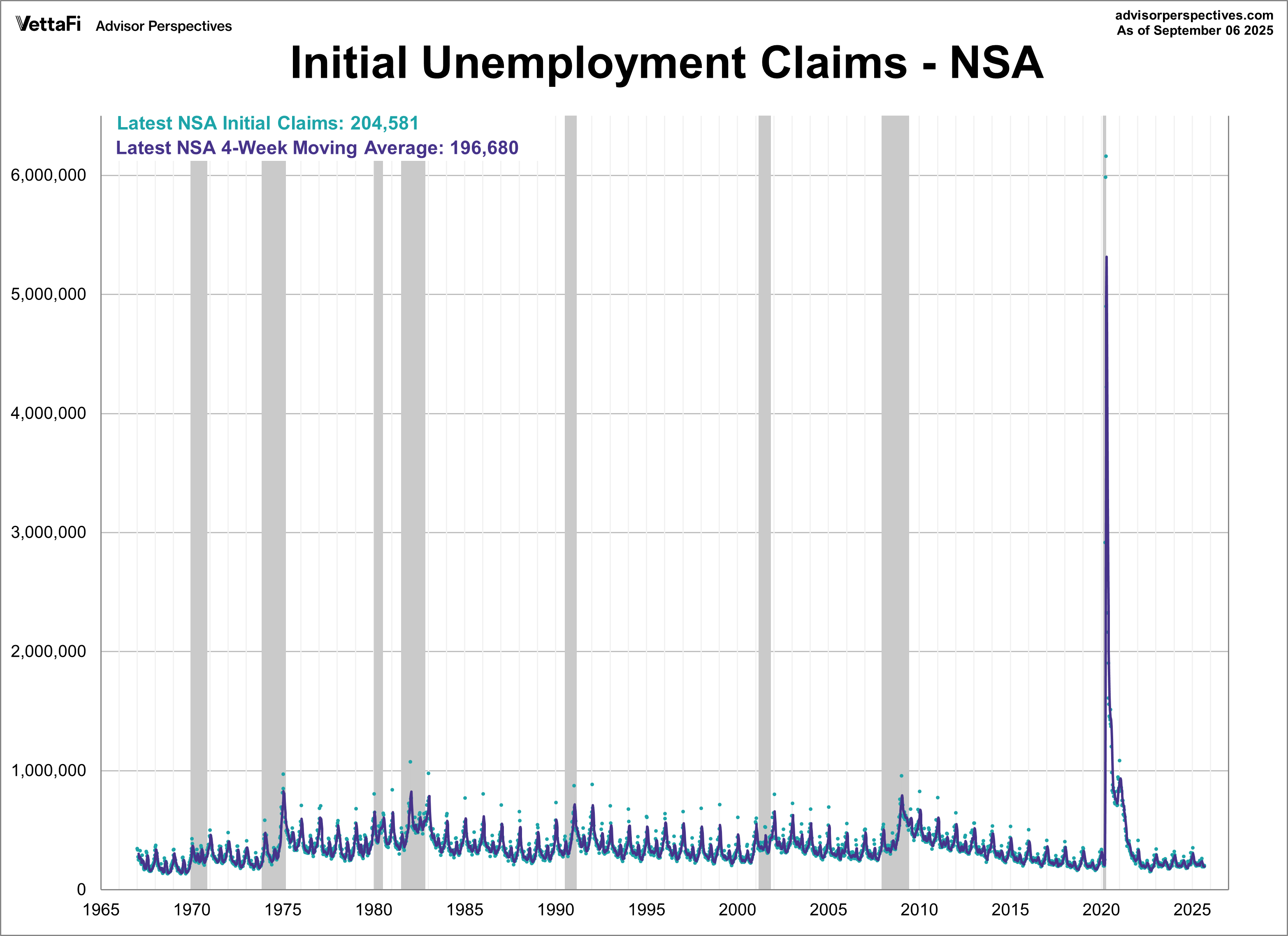
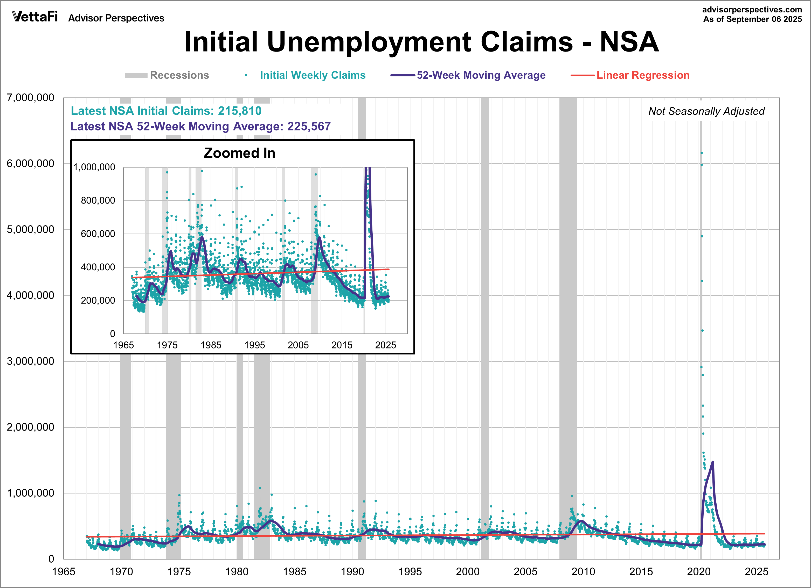
Initial Unemployment Claims: Not Seasonally Adjusted
The headline unemployment insurance data—and the charts above—are seasonally adjusted. But what does the non-seasonally adjusted data look like? The chart below highlights its extreme volatility, as shown by the green dots. The four-week moving average helps reveal the recurring seasonal patterns, such as the regular spikes in January.
Because of the extreme volatility of the non-adjusted weekly data, we can add a 52-week moving average to give a better sense of the secular trends. The chart below also has a linear regression through the data (red line), which we are currently below.
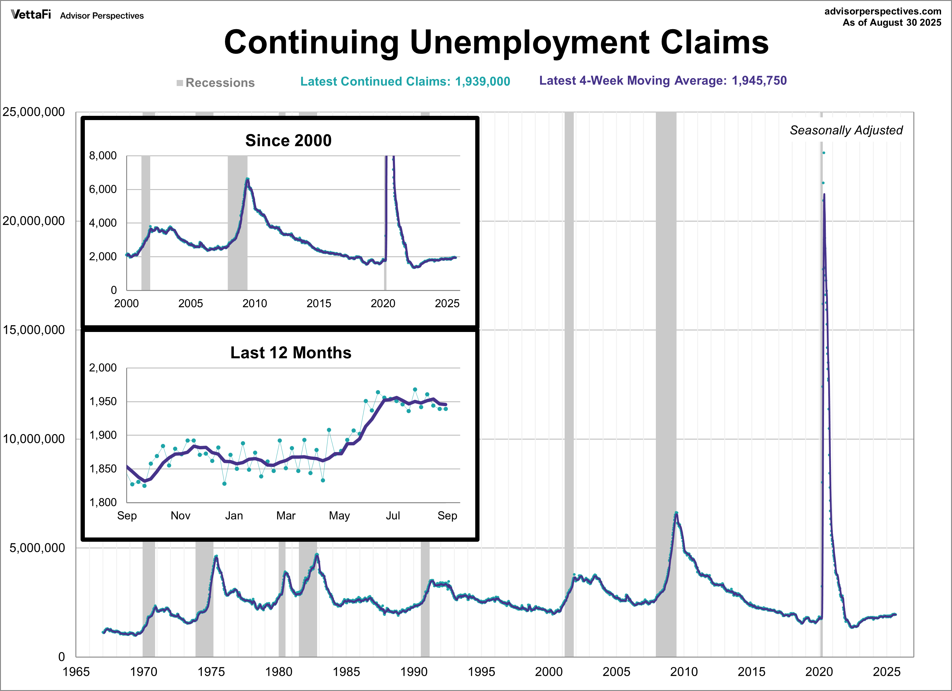
Continuing Unemployment Claims
Continuing unemployment claims are the number of people who have already filed for unemployment and have continued to claims benefits for a subsequent week. Unlike initial unemployment claims, continuing claims are not considered a leading economic indicator and are a less important measure of economic health. Additionally, data for continuing claims has a one-week lag compared to initial claims. In the week ending August 30th, continuing jobless claims were at a seasonally adjusted level of 1,939,000. This is unchanged from the previous week’s figure. The latest reading was lower than the 1,950,000 forecast.
Here is the data series dating back to 1967. Again, we’ve included the 4-week moving average to highlight the overall trend. Continuing jobless claims have hovered near multi-year highs for the past several months.
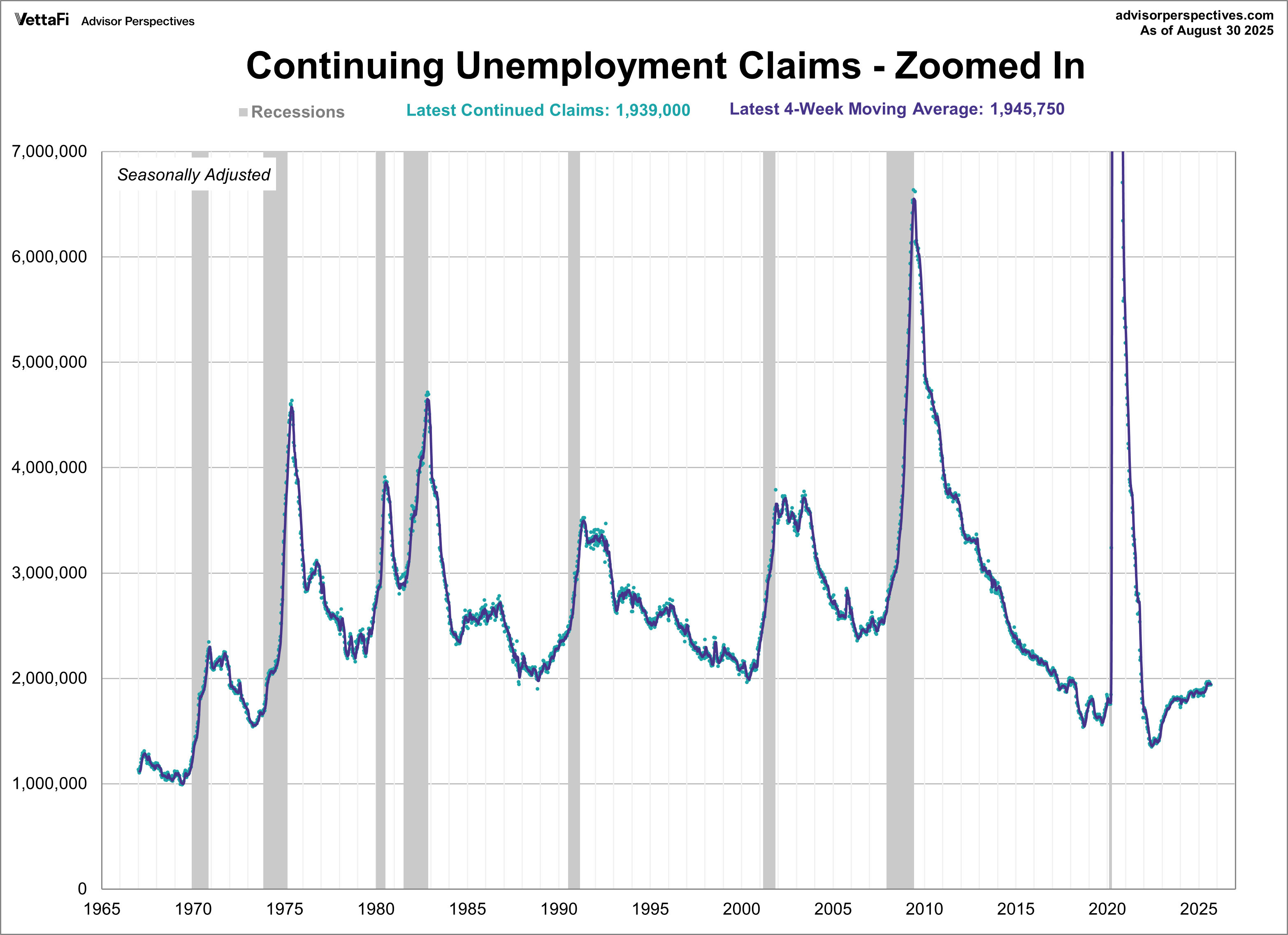
Here is a zoomed in view so that the COVID-spike is not as prominent.
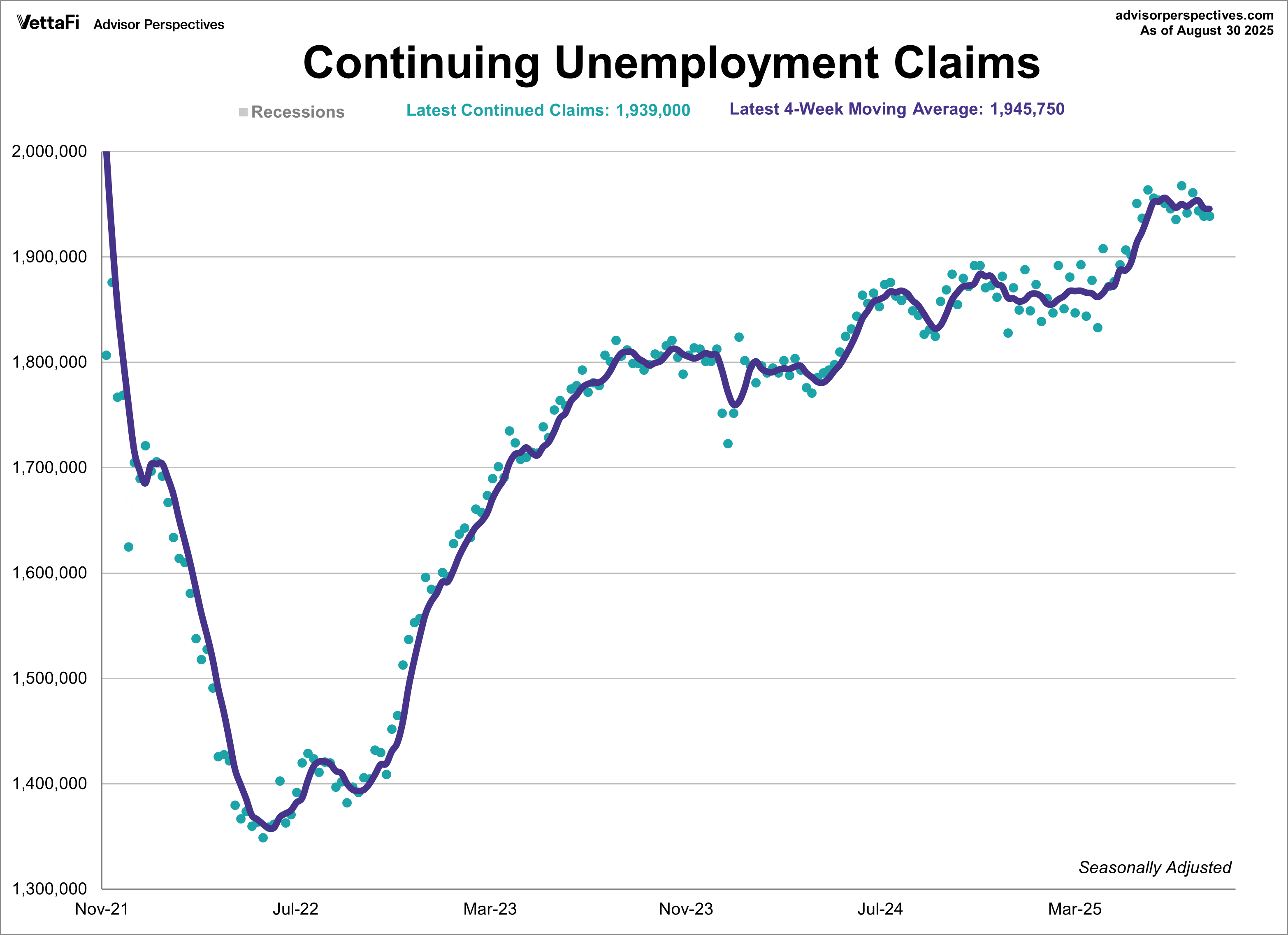
And lastly, here is a chart starting in November 2021 to see the more recent trends in continuing claims.
Unemployment Claims as a Recession Indicator
For an analysis of unemployment claims as a percent of the labor force, see this regularly updated piece Unemployment Claims as a Recession Indicator.
Here’s our list of monthly employment updates:
Job Openings and Labor Turnover Summary (JOLTS)
Full-Time and Part-Time Employment
Unemployment Claims as a Recession Indicator
Five Decades of Middle Class Wages
Long-Term Trends by Age and Gender
Originally published by Advisor Perspectives
For more news, information, and strategy, visit ETF Trends.
