
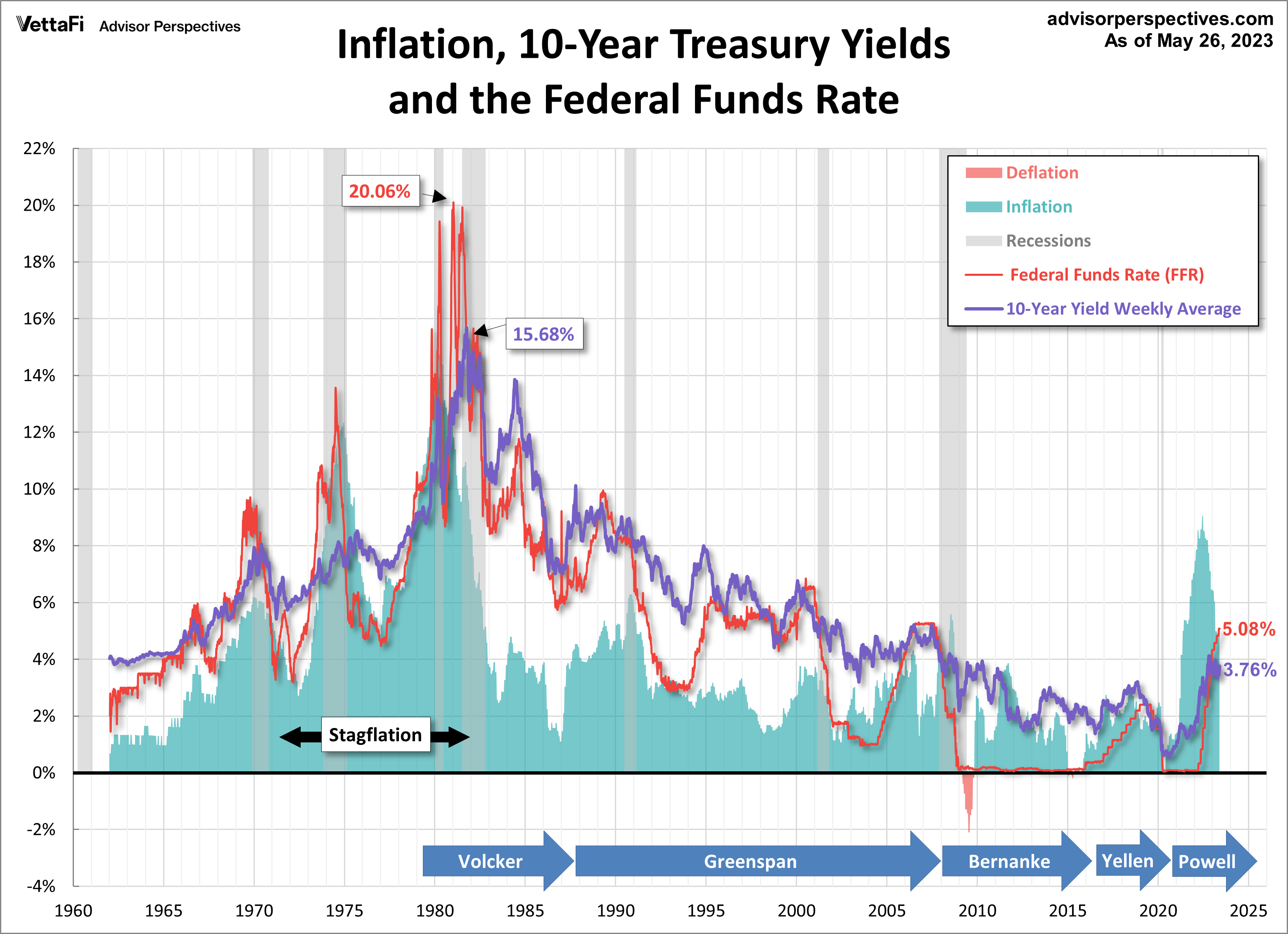
This article takes a look at a long-term perspective on Treasury yields as of the May 31, 2023 close. The chart below shows the 10-year constant-maturity yield since 1962 along with the Fed funds rate (FFR) and inflation. The range has been astonishing. The stagflation that set in after the 1973 Oil Embargo was finally ended after Paul Volcker raised the FFR to 20.06%.
As of May 31, 2023, the 10-year note was 312 basis points above its historic closing low of 0.52% reached on August 4, 2020.
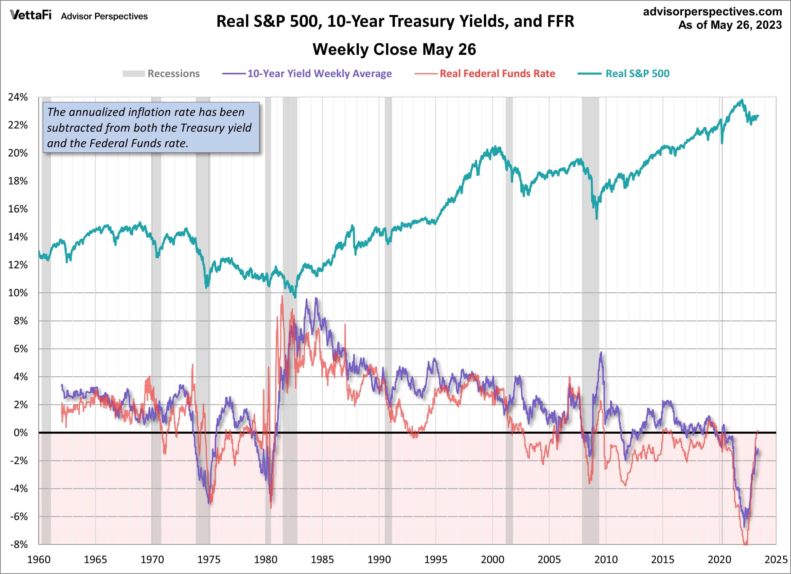
Now let’s overlay the S&P 500 to see the historical pattern of equities versus Treasury securities. This is a nominal chart, which significantly distorted the real value of both yields and equity prices.

Here’s the same chart with the S&P 500 and 10-year yields adjusted for inflation using the CPI. The impact of stagflation becomes much clearer. We can better understand the severity of the decline in equities from the mid-1960s to the bottom in 1982. And we can also see why high yields can be deceptive in periods of double-digit inflation.
The most interesting series in the charts is the FFR red line. We can see how the Fed has used rates to control inflation, accelerate growth and, when needed, apply the brakes. The FFR was virtually zero from 2008 through 2016 and again starting in 2020. It’s not obvious that the Fed has done a great job stimulating the economy, but the S&P has risen to record levels over the last decade. Additionally, even when rates were at record highs in the late 1980s, the S&P did not plummet. I’ve annotated the top chart with the tenures of the last five Fed chairmen so we can see who was managing the various FFR cycles since the summer of 1979.
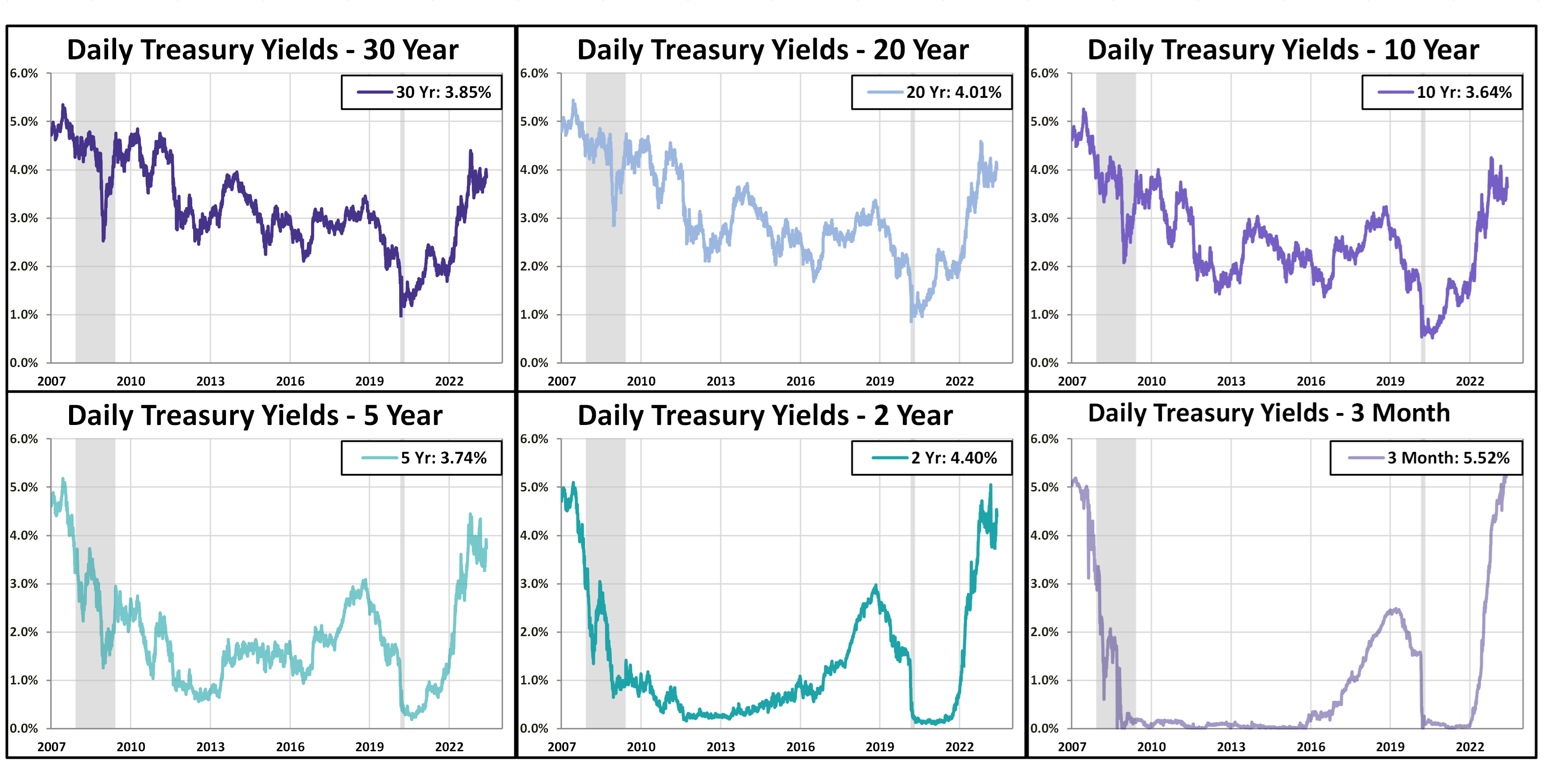
The next chart is based on daily data and adds some additional Treasury maturities for a close look at yields since 2007.

The overlay above can be quite noisy, so the below chart breaks out the Treasury maturities into their own charts for an easier visual.
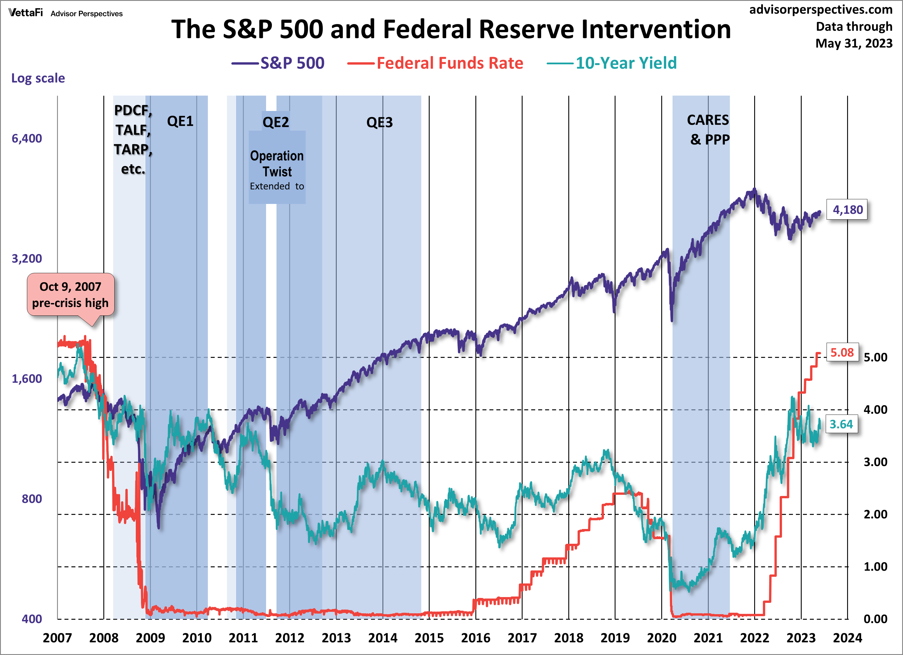
Now let’s see the 10-year against the S&P 500 with some notes on Fed intervention.
For a more frequent look, we update our Treasury Yield Snapshot on a bi-weekly basis.
ETFs associated with treasuries include: iShares 20+ Year Treasury Bond ETF (TLT), iShares 1-3 Year Treasury Bond ETF (SHY), and iShares 7-10 Year Treasury Bond ETF (IEF).
For more news, information, and analysis, visit the Fixed Income Channel.
This article was originally written by Doug Short. From 2016-2022, it was improved upon and updated by Jill Mislinski. Starting in January 2023, AP Charts pages will be maintained by Jennifer Nash at VettaFi | Advisor Perspectives
