
Summary:
- We don’t expect a recession in 2022. Real GDP growth will range between 3.0% to 3.5%. Inflation remains elevated, though price pressures will likely subside in H2 2022. We expect the core PCE deflator, the Federal Reserve’s preferred measure of inflation, to decline into a range between 3.5% to 3.0%. Overall CPI will decline into a range of 4.0% to 3.5%. So, inflation will remain elevated but should ease. Labor markets should slowly normalize, with unemployment reaching 4.0% by year’s end.
- The 10-year T-note will end the year with a yield of 1.85%, with an intra-year peak of 2.20%. Our base case is that the Federal Reserve will end its balance sheet expansion by mid-2022, but the first rate hike is more likely to come in Q1 2023.
- The S&P 500 will reach 5000 in 2022, approximately 6.0% higher than the expected 4700 at year-end 2021. Given liquidity conditions, we would carry an upside bias to this forecast. On the negative side, inflation is elevated, multiples are stretched, and bottlenecks and rising labor costs could eventually hurt margins. On the positive side, liquidity is ample, especially in the top 10% of households, and will tend to support equities. We favor value over growth and small caps over large caps. We remain favorable to foreign stocks.
- We still view the dollar as overvalued, but some sort of exogenous catalyst will likely be necessary to change the current bullish sentiment. We are bullish commodities and believe we are in the early stages of a broader bull market. Gold is undervalued on a long-term basis but is facing competition from bitcoin
Walter Scheidel’s book, The Great Leveler: Violence and the History of Inequality from the Stone Age to the Twenty-First Century,[1] postulated that inequality tends to rise over time but reverses when at least one of four unhappy events occur. These events are mass mobilization war, transformative revolution, societal collapse, and pandemic. The COVID-19 pandemic continues; although the world is steadily emerging from the event, disruptions are still affecting the global economy. One of the key factors in forecasting the upcoming year is determining what effects from the pandemic are temporary and will end in the near term and what effects are long-lasting. This difference presents a problem for forecasting because only with the passage of time will we know with certainty which changes are long-lasting and which are not. But, part of our role is to forecast—this is the business we have chosen. Therefore, the following expresses our current thinking about the aftermath of the pandemic:
- Globalization was under pressure before the pandemic. The rise of populism in the West since the Great Financial Crisis was, in part, a reaction against globalization. The pandemic has accelerated the pace of deglobalization. Lengthy supply chains have been exposed as wanting. Although businesses are loath to give up on the cost savings they have enjoyed by seeking low-cost labor abroad, persistent disruptions and lost sales will eventually lead to a desire to make supply chains more resilient, which will likely bring a shortening of supply chains and reshoring. This process will allow greater security of supply but at higher Inflation has already increased; although the pace of price increases will almost certainly ease in 2022, the level of prices isn’t likely to retreat anytime soon.
- As supply chain resilience becomes paramount, we expect a shift from just-in-time to just-in-case inventory management. This change would represent a balance sheet shift from financial to real assets and would also tend to bolster inflation.
- U.S. labor markets are exhibiting unusual behavior. Job openings are going unfilled, lower skilled workers are seeing faster wage growth than higher skilled workers, and quit rates are elevated. The labor force has contracted and is recovering slowly. The path forward is mixed. There has been a notable increase in retirements which has reversed a strong trend in labor market participation from the 65+ age cohort. Our expectation is that this decline is permanent, meaning the labor market will be at least partly constrained by the loss of these workers. In other age groups, we do expect a recovery to pre-pandemic levels, but employers will be forced to pay higher wages and accept work rule changes that raise costs and lower productivity. Immigration could ease some of these constraints, but sentiment toward immigration has become less positive (an element of deglobalization) and thus it is unlikely that foreign labor will resolve this issue.
- Although most participants underestimate its importance, a broadly accepted reserve currency is imperative for globalization. Without a universal currency to conduct trade and investment, relations trend toward bilateral and away from multilateral. What has been underappreciated is that extraordinarily loose monetary policy since 2008 has almost certainly undermined the dollar. It hasn’t caused significant depreciation in exchange rates, but the strength in cryptocurrencies and gold suggests growing discomfort with the overall direction of monetary policy. The central bank’s shift in its mandates from a nearly sole focus on inflation to other concerns, e.g., climate change, inequality, etc., will tend to provide excuses to maintain policy accommodation. Without a reliable reserve currency, the retreat from globalization will accelerate.
- A persistent theme we hear from investors is that we are heading into a repeat of the 1970s. Although possible, we don’t think this outcome is likely, at least for a number of years. There are two reasons for this presumption. First, it is generally underappreciated how few alternatives investors had to cope with inflation in the 1970s. Although commodity futures existed, there were a limited number of contracts one could use to counteract higher inflation. Although agricultural commodity futures existed before the 1970s, gold futures didn’t start trading until 1974. Crude oil commenced in 1978; T-bonds in 1977. Commission rates were high. Structured products that would protect against inflation were generally unavailable. Regulation Q capped most deposit rates at 5.5%, so real returns were negative during periods of elevated inflation. Although it was possible to buy real estate, the ability to extract home equity was limited. Contrast that scenario to the present. There is a wide variety of products available to protect against rising prices with low or non-existent commission rates. In addition, there was much less income inequality in the 1970s. With a wider distribution of income, lower income households generally adapted to inflation by purchasing goods. In terms of the balance sheet, households held physical inventory and less financial assets. Today’s income inequality is much higher, meaning that liquidity is concentrated in a smaller set of households. It is impractical for these households to buy goods in advance as an inflation hedge. Instead, they will be looking for financial products that provide protection. The strength seen in equities, cryptocurrencies, precious metals, and commodity ETFs are indications of how inflation worries are affecting financial markets. Thus, the reaction to inflation today is likely to be much different than it was 50 years ago.
- Not completely related to the pandemic, China represents the other worrisome tail risk. From the Deng reforms in the late 1970s until the Great Financial Crisis, China relied on exports and investment to drive growth. Given China’s stage of development, this path is approaching, if not already passed, its “sell date.” Policymakers in China are well aware that they need to shift the economy’s growth driver to consumption; unfortunately, history suggests that making that transition will be painful and fraught with political risk. We discussed the risk of China in greater detail in our annual “2022 Geopolitical Outlook,” published on December 13. Suffice it to say, China’s growth is poised to fall to 3% or less in the coming years, which will have an adverse effect on global growth.
The subtitle of this report is meaningful. By “fat tails” we mean that in the distribution of outcomes, there is a higher than normal probability of both negative outcomes (left side of the distribution) and positive outcomes (right side of the distribution). In our forecast, we will present the base case, highlight the potential right and left distributions, and argue which “tail” is more likely. We are using this method not to cover all possibilities but to provide investors with a snapshot of what dangers and benefits lurk in the lower probability areas of the distribution of outcomes that, in our opinion, have a higher likelihood of occurring this year.
What Do We Mean by “Fat Tails”?
One of the classic discoveries of statistics is the normal, or bell-curve, distribution.[2] Seemingly random events observed in nature, such as the distribution of height among people, tend to exhibit this pattern. The normal distribution is a powerful concept; much of modern portfolio theory is based on the idea. If returns in markets tend to follow a normal distribution, we can make statements about risk. Risk, as commonly discussed in financial markets, based on modern portfolio theory, is essentially the difference from average.[3]
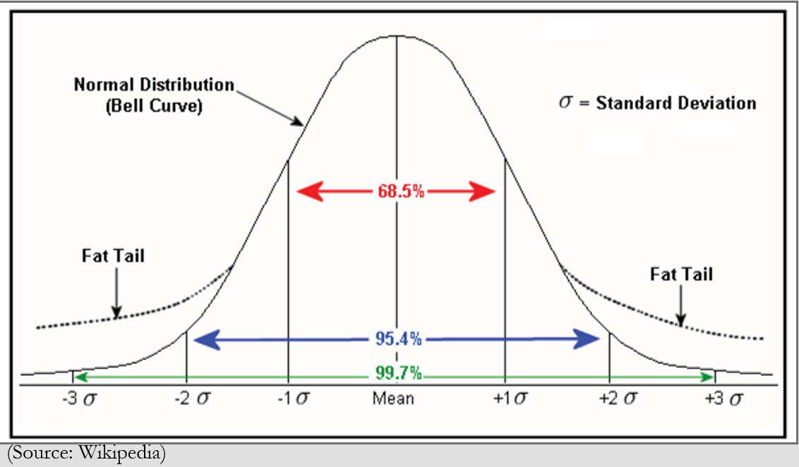
In a normal distribution, events (data points) that occur far from the average are rare; as the above schematic shows, over 95% of events occur within two standard deviations[4] from the average. Data points that occur more than two standard deviations from average are quite rare if the distribution is normal. For example, a data point that occurs in the zone more than three standard deviations from the mean should only occur 0.3% of the time. Or, put another way, a positive three standard deviation data point (the right side of the above distribution curve) only occurs 0.15% of the time. However, if the distribution isn’t normal and has more than normal data points at the tail areas, it means that the probability of unusually positive or negative data points is more likely. That is what we mean by “fat tails”―unusual outcomes happen with greater frequency than normal.
In other words, we think 2022 is a year in which unusual events are possible due to the aftereffects of the pandemic, including the lingering issues in supply chains, uncertainty surrounding both monetary and fiscal policy, and growing geopolitical risks. It is important to note that risks go both directions—returns could be unusually negative or positive. Therefore, in our report, we lay out our base case for the economy and key markets, and discuss what could trigger “tail events,” that is, both positive and negative outcomes for markets.
The Economy
The Base Case: We expect real GDP to range between 3.0% to 3.5%, with the GDP overall deflator running near 4.0%, meaning that nominal GDP will be 7.0% to 7.5%. The economy slowed in H2 of 2021, mostly due to supply constraints. We expect supply issues to ease gradually in 2022, which will support growth. Inflation will remain elevated but gradually improve as supply increases. We expect the core PCE deflator, the Federal Reserve’s preferred measure of inflation, to decline into a range between 3.5% to 3.0%. Overall CPI will decline into a range of 4.0% to 3.5%. The unemployment rate will approach 4.0% by Q4.
Right-Tail (Positive) Case: Our case for a right-tail/positive outcome calls for real GDP to run at 4.5% as supply constraints ease faster than expected as COVID-19 infections decline rapidly. The combination of vaccinations, the availability of effective anti-viral treatments, and natural immunity finally reach a point where constraints on activities steadily diminish. Consumers shift from goods purchases to services, relieving some of the supply chain stresses and boosting employment in leisure and hospitality. Growth is supported by the effort to build supply chain resiliency, which would include building domestic productive capacity and inventory.
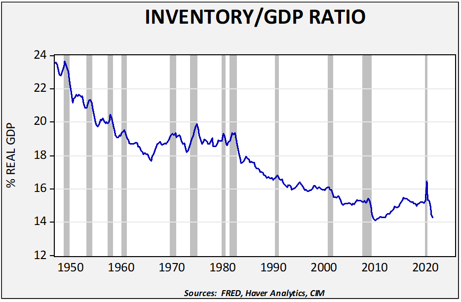
Although just-in-time inventory management has led to steady declines in stockpiles, the postwar trend in inventories has seen a steady drop relative to GDP, with the ratio mostly stabilizing this century.
We did see the ratio stabilize from the mid-1960s into the early 1980s, which was during the rising inflation era. Holding inventory in lieu of financial assets on balance sheets makes sense in a period of rising prices. In the last business cycle, we saw a sharp drop in inventories with a steady build in stockpiles into the second half of the last decade. The current sharp decline will likely foster several years of inventory rebuilding as firms use stockpiles to make their supply chains more resilient. Inventory accumulation will likely bolster the economy and could lead to higher than expected growth.
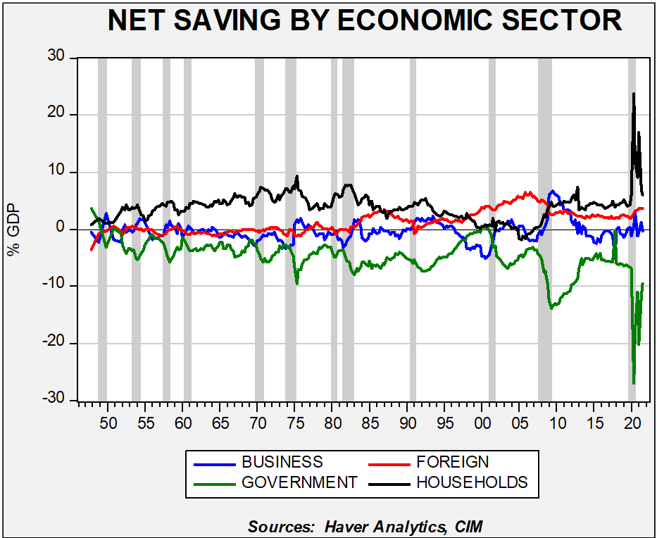
The second bullish factor is tied to high levels of household saving.
The extraordinary government transfers to households during the pandemic have increased the flow of saving. This chart, which shows flows of net saving in the four sectors of the economy, depicts an outsized rise in household saving.
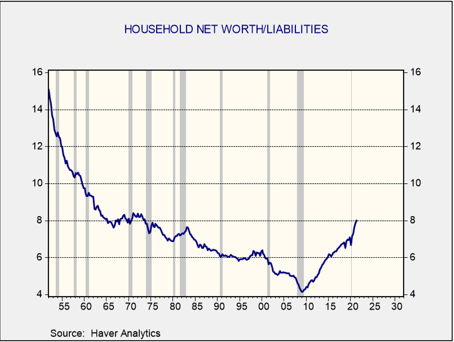
In addition, the ratio of household net worth to liabilities has made a dramatic improvement, with the ratio at levels last seen in the early 1970s. The improvement has occurred across all income groups, as shown in this chart. The current ratio, at 8x, is the highest in five decades.
Household saving is elevated, and balance sheets have improved. These factors could support stronger consumption and lift growth above our baseline forecast.
Left-Tail (Negative) Case: Conversely, our case for the left-tail/negative outcome would call for real GDP to fall to 2.0% as supply constraints worsen and new variants prevent services from recovering. The pandemic has disrupted the labor markets and those problems continue in this scenario. Demand for workers is outstripping supply, bringing higher wages. Labor, sensing its power, increases unionization drives, boosts strike activity, and lifts wages. A port strike on the West Coast (the current longshore workers’ contract expires July 1, 2022) exacerbates an already strained supply situation. Net exports continue to be a drag on growth. The decoupling from China accelerates, reducing capacity.
The pandemic has caused notable changes to the labor market; some will be temporary, while others will be permanent. The pandemic has jolted the balance between labor and management in favor of the former.
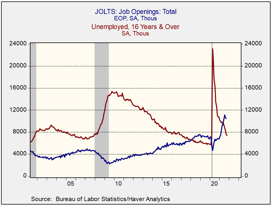
In the 2001-07 expansion, the level of the unemployed stayed above the level of job openings. In the next expansion, which ran from 2009 to 2020, openings exceeded the level of unemployment in early 2018, almost nine years after the last recession ended. In the current expansion, openings exceeded unemployment in May 2021, a mere 13 months after the recession ended. Openings have soared.
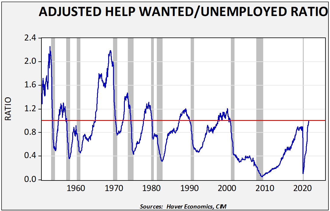
Unfortunately, the JOLTS data doesn’t have a long history. Thus, we have combined it with an earlier series from the Conference Board that measured the ratio of help-wanted ads to the level of unemployment.
We have positioned a ratio of one as an indicator of when the labor market is balanced between unemployment and openings. This indicator is a guide; help-wanted ads are not as precise of an indicator as the JOLTS opening data, but it gives us a relative view of the tightness of the labor markets. The data shows that the recovery we are seeing based on this ratio is the fastest since the 1955 recession. In this century, labor markets have tended to be weak; employers are having to cope with tight labor conditions much sooner in the cycle than what they have experienced in their careers.
There is a high level of uncertainty surrounding the labor supply situation. It should be noted that labor markets usually tighten after pandemics. After the Black Death, real wages rose due to the lack of workers. Even after the 1918 Spanish Influenza pandemic, it took five years for the labor force to return to trend.
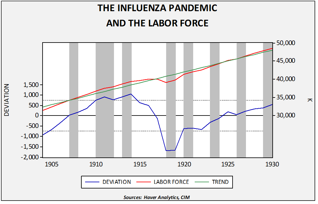
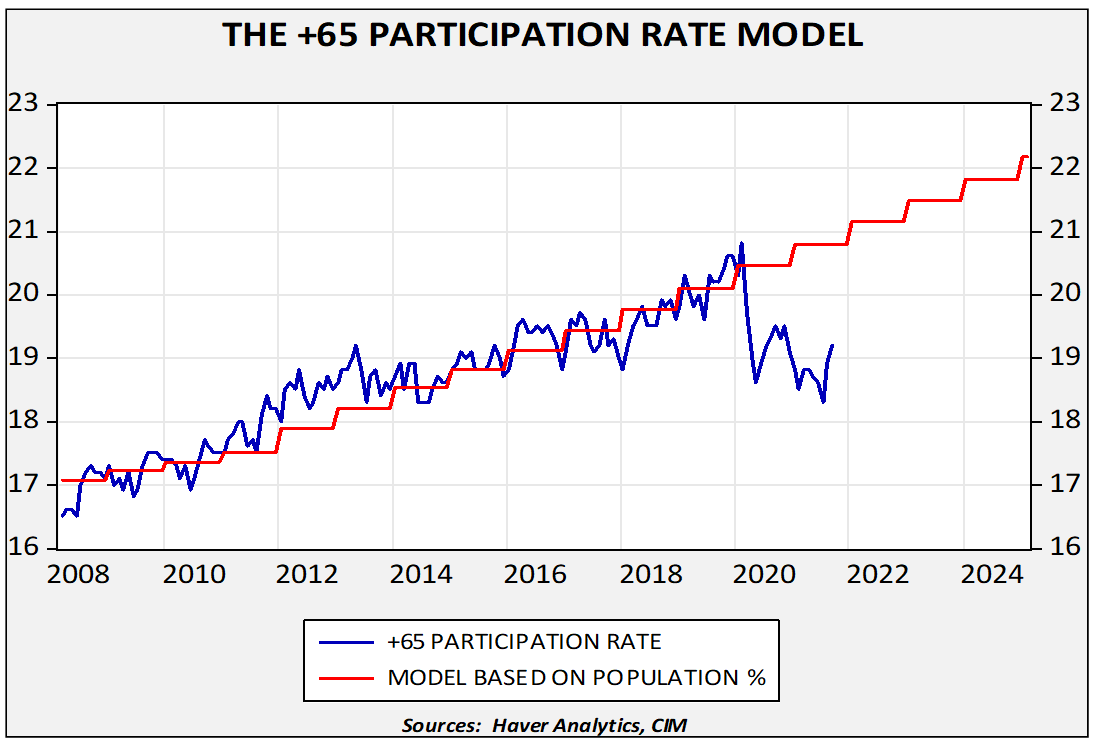
Pandemics change labor markets; some changes are temporary, but others are longer-lasting. For example, in the 25-54 age range, the labor force participation rate for men is 1.0 percentage point below the pre-pandemic levels. For women, it is 1.6 percentage points. Disruption in childcare is likely the reason for lagging female participation. But the biggest effect has been the impact on the 65+ labor participation. The 65+ age segment of the labor force has been growing mostly due to the aging baby boom generation.
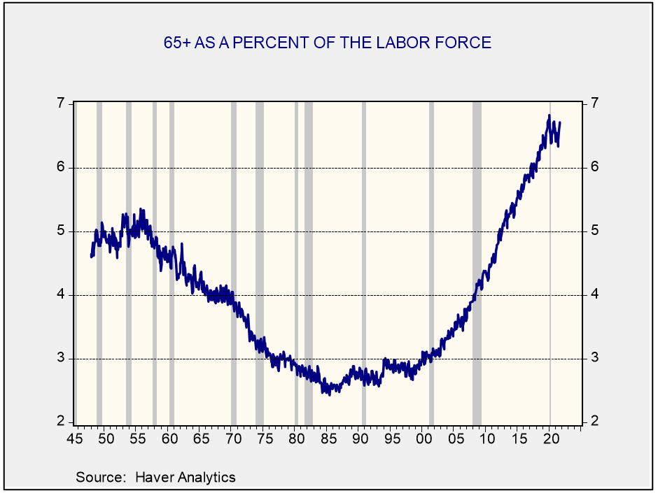
We modeled the trend in this next chart to the right. The dropout from trend is notable. Although these aging workers who left the labor force might return, we doubt this will be the case. If so, tight labor markets will likely be a permanent feature of the economy going forward.
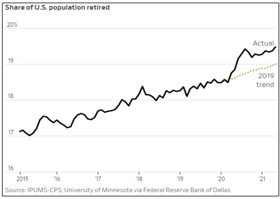
Complicating matters further is the increase in retirements, in general.
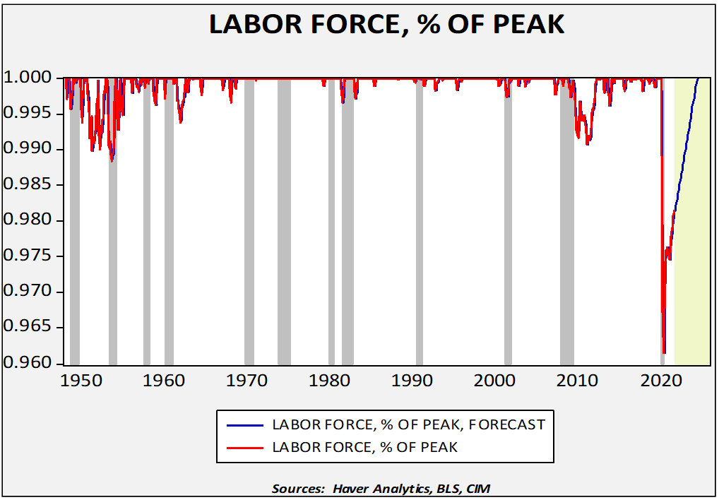
This has led to a deep decline in the labor force relative to the recent peak.
This chart shows the monthly labor force compared to the most recent peak, smoothed with a three-month moving average. As the data shows, this is the largest decline in the labor force relative to the previous peak in the postwar era. Using the BLS estimate of long-term labor force growth, we estimate that the labor force won’t return to pre-pandemic levels until June 2024, which is consistent with labor force behavior in the wake of the Spanish Influenza pandemic. This data suggests labor markets will likely remain tight unless the demand for workers declines. Such a decline would be consistent with recession.
A smaller labor force could raise wages, potentially narrowing profit margins, and lead to persistent inflation. However, the effects are complicated. Higher wages will likely trigger increased automation and investment; it could also encourage firms to increase their investment in workers through training. And, higher wages may not be negative for all companies; families may have higher incomes, which would boost consumption and growth. On the other hand, people typically ratchet back their spending to some extent when they retire, so the wave of retirements could also leave consumer spending somewhat weaker than it otherwise would have been, particularly if retirements “stick.” Simply put, rising wages are not an unalloyed negative for equity markets. However, in 2022, if tighter labor markets lead to constrained supply, economic growth could weaken.
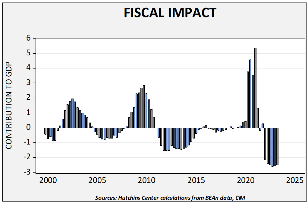
The second factor is that the level of fiscal support is set to decline rapidly next year, even accounting for the infrastructure bill and assuming the budget bill passes in some form.
This chart, with data from the Brookings Institute, estimates that slower fiscal spending will be a drag on real GDP growth next year to the tune of around 2.5%. Although deficits are expected to continue, GDP is a flow measurement, so a mere slowing in the pace of fiscal spending will act as a drag on growth. We don’t think it is enough to trigger a recession, but it does increase the odds of a policy error.
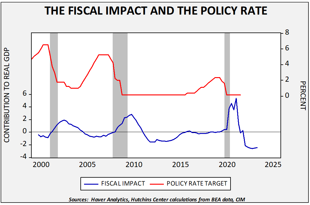
We will cover interest rates and monetary policy in the market section below. But, to highlight the sensitivity of fiscal drag, we overlayed that data with the FOMC’s fed funds target. A positive fiscal contribution is normal during recessions and the immediate aftermath. However, as the recovery takes hold, fiscal support often shifts to fiscal drag. It is arguable that the Fed overdid the rate hikes into the 2007-09 recession and perhaps its decision to wait in the last cycle was due, in part, to the fiscal drag that developed in 2011. Expectations of rate hikes are currently prevalent and would run headlong into fiscal tightening; this factor may lead the FOMC to wait before hiking.
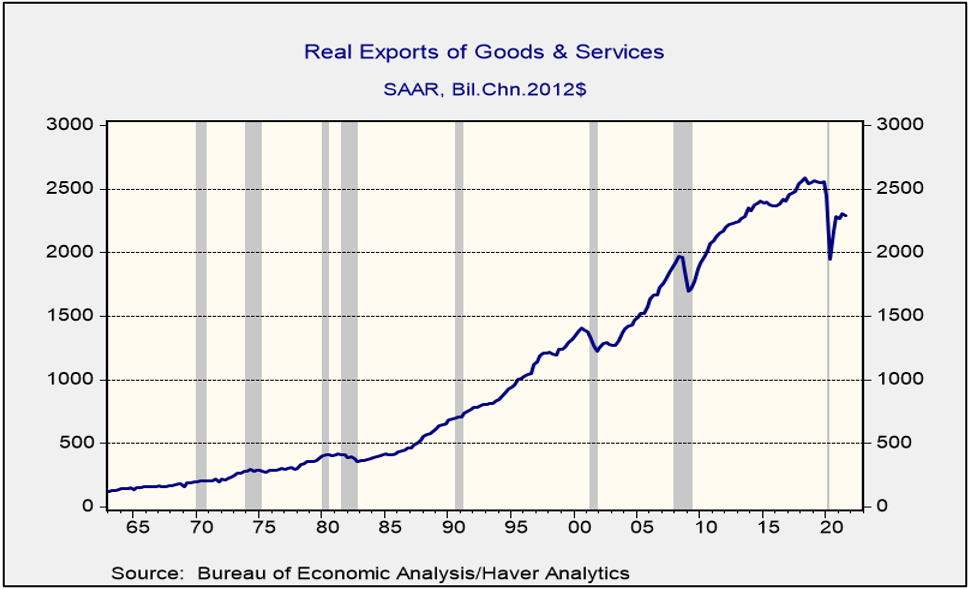
The third factor that could undermine growth next year is the trade situation. U.S. exports have been sluggish since the trade war with China began in 2018.
Since 1982, real exports have tended to rise in each expansion, peaking just before or during recessions. However, in the last cycle, exports peaked in Q2 2018, coinciding with the trade sanctions on China. The decline in world economic activity accounts for the historic plunge but the recovery has been sluggish. With imports rising quickly (they have already made new cycle highs), net exports will be a drag on growth.
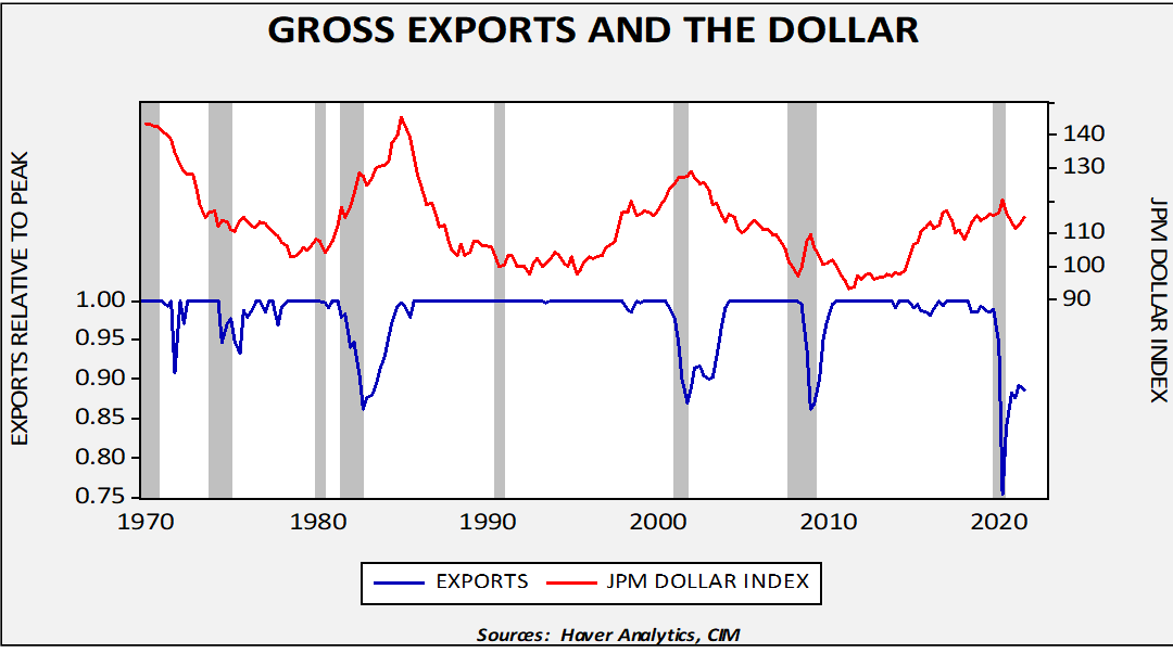
The upper line on this chart shows the J.P. Morgan dollar index, which is inflation adjusted and trade weighted. The lower line shows real gross exports relative to peak. A reading of 1.00 means a high peak has been established. It is not at all uncommon for exports to fall below peak during recessions, but the decline in the pandemic recession was the largest in the floating currency era. A recovery in exports is usually a function of an improving global economy, but, as the chart shows, a weaker dollar has historically contributed to the recovery in exports.
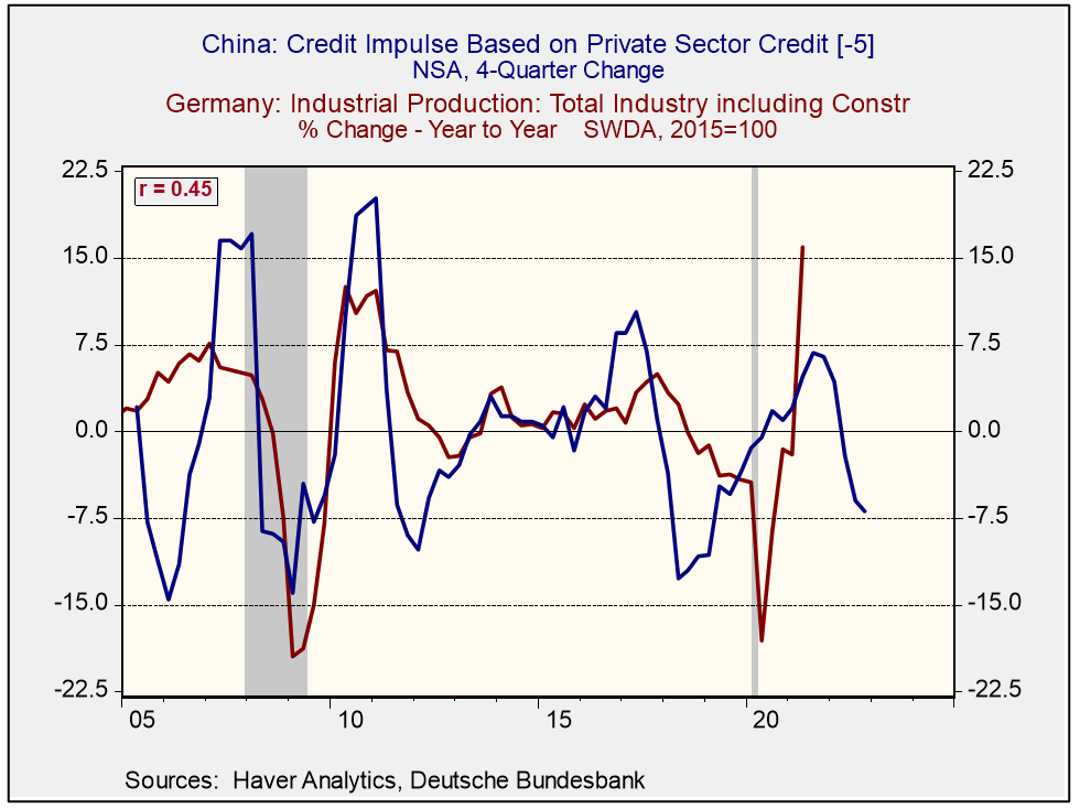
The fourth factor is that the world economy is much more dependent on China, and conditions in the “middle kingdom” are quite fluid at this point. That uncertainty matters. The chart below shows the relationship between China’s credit impulse and German industrial production. China’s borrowing relative to GDP tends to lead German industrial production by five quarters, suggesting weaker German growth next year. That may signal weaker global growth.
If China is embarking on addressing its debt problems, a period of slower growth is almost unavoidable and that will adversely affect world growth. Since the Great Financial Crisis, CPC leaders have tended to revert to debt and investment whenever growth slowed. That may occur this time around too, but so far, General Secretary Xi appears emboldened to address the debt issue once and for all. If he does, the U.S. will tend to have better growth than China and much of the rest of the world. China is one of those tail risks that we noted above.[5]
What About Inflation?
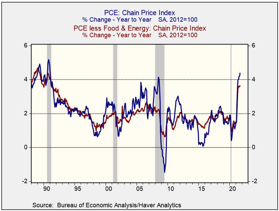
To reiterate, we expect the core PCE deflator, the Federal Reserve’s preferred measure of inflation, to decline into a range between 3.5% to 3.0%. Overall CPI will decline into a range of 4.0% to 3.5%. So, inflation will remain elevated but should ease. Still, the pickup in inflation in 2021 was notable. For the first time since the early 1990s, the U.S. economy is dealing with elevated inflation.
Using the personal consumption deflator (both overall and core), this is the highest inflation since the 1990 recession and the highest core rate since June 1991.
Economics as a science continues to lack a comprehensive theory of inflation. Our experience suggests that this is because there is both a market element and a monetary element to inflation. The market element is fairly simple―inflation is the intersection of aggregate demand and aggregate supply. What we are experiencing is a contraction in supply caused by supply chain issues and a drop in the labor force and, at the same time, rising demand as households are holding large levels of saving and want to spend. The current imbalance will most likely be resolved when supply chain problems ease, although it is possible that the Federal Reserve could try to depress demand through rate hikes. However, curing an inflation event with a recession is something policymakers will try to avoid. That means this bout of inflation will likely be transitory,[6] although how “transitory” remains to be seen. In previous events, we’ve seen price levels eventually slow their rise as the supply situation improves and rising prices discourage consumption.
The monetary element is a more difficult issue because it gets at the heart of what money is. Money is commonly defined as being a unit of account, a store of value, and a medium of exchange. This definition is rather superficial; it describes what you can do with money but doesn’t explain what money is. It would be akin to defining an automobile as something you can drive, listen to the radio, and fill up with gas. All these things explain what you can do with a car but don’t define it. So, how do we define money? It’s a social construct that we use to facilitate trade, allowing for society to not only overcome the high transaction costs of barter but also allowing for intertemporal buying and selling. It also gives a basis for determining wealth and income relationships.
In terms of what money does, the two most important are medium of exchange and store of value. Unfortunately, the two functions are contradictory. A well-performing medium of exchange should grow roughly in tandem with the supply of goods and services. If the money supply exceeds the supply of goods and services, overall price levels could rise. At the same time, maximizing for this function means the supply of money constantly rises, assuming the supply of goods and services does as well. On the other hand, the store of value is maximized by stability. In other words, the supply of money shouldn’t rise at all. After all, if the supply of money rises, it is a bit like a company issuing additional stock; it dilutes the value of existing money.
Societies have to balance these two functions. If the medium of exchange goal is maximized, it can undermine faith in the currency and lead to hyperinflation. If the store of value goal is maximized, faith in the currency is maintained but can result in deflation. So, over time, societies try to optimize between the two goals. There have generally been two ways this has been accomplished. The first is to use a metallic standard, such as gold and/or silver, with an explicit link of currency issuance to the supply of the metal. The second is a fiat standard, which relies on the credibility of government.
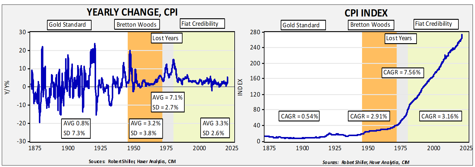
The chart on the left shows the yearly change in CPI going back to 1871; the chart on the right shows the level of the index. We have divided the periods into the gold standard (1871-45), the Bretton Woods era (1946-71), the “lost years” (1971-79), and the fiat credibility era (1979-present). Starting with the chart on the left, the gold standard did, on average, lead to low inflation but the stability of price changes was lacking; the standard deviation of the yearly change in prices was 7.3%. The Bretton Woods era had higher inflation but less inflation volatility. The “lost years,” from Nixon unilaterally ending the Bretton Woods arrangement to the appointment of Paul Volcker, had very high average annual inflation. Finally, the era of fiat credibility has seen modest inflation with low price volatility.
The chart on the right shows that the actual level of prices has been on a steady upward trajectory since the Nixon shock. It’s the chart on the right that we think is the most critical to investors. Under a metallic standard, the supply of money is tied to mining output. History shows that labor bears the cost of adjustment under a metallic standard; when money becomes scarce, austerity is required to attract foreign gold flows. Under a metallic standard, labor and debtors tend to be disadvantaged, but there is high credibility in the currency. This process usually results in lower wages and higher unemployment. As suffrage spread beyond property owners, it became increasingly difficult to maintain a pure gold standard. Bretton Woods was, in reality, a dollar/gold standard, which relied on the U.S. having enough gold to maintain a metallic standard. Under Bretton Woods, the U.S. behaved as if it was not constrained by the inventory of gold.[7]
Once a society adopts a fiat currency, the question of credibility is raised. The Nixon shock was combined with a compliant Federal Reserve, and confidence in the dollar was steadily undermined. It was restored by Fed Chair Volcker through monetary austerity. In the wake of Volcker, fiat regimes have built monetary credibility by declarations of central bank independence and inflation targeting. And, as the periods of fiat credibility on the above charts show, price levels have increased but at a pace where firms, households, and investors have mostly not paid attention. For the most part, the rise in inflation has not affected investment and purchasing decisions. Essentially, policymakers have been able to steadily lift price levels without triggering balance sheet actions that would cause accelerating inflation.
However, we posit that this fiat credibility rests on central bank independence and a convincing inflation target. In the case of the U.S., central bank independence was formally established in 1951, but that didn’t stop presidents from trying to strongarm the Fed. Fed Chair William Martin told tales of being physically pinned to a wall by President Johnson. President Nixon spread rumors about Arthur Burns that the latter wanted an exorbitant pay raise and then offered to quash the reports in return for policy accommodation.[8] President Reagan, through the proxy of Jim Baker, demanded that Chair Volcker not raise rates, and George H.W. Bush’s administration insinuated that Chair Greenspan might not be “normal.”[9] Treasury Secretary Rubin facilitated a peace accord of sorts, where he convinced President Clinton to make no comments about monetary policy.[10] That position seemed to work and held in place until President Trump.
We think there is emerging evidence that the pillars of fiat credibility are under stress. Last year, the Fed unveiled a new inflation targeting regime that purported to be based on an average rate rather than a 2% ceiling. The FOMC didn’t exactly detail how it was expected to work (e.g., what is the average, how long would deviations from 2% be tolerated, etc.); although the plan was reasonable, the lack of detail means the FOMC could say that inflation isn’t above some target almost indefinitely. Without details, the credibility of target is undermined. We note that Adam Posen, a former member of the Bank of England’s Monetary Policy Committee and president of the Peterson Institute, has been pushing for setting a higher inflation target. We suspect the psychological element of an inflation target is being unappreciated by economists. If it becomes overly flexible, or can be changed on a whim, there is a risk that currency confidence will be undermined. The other pillar, independence, is also under pressure. Chair Powell’s nomination hung in the balance for weeks, raising concerns about his ability to raise rates and be renominated. Nonetheless, a larger threat comes from the rising popularity of Modern Monetary Theory (MMT), which postulates that if a nation uses a fiat currency and issues debt in said currency, its only constraints on spending are worthwhile projects and inflation. An unspoken assumption of MMT is what is called a “whole of government approach,” which means that monetary and fiscal policy should be coordinated. We suspect, over time, that this approach will win the day. And when it does, the likelihood is high that the current era of fiat credibility will end and usher in an era similar to the lost years. Recent patterns in monetary policy arguably suggest this process is already underway.
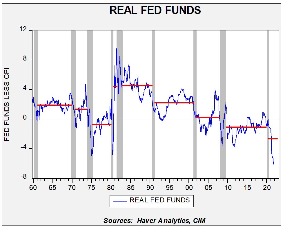
This chart shows the average real fed funds rate (fed funds less y/y% change in CPI) for each expansion since 1960. Note that we saw a steady decline in the three cycles from 1960 to 1979. Volcker’s term led to a high average real rate but since then we have seen the average real rate steadily fall. In the last cycle, the fed funds rate was persistently below the rate of inflation. The current cycle’s average rate is the lowest on the chart, although we do expect it to rise over time as inflation declines. Still, given the fact that the Fed has engaged in steadily easier monetary policy over the past few decades, it would be reasonable to expect that, at some point, the credibility of monetary policy would be questioned.
What happens when credibility is lost? Households, firms, and investors will make balance sheet decisions to convert money into a form that they believe will hold its value. For households and firms, this may mean holding more inventory, making advance purchases at a fixed price, and holding assets that are believed to maintain their value against inflation. Investors tend to hold shorter-term fixed income, value stocks,[11] hard assets (e.g., precious metals, commodities), and real estate.
We often hear discussions about “inflation expectations” and the need to keep them “anchored.” We understand the argument but notice that the discussion seems to end up with debates about whether or not price levels will remain elevated and what surveys of inflation expectations tell us. We think framing the argument as we have above, about credibility and the pillars that support it, makes for a better way to determine if policymakers are maintaining confidence in the currency.
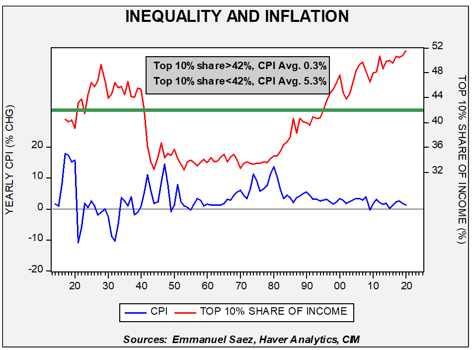
The last component to discuss on this topic is where inflation emerges. In other words, if economic actors decide that the currency lacks credibility, what actions are taken to protect purchasing power? An oft-overlooked part of this factor is income equality. If equality is high, it means more money is distributed across households. For households of modest means, a reasonable way to react to declining currency confidence is to buy goods and services in advance. But, if income and saving is concentrated in just a few households, then it is impractical to protect purchasing power in this manner. Instead, these households will try to protect purchasing power by holding investments that (they hope and believe) will tend to rise at least as fast as inflation.
This chart tends to support the idea that inequality acts to quell inflation. When the top 10% of households capture 42% or more of national income, inflation tends to be very low. When that share falls below 42%, inflation averages 5.3%. When inequality is elevated, it makes sense that we would see inflation in assets, rather than in goods and services. At the same time, there is evidence that all households are currently holding higher levels of cash.
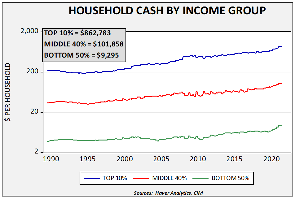
The pandemic has led to greater cash holdings. For the top 10%, cash levels rose $163,153, up 23.3%, while the middle 40% saw cash holdings rise $14,401, up 16.5%, and the bottom 50% saw cash holdings rise $2,197, up 30.9%, since the onset of the pandemic. We do expect this cash to be deployed in the coming months and its path will determine if inflation becomes a bigger problem or if asset prices rise further. However, this deployment of cash may not drive persistent inflation but rather may lead to inflation within those assets deemed to protect purchasing power.
The Markets
For our purposes, forecasting the economy is done in the service of forecasting financial and commodity markets. We use our economic forecast to guide our expectations for the markets. This year, we will begin our forecast by looking at the long-duration fixed income markets. The reason is because the path of long-duration interest rates will likely determine the outlook for the rest of the markets.
We begin with our 10-year T-note model. We have expanded the variables contained based on additional research we performed this year. The current model begins with fed funds and the 15-year average of inflation, which acts as a proxy for inflation expectations.[12] These two variables address much of the variation in long-term interest rates as the fed funds rate acts as an anchor, while the inflation proxy addresses price issues. Both variables are positively related to 10-year yields.
What about Fed policy? We have been surprised that there has been little comment about the Fed’s move to average inflation targeting or its focus on the labor markets. Essentially, the FOMC’s reaction function is unknown at this point. Using the earlier reaction function, the Fed is hopelessly behind the curve.
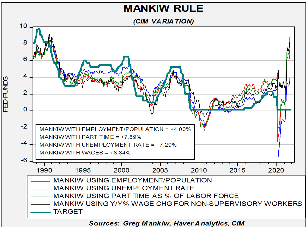
The Mankiw Rule is a variation of the Taylor Rule; the latter uses core inflation and the difference between actual and potential GDP. Since potential GDP can only be estimated, Greg Mankiw proposed using unemployment to replace the spread of actual to potential GDP. We have added variations of wage growth for non-supervisory workers, the employment/population ratio, and involuntary part-time employment. As this chart shows, the FOMC’s policy rate is at least 400 bps too low.
So, if the Fed is no longer using the Taylor or Mankiw rules to guide policy, what is the new reaction function?
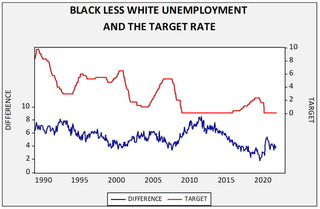
One area in which policymakers have expressed concern is minority unemployment.
This middle chart shows the policy rate target relative to the difference between white and black unemployment. There is no obvious rule that can be gleaned from this, but we suspect the FOMC would probably want to see the difference less than 2.5%.
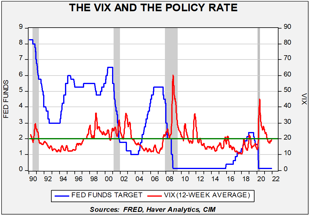
The Fed has also shown sensitivity to financial market stress. If we compare the policy rate to the VIX, the Fed has shown a tendency to raise rates if the 12-week average of the VIX is less than 20.
The 12-week average of the VIX is hovering around the 20 level. Given recent market volatility, it will likely move above this level, which should delay rate hikes.
Finally, we note that next year’s roster of regional FRB presidents is mostly hawkish. Esther George and Jim Bullard will be reliably hawkish. Loretta Mester’s recent comments have leaned hawkish as well. The Boston FRB presidency is vacant but has been hawkish recently. We still don’t know how President Biden will handle the governor situation, but we suspect he will try to staff open slots with doves. That doesn’t mean he can get them approved. We do note the Senate has been consistently rejecting unorthodox candidates. So, moderate doves are likely.
The deferred Eurodollar futures are signaling 50 bps to 75 bps in higher rates over the next two years.
We expect the FOMC to start gradually raising rates in H1 2023. However, there is great uncertainty surrounding what the FOMC will do as reaction functions have changed. Although the markets are currently forecasting rate hikes in H2 2022, we expect the FOMC will wait, but this patience may depend on the Biden administration filling the three open governor seats quickly.
In the rest of the bond model, we also include five-year inflation volatility, the yen/dollar exchange rate, German bund yields, WTI, the fiscal deficit/GDP ratio, the composition of government (unified or divided), and whether QE is in place. The key surprises of these variables are that fiscal deficits are not negative for yields (mostly because deficits occur during recessions), QE is modestly negative for yields (most likely because QE raises inflation fears), and divided government leads to lower yields. Higher oil prices lead to higher long-duration yields, which is no surprise, and German yields are also directly related to long-duration yields.
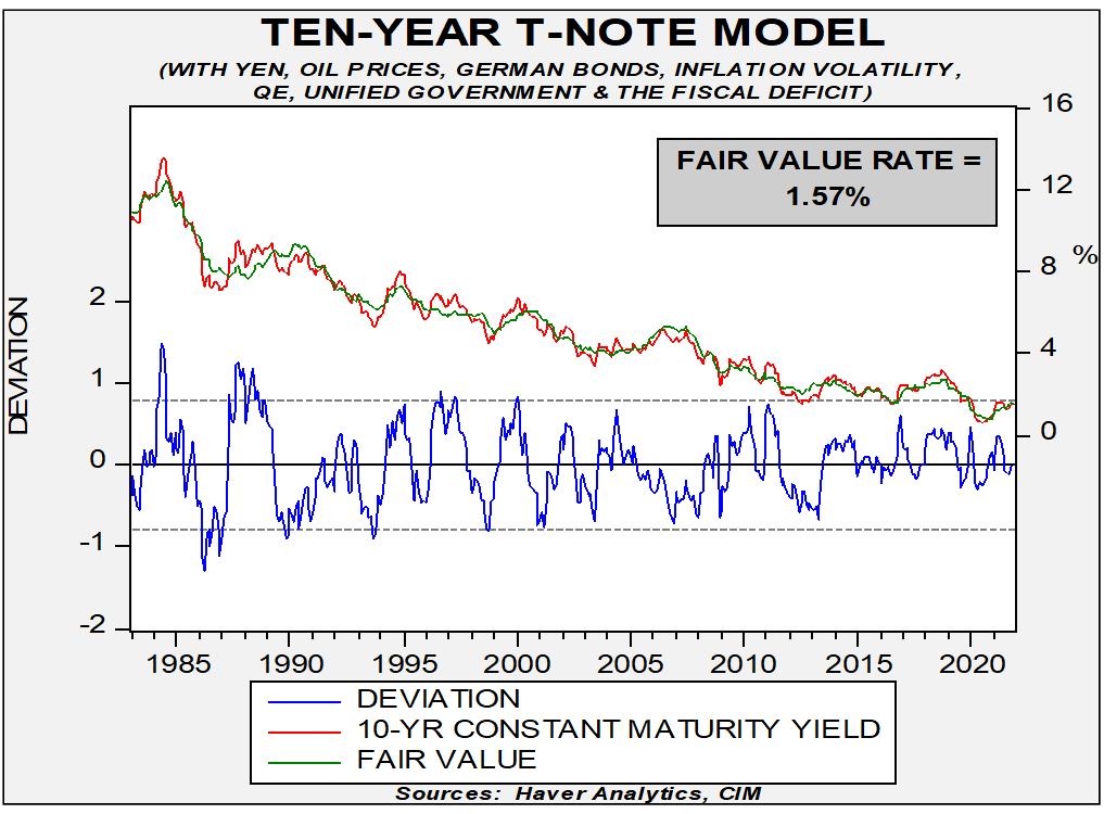
Our base case assumes that the inflation proxy will hit 2.03%, a steady yen/dollar, German Bund yields will reach +0.20%, WTI will be $95 per barrel, the deficit/GDP ratio will decline to 4.7%, the Democrats will lose badly in November, leading to a divided government, five-year CPI volatility of 1.35%, and the end of QE. All those assumptions lead to a year-end 10-year T-note yield of 1.85%, with an intra-year high of 2.20%.
Left-Tail Case: The case for a left-tail outcome assumes the FOMC raises rates more aggressively than expected, taking the policy target to 75 bps because inflation is higher than our base case, leading to a proxy of 2.25%. Oil prices reach $100 per barrel (our base case is $95), and inflation volatility reaches 1.5%. This basket leads to a high in yields of 2.45%, with a year-end projection of 2.11%.
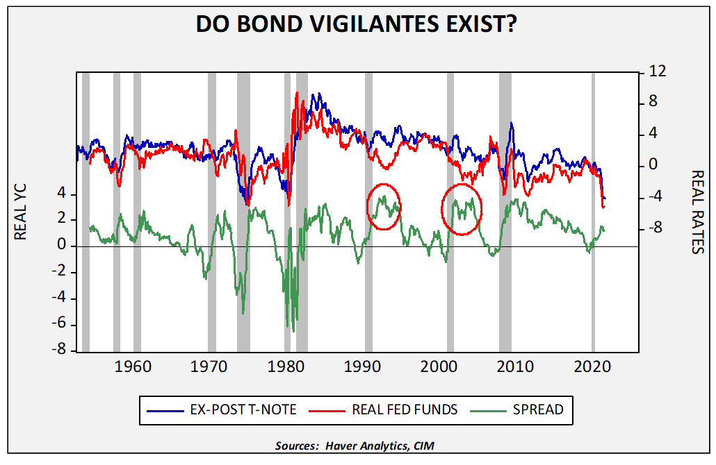
Extreme Left-Tail Case: This more extreme outcome rests on the notion of the “bond vigilante,” or the “buyer strike” idea. In other words, this is what happens if investors stop buying long-dated Treasuries, forcing interest rates higher. The idea of the bond vigilante emerged in the early 1980s as a way of explaining why bond yields were rising.
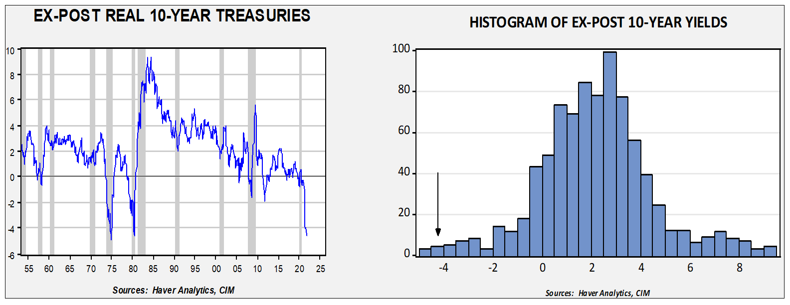
The chart on the left shows the nominal 10-year T-note yield less the yearly change in CPI.[13] We start the analysis in the mid-1950s, which excludes the period when the Fed was not independent from the Treasury. Our current real yield is -4.0%, which is the lowest since the early 1980s. For perspective, the histogram on the right shows that the current ex-post real yields are well out on the left tail of the distribution. The average real yield over this period is around 2.1%; with CPI running at 6.2%, that would imply a nominal yield of 8.3% on the 10-year, which would likely have catastrophic results for the economy.
This outcome isn’t likely, in part because what led to the narrative of the bond vigilante had more to do with Paul Volcker.
When T-note yields spiked in the early 1980s, so did real fed funds. In other words, the rise in 10-year yields had more to do with a monetary policy shock than with a buyers’ strike. A better case could be made in the early 1990s and the early part of this century, when real fed funds fell but real T-note yields did not. Those periods are shown on this chart by red circles. A massive rise in T-note yields to the level described above would probably be met with yield curve control. The risk of this outcome is small, but not zero.
Right-Tail Case: A right-tail outcome occurs if inflation surprises to the downside, putting the inflation proxy at 1.90% and inflation volatility at 1.25%. WTI falls to $70 per barrel. The FOMC does not raise rates in 2022 and German yields hold at 0%. That puts the high yield for the year at 2.02% with a year-end yield of 1.67%.
In all our cases, we expect rates to rise, although in the right-tail case, the impact is less. The primary reason is that if the fiscal deficit narrows as expected, it will add 45 bps to the fair value yield. This outcome does fly in the face of accepted wisdom, but since 1983, the impact of deficits and united government has changed, as we discussed earlier this year. Essentially, our research showed that from 1960 to 1982, unified government reduced 10-year T-note yields by 50 bps. From 1983 to the present, unified government increased 10-year T-note yields by 31 bps. In the earlier period, there was greater faith in government, therefore single-party control was considered positive. In the early 1980s, attitudes toward government changed, and the bond market preferred divided government. Our expectation is that we will have divided government after the November midterms, which will be bullish for long-duration yields.
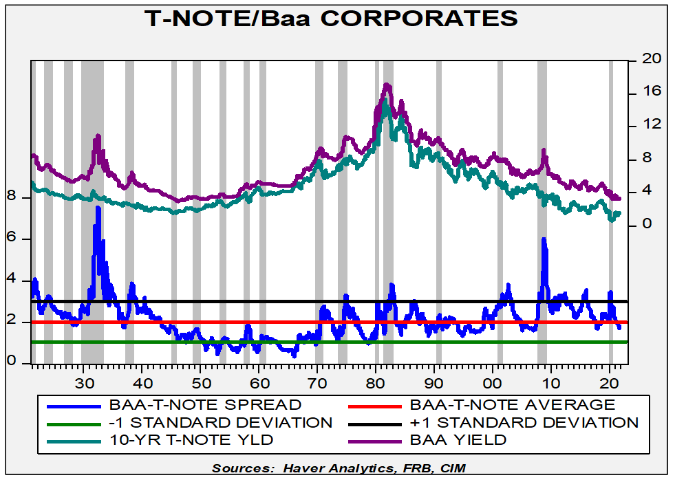
In terms of corporate yields, investment-grade corporates are just a bit below average.
This spread is in the region of its lows over the past 40 years, which does suggest that investors are taking some risk in this area.
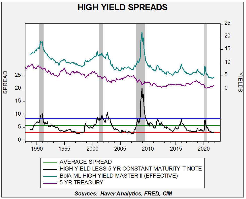
High-yield spreads remain near historic lows.
If there is any sort of financial stress, we would expect spreads to widen, which would adversely affect both investment-grade corporates and high-yield instruments.
Equity Markets
We start with forecasting the S&P 500, which entails two estimations―earnings and the P/E multiple. Let’s start with earnings.
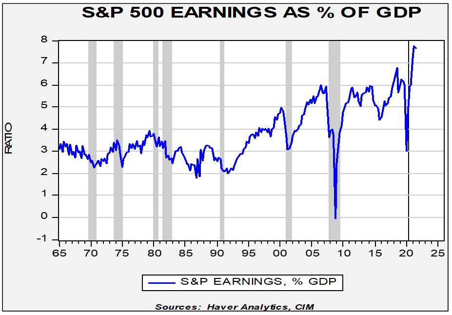
This first chart regresses the four-quarter trailing S&P 500 earnings against nominal GDP. The goal of this exercise is to determine how much of earnings are being accounted for by overall economic activity. As the chart shows, there are periods where earnings outpace economic activity, and vice versa. The other pattern that usually exists is that earnings decline in recessions. The last recession was an exception; earnings only fell modestly, especially compared to the last two cycles. In fact, the current level of earnings is second only to Q1 1930.
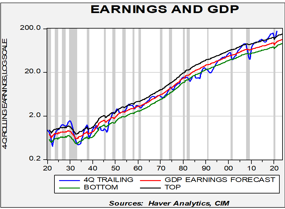
Comparing total S&P 500 operating earnings[14] to GDP, the current reading is 7.7%, which is extremely elevated. Although we don’t have a longer-term history of this data, by all accounts, current margins are historic.
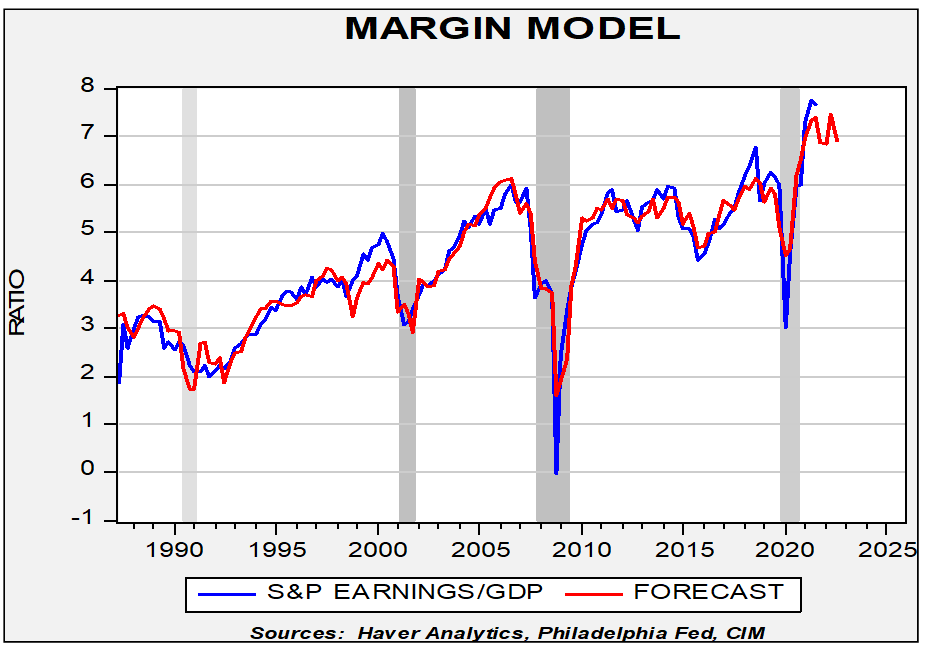
Our forecasting model suggests that margins will remain elevated for 2022. We expect the labor markets won’t fully recover until mid-2024, which means that firms will have operating leverage until that occurs. Some of that leverage will be lost to higher wages but not enough to harm margins significantly. In addition, margins tend to be helped by a large trade deficit, which, as we noted above, will be a drag on economic growth. Thus, we are looking for S&P operating earnings to be $225.80 for 2022.[15]
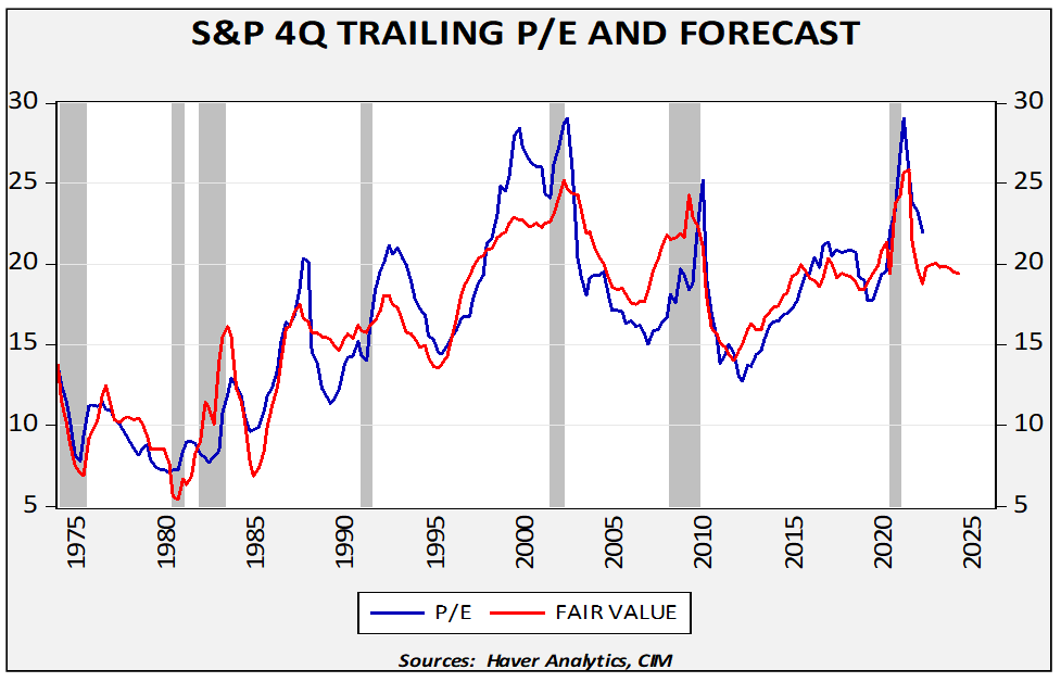
The next step is to estimate the P/E ratio. Our model uses several monetary factors, including the level of retail money market funds, M2 growth, and money velocity adjusted for the level of inequality. We also have the 10-year Treasury yield, fed funds, the yearly change in CPI along with the five-year standard deviation, and the fiscal deficit. Several variables are weighing on the multiple’s forecast―it’s not just persistent inflation but also rising volatility, rising interest rates, and slowing money growth. Our average P/E forecast of 20.0x yields a forecast of 4516.00 for the S&P 500, which is below the current level of the index.
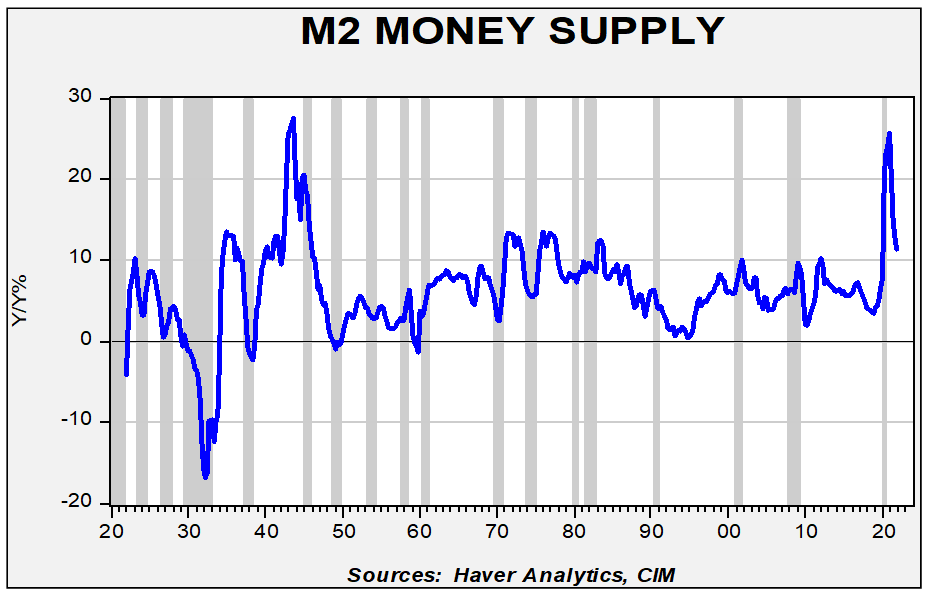
Right-Tail Risk: The case for equity outperformance mainly rests on liquidity and the inflation response from equities. Al Goldman, a renowned market analyst at A.G. Edwards, often repeated the mantra that equity markets are driven by mood, money, and momentum. In our analysis, money is a key driver. Money, by design, is fungible. It can be used to buy a wide spectrum of goods and services, or it can also facilitate the purchase of assets that can act as a store of value for future purchases. The FOMC has aggressively boosted the money supply; as the chart below shows, this level of money supply growth has only been matched by the expansion during WWII, when the Federal Reserve was required to expand its balance sheet to meet the demands of wartime spending.
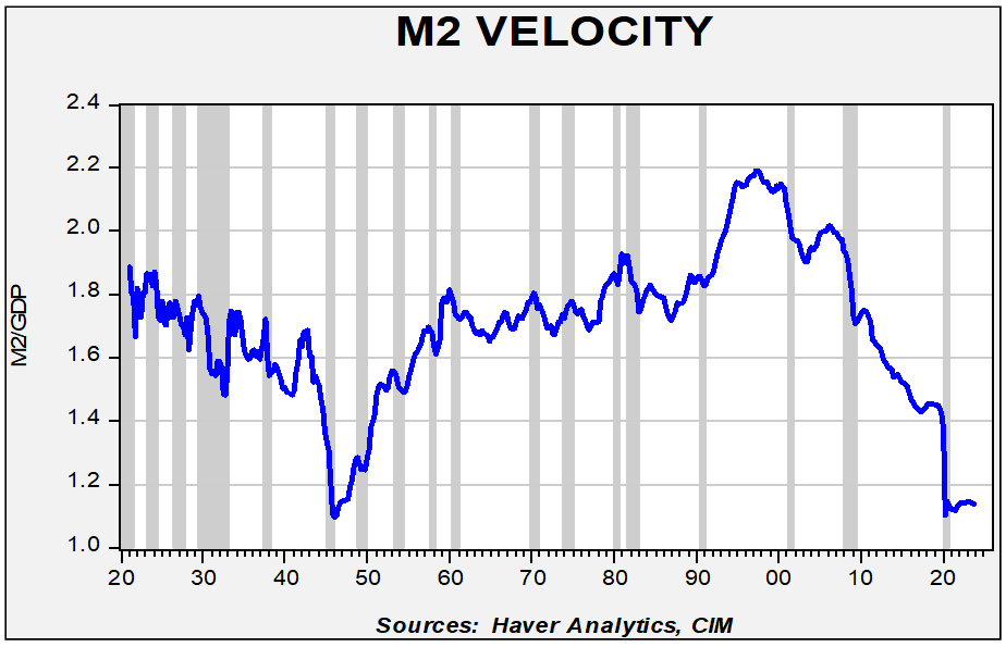
In addition, the federal government has made massive transfers to households (as shown in the earlier net savings chart). Households are flush with cash, and although some of it is being spent, much of it is being held either for anticipated spending or due to uncertainty about future conditions. This shows up most markedly in money velocity.
Money velocity is the quotient of nominal GDP divided by the money supply. Current velocity has rarely been this depressed.
Over the past century, the only other time velocity was this low was near the end of WWII. A velocity reading this low means that the central bank is providing more liquidity than needed for goods and services. This liquidity needs to go somewhere.
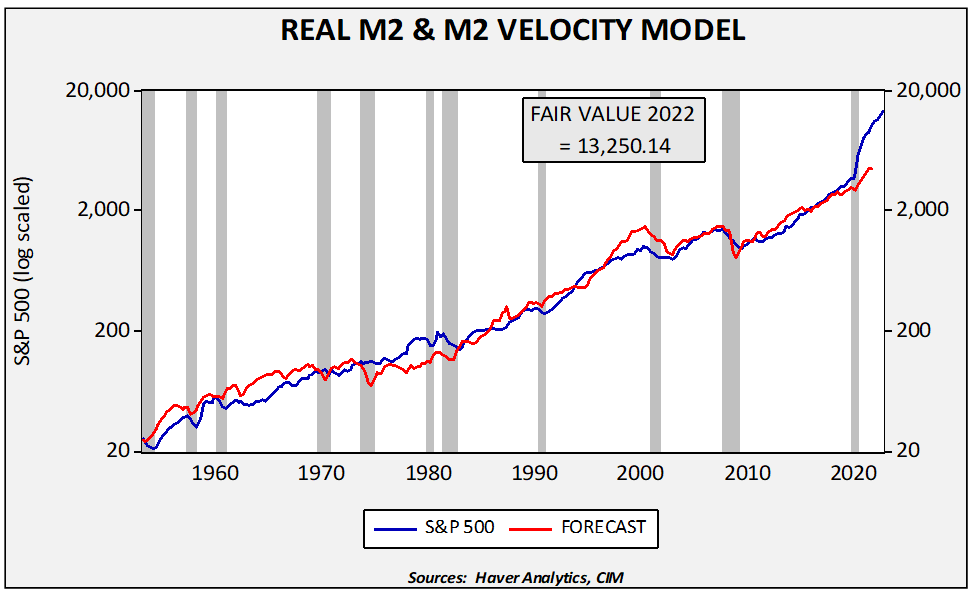
Equities appear to have benefited from this excess liquidity. If we model the S&P 500 relative to real M2 (money supply deflated by CPI) and velocity, equity markets are undervalued.
We would not be so rash as to expect the S&P 500 to reach this model’s level, but it does show that liquidity is a powerfully supportive factor for equity prices. However, it is also possible that liquidity will flow into goods and services or other financial assets.
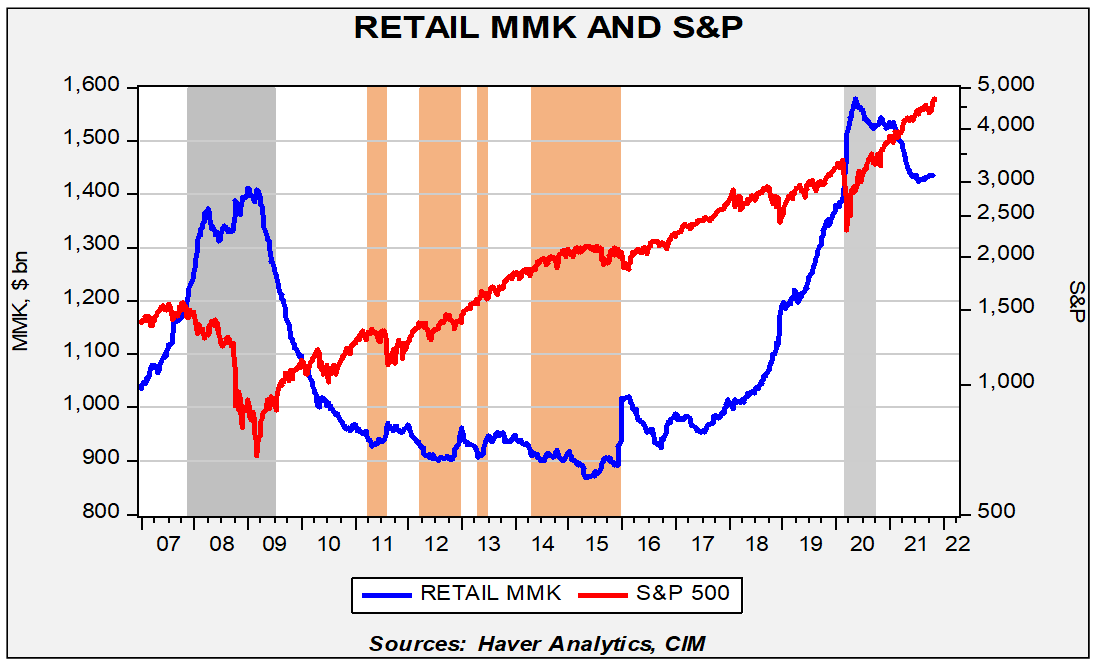
Another way of looking at the data is to compare the S&P 500 to retail money market funds (MMK).
The gray bars on this chart indicate recessions, while the orange bars represent when MMK falls to $920 billion or less. In general, equity markets tend to stall when MMK falls to $920 billion or below. The current level of MMK, at $1.4 trillion, suggests there is ample liquidity to propel equities higher.
Finally, it should be noted that, so far, equities have provided a real return above the rate of inflation.
A falling index level on this chart means that equities are not keeping pace with inflation. That is clearly not the case at present.
Left-Tail Risk: The left-tail represents the bearish case for equities. There are three primary worries. The first is that a natural slowdown in the economy will bring down equities. The second is that policymakers make a mistake and clamp down on policy support just as the economy is naturally slowing after the jolt of stimulus over the past two years. The third factor is the election cycle.
In terms of the economy, the yearly change in the S&P 500 tends to track the ISM manufacturing index. Since 1999, the two variables are positively correlated at the 76.1% level. This scatterplot shows that the current level of the S&P is undervalued relative to the ISM manufacturing index.
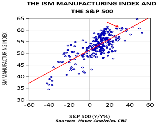
However, the recent decline in new orders coupled with rising inventories would point to a lower ISM in the near future.
The current spread is consistent with an ISM of around 52.0. An ISM at this level would generate a yearly growth rate of 4.3% on a yearly basis. That outcome would lead to a year-end level of 4863 for the S&P 500.
The recession outcome, which isn’t likely but not a zero probability, would usually trigger a 20% decline in the S&P 500, rendering an approximate level of 3725 from the current 4650. That outcome would be more likely if the Federal Reserve raises rates more quickly than currently expected. We discuss our policy expectations in the fixed income section above.
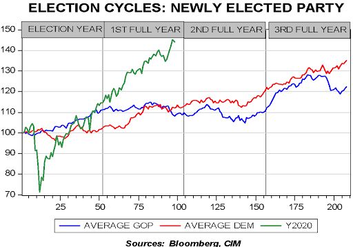
History shows that the second year of a president’s term tends to exhibit sideways markets. That’s likely because the midterms are held that year and the uncertainty surrounding the election reduces sentiment.
On this chart, we index the weekly Friday closes of the S&P 500, starting in January 1928. We then average the four-year performance for each cycle by party. In general, the level of the index is less important than the behavior. Clearly, performance of the S&P 500 this year has been stellar. However, we do note that markets tend to move sideways in the second year, with a rally into year’s end.
So, what is our forecast? Our bias is that until liquidity is curbed, investors should lean toward the right-tail risk. In other words, we expect that P/Es will remain elevated and a recession will be avoided. Notwithstanding the left-tail risks, and assuming a 4700 level of the S&P 500 at the end of 2021, we would expect a 6.0% rise that would give us a year-end target of 5000. As noted above, the balance of risk is probably to the right side of the distribution until the current liquidity overhang is absorbed. If anything, investors should be prepared for elevated volatility despite higher prices.
There are three other areas to discuss before moving on to exchange rates and commodities. The first is growth/value, the second is small caps/large caps, and the third is international.
Growth/Value, Capitalization, and International
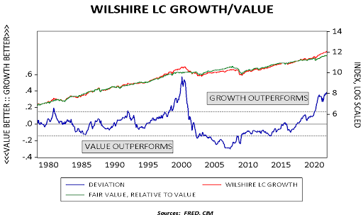
This chart shows the relative performance between large cap growth and value. Early in the year, value gained on growth, but the trend reversed as the economy slowed. Growth stocks remain elevated compared to value stocks. We expect the economy to grow above its long-term trend in 2022 which will tend to support value stocks. In general, growth stocks tend to flourish when economic growth is slow; however, when the economy heats up, value often outperforms. The rally in growth in the third quarter of this year was mostly due to the drop in economic activity.
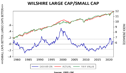
This next chart shows the relative performance of large and small cap stocks. Large cap stocks generally outperformed small caps from 2014 into 2019. Like the growth/value split, small caps outperformed earlier this year but retreated as the economy slowed. We tend to favor small caps in 2022.
The relative performance of international equities for an American investor mostly comes down to the dollar. In general, domestic stocks tend to outperform during periods of dollar strength, while foreign stocks do better in dollar bear markets. We will discuss our dollar outlook below.
This chart outlines the cycles in the dollar.
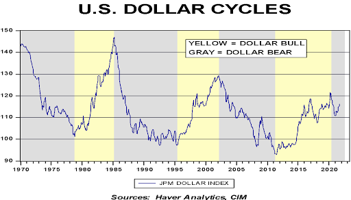
As we will discuss below, we think we are in a dollar bear market. But, the faster U.S. recovery and quiet policy support for weaker currencies abroad have led to a recovery in the JPM dollar index. This recovery has, in part, thwarted the expected outperformance of foreign stocks.
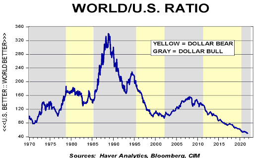
The U.S. has outperformed the world, ex-U.S., since the Great Financial Crisis. The current ratio of outperformance is at historic highs (or lows for the rest of the world).
The EAFE chart looks much like the world chart.
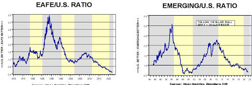
Moreover, the charts for developed and emerging markets are similar. If the dollar turns, there will likely be several years of international outperformance. Emerging markets do carry a caveat, however. The sector is heavily weighted to China; thus, if relations between the U.S. and China continue to deteriorate, index investing in emerging markets will become a challenge.
Foreign Exchange
Our “workhorse” valuation model for exchange rates is purchasing power parity (PPP). Although other models exist, such as flows, relative exchange rates, and relative productivity rates, PPP is the oldest model and it does a reasonably good job of informing an investor about a currency’s valuation. Like all valuation models, it doesn’t tell you when a turn is going to occur, but it does shed light on how potent the new trend should be over time if one does occur.
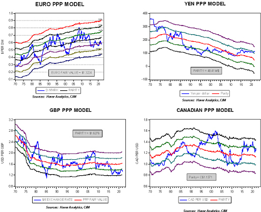
Against these major currencies, the dollar is overvalued. As these charts show, PPP can deviate from fair value for a long time, but once the trend changes, the reversal rarely stops at parity and usually moves to the other extreme.
This tells us that conditions are in place for a reversal in the dollar, but some outside catalyst will likely be necessary to cause that change in trend. We thought that the advent of a full faith and credit Eurobond might act to change sentiment but, so far, it has not. The most potent change would be an overtly weak dollar policy from Washington; however, that shift is unlikely with high inflation. A spike in long-duration Treasury yields met with yield curve control would likely trigger a bear market in the dollar.
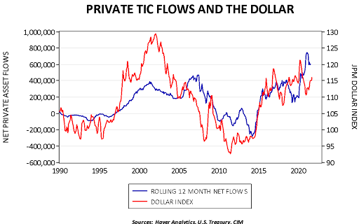
A supportive factor for the dollar has been investment flows.
The Treasury Department details portfolio investment flows into Treasuries, Agencies, corporate bonds, and equities. This chart takes the rolling 12-month flows into the latter two and compares it to the JPM dollar index. Flows into Treasuries and Agencies can be both private and official; if a nation’s foreign reserve manager needs to invest dollar holdings, they are usually restricted to sovereign debt. Thus, flows into corporate bonds and equities, which are not usually purchased by reserve managers, reflect foreign private investment flows in most cases. The relationship isn’t perfect, but it does show that rising foreign investment into U.S. corporate bonds and stocks has usually been dollar bullish. For the most part, these flows are fickle; foreign investors can change their sentiment. But given the rapid U.S. recovery from the pandemic, it appears foreign investors have been moving funds to the U.S., which has lifted the dollar. As the rest of the world recovers, it is likely this situation will reverse.
Overall, we remain dollar bears but admit we will need an exogenous catalyst to bring the dollar lower. Given the dollar’s level of overvaluation, based on parity, we think it makes sense to expect a weaker dollar over time.
Commodities
Major commodity bull markets often occur due to human tragedy. Wars and currency debasement are two factors that are usually associated with strong commodity markets. Wars are associated due to the disruption of supply chains, increased demand due to the war effort, and the desire to hoard due to uncertainty. Currency debasement leads to the balance sheet decision to hold liquidity in real assets. If we look at real commodity prices, the long-term trend is down. This downtrend is the triumph of capitalism as capitalism fosters the constant goal of efficient use of raw materials.
This is a chart of a regression model of the CRB index, deflated by U.S. CPI, regressed against a time trend. The green line, the trend, is clearly lower. However, as the deviation line shows, there are periods when commodity prices rise above trend. The wars are obvious―WWI, WWII, and Korea are clearly evident. The 1970s debasement, triggered by President Nixon’s decision to end the Bretton Woods arrangement, is also obvious. But since Paul Volcker restored faith in the dollar, commodities stayed below trend until China’s rapid expansion boosted commodity prices. And, as the era around 2010 shows, that bull market in commodities paled in comparison to the war or debasement events.
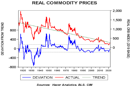
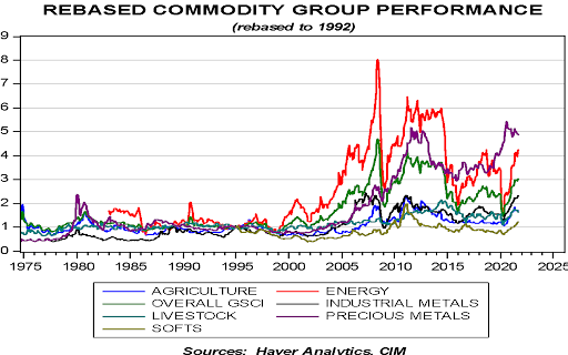
Current prices are still below trend. Given the changes in monetary policy discussed above, a strong case can be made that currency debasement is underway. Currency debasement, along with an increased desire to hold inventory, should support continued strength in commodities going forward. We are seeing a broad-based rally in commodity prices.
Only precious metals have lagged the recent rally, and that is after the sector was unusually strong during the pandemic.
Our research suggests that U.S. oil production tends to follow the five-year moving average of prices, advanced five years. This makes senses as investors tend to make projections based on experience and project those experiences into the future. This relationship would suggest that U.S. production will continue to decline into the latter half of the decade.
If ESG concerns continue to restrict investment into the oil and gas sector, supplies will likely remain tight, which should support oil prices. On the other hand, the electrification of the transportation sector will likely support metals prices going forward.
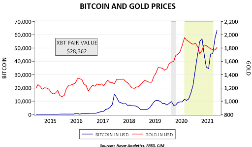
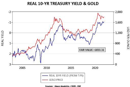
What about precious metals? Gold prices remain undervalued based on our most basic model.
This model uses the balance sheets of the Federal Reserve and the ECB, real two-year yields, the EUR, and the fiscal deficit. Given this level of undervaluation, what is holding back gold? One answer is that bitcoin has become an alternative debasement asset to gold.

Since August 2020 (area shaded in yellow-green), bitcoin and gold are inversely correlated at the 86.3% level. Using gold as a comparison, a model based on this time frame would put the fair value for bitcoin at $28,362.
Finally, negative real yields continue to support gold prices.
We remain friendly to gold prices, although worries about Fed tightening may bring further consolidation.
Concluding Remarks
The economy and markets are trying to manage a situation to which there are few comparisons. An intricate global supply chain has been upended and it isn’t at all clear when conditions will improve. We suspect the equilibrium solution will include some improvement in the current supply chain but with strong incentives to build redundancy, bring production closer to end consumers, and increase stockpiles. This process will likely keep inflation elevated, although we would expect the pace of price increases to moderate over time.
The key market to watch is the long-duration Treasury market. A return to the average real rate on the 10-year would trigger a severe dislocation to the financial markets and almost certainly result in a deep recession. The FOMC would likely intervene, which would mitigate the downturn but likely lead to a flight to debasement assets—gold, commodities, crypto, and, for now, equities. On the other hand, household balance sheets have improved dramatically. High levels of inequality will tend to favor equities and ample liquidity will tend to support both real assets and equities.
The potential for volatility in 2022 is elevated. Much like a batter shouldn’t dig in against Ebby Laloosh, [16] investors should not cling too tightly to any market narrative. We intend to offer updates this year due to the uncertainties we face. Nevertheless, for now, this report describes what we think will happen and the risks to investors if conditions vary from our expectations.
Finally, we have not covered geopolitical risks in this report. Those are discussed in our “2022 Geopolitical Outlook,” which was published on December 13, 2021.
Mark Keller, CFA
CEO & Chief Investment Officer
Bill O’Grady
Chief Market Strategist
Patrick Fearon-Hernandez, CFA
Market Strategist
December 16, 2021
For more news, information, and strategy, visit the ETF Strategist Channel.
This report was prepared by Mark Keller, Bill O’Grady, and Patrick Fearon-Hernandez of Confluence Investment Management LLC and reflects the current opinion of the authors. It is based upon sources and data believed to be accurate and reliable. Opinions and forward-looking statements expressed are subject to change. This information does not constitute a solicitation or an offer to buy or sell any security.
Confluence Investment Management LLC
Confluence Investment Management LLC is an independent Registered Investment Advisor located in St. Louis, Missouri. The firm provides professional portfolio management and advisory services to institutional and individual clients. Confluence’s investment philosophy is based upon independent, fundamental research that integrates the firm’s evaluation of market cycles, macroeconomics and geopolitical analysis with a value-driven, company-specific approach. The firm’s portfolio management philosophy begins by assessing risk and follows through by positioning client portfolios to achieve stated income and growth objectives. The Confluence team is comprised of experienced investment professionals who are dedicated to an exceptional level of client service and communication.
[1] We reviewed the book in 2017. In that review, we discuss all four events in detail.
[2] To see how this works in practice, educators use a Galton board, which drops marbles through a series of pegs to simulate random behavior. Although the path of any individual marble cannot be predicted, the entire series will distribute into a normal, or bell, curve, as shown in this video.
[3] As an aside, this is not how we define risk at Confluence Investment Management. We define risk as the probability of a large and permanent loss of capital.
[4] Standard deviation is a measure of distance from the average; it is calculated by subtracting the individual data points from the average, adding the deviations together, squaring that summation, and dividing by the number of data points. To convert that sum of squared deviations to a single number, we take the square root.
[5] We discussed China’s geopolitics in the year-end “2022 Geopolitical Outlook.”
[6] Despite the fact that the Fed has now ditched the term.
[7] Much to the chagrin of France, where Charles de Gaulle described the dollar’s reserve role as an “exorbitant privilege.”
[8] Mallaby, Sebastian. (2016). The Man Who Knew: The Life and Times of Alan Greenspan. New York, NY: Penguin Books, pp.140-144.
[9] Ibid., p.415.
[10] It should be noted that Rubin also formulated the “strong dollar policy,” which meant that administrations should only say the U.S. wanted a strong dollar without ever defining what that meant. In practice, it meant the government didn’t use the exchange rate manipulation for policy goals and this led to a sort of ceasefire among the G-7 on exchange rates.
[11] Value stocks have high earnings relative to current prices and thus can be considered short-duration assets. Growth stocks promise high future earnings and thus are long-duration assets. Under inflation, long-duration assets are risky.
[12] This proxy is based on Milton Friedman’s analysis, who proposed that investor inflation expectations are formed over a long time frame.
[13] The nominal yield less current CPI is defined as the ex-post real yield, which is the actual real yield. The other way of determining the real yield is ex-ante, which is the nominal yield less inflation expectations. Ex-post is what actually happened, whereas ex-ante is what investors thought would happen.
[14] This is not earnings per share but the total operating earnings of the S&P 500 companies.
[15] There are two primary sources for operating earnings, Standard and Poor’s and Thomson/Reuters. We calculate the former, which is estimated at $207.98, and use a model to estimate the more commonly reported Thomson/Reuters earnings number, which is the one showed in the text.
[16] The young phenom from the movie Bull Durham.
