
The S&P 500, Dow Jones Industrial Average (Dow), and Nasdaq Composite are all stock market indexes used to measure the performance of various aspects of the U.S. stock market. The indexes generally rise and fall together, however the extent of gains or losses produced by each can differ depending on market conditions and the state of the economy.
The indexes differ in several key ways such as weighting methods, coverage, and criteria for including stocks. The S&P 500 assigns weightings based on market capitalization, includes roughly the 500 largest U.S. stocks spanning 11 sectors, and offers a more comprehensive view of the broad market’s performance. The Nasdaq also employs market cap weighting but includes over 3,000 stocks with a heavy focus on the technology sector, making it a popular benchmark for technology and growth companies. In contrast, the Dow is a smaller index consisting of 30 well-established “blue-chip” stocks, with weightings based on stock prices, making it a more conservative and limited representation of the broader market.
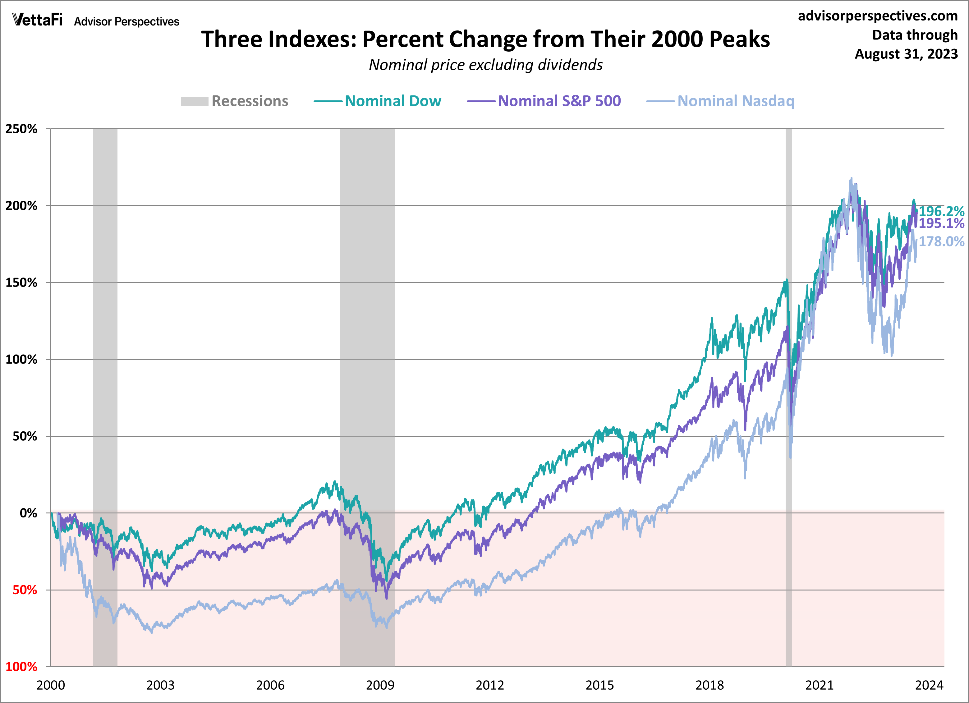
In this article, we examine these three indices and how they have changed since their peaks from 2000. We’ve updated the data through the August 31, 2023 close.
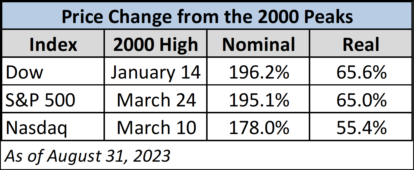
Here are two overlays — one with the nominal price, excluding dividends, and the other with the price adjusted for inflation based on the consumer price index for urban consumers (which is usually just referred to as the CPI). As of August 31, the Dow 30 is down 2.4%, the S&P 500 is down 1.8%, and the Nasdaq is down 2.2% from the last day of July.
When adjusted for inflation, the real month-over-month changes for each index become -2.5% for the Dow 30, -2.0% for the S&P 500, and 0.2% for the Nasdaq.
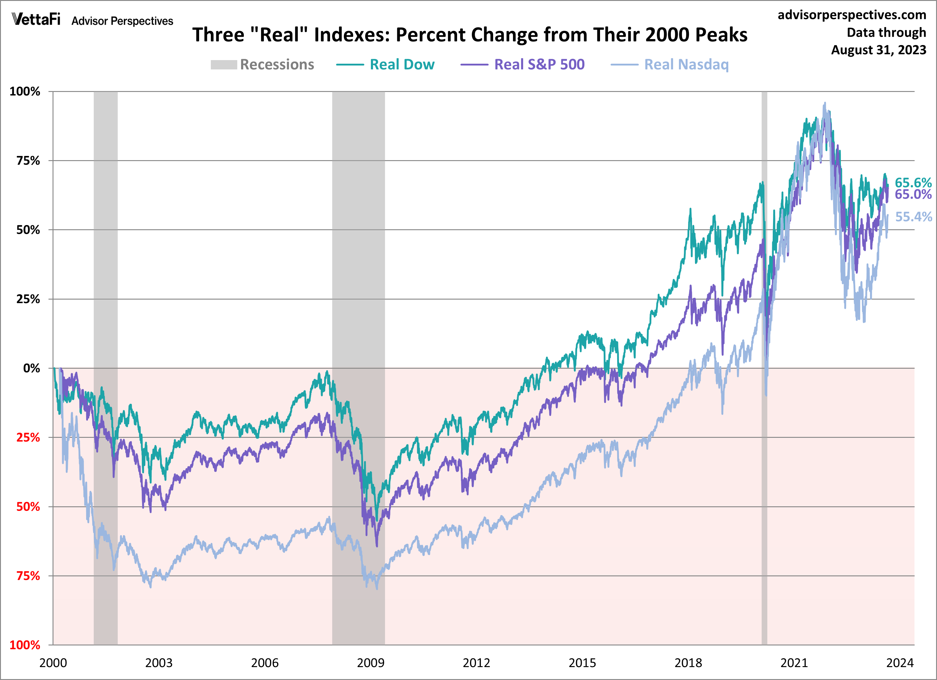
The charts require little explanation. So far, the 21st century has not been especially kind to equity investors. Yes, markets do bounce back, but often in time frames that defy optimistic expectations.
Performance of the SPY ETF Since 2000 Peak
The charts above are based on price only. But what about dividends? Would the inclusion of dividends make a significant difference? Let’s take a look at the return on $1,000 invested in the SPY ETF at its March 2000 peak.
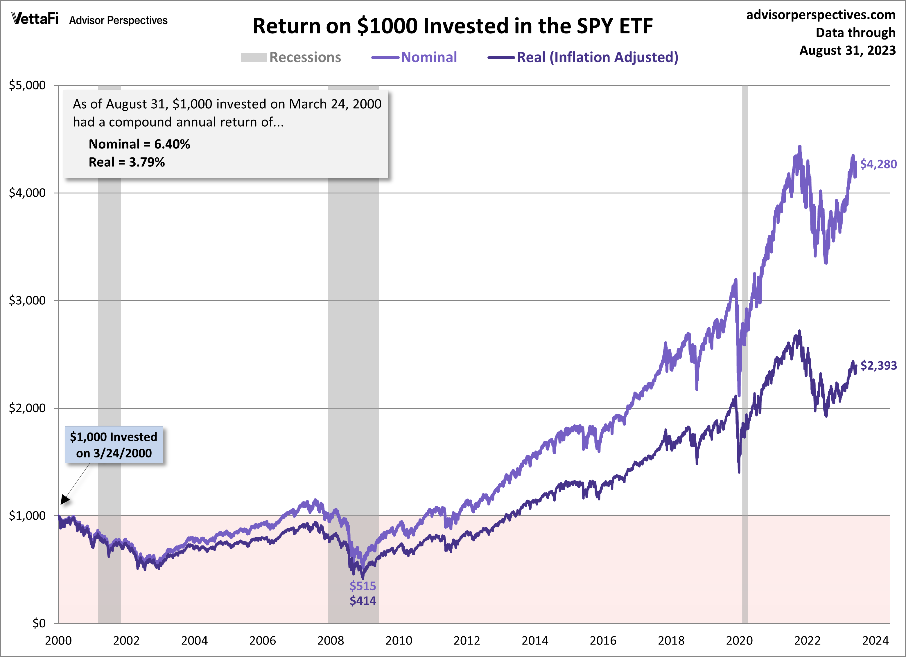
The total return certainly looks better over 20 years later, but the real (inflation-adjusted) purchasing power of that $1,000 is currently $2,393, a real compounded annual return of 3.79%.
Performance of the DIA ETF Since 2000 Peak
Now, let’s take a look at the return on $1,000 invested in the DIA ETF at its January 2000 peak.
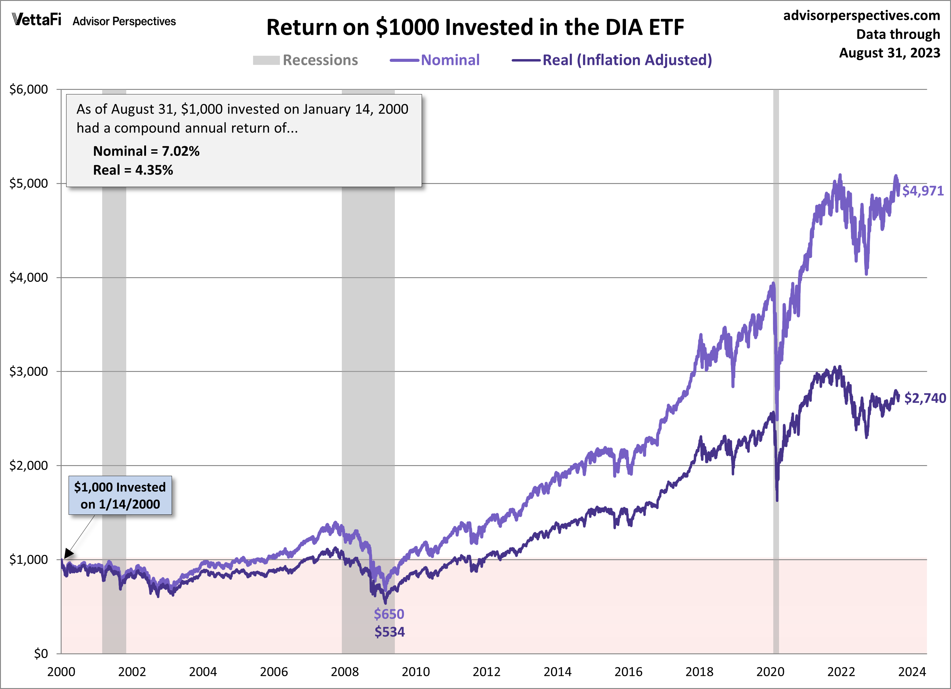
Again, the total return looks better over 20 years later, but the real purchasing power of that $1,000 is currently $2,740, a real compounded annual return of 4.35%.
Performance of the QQQ ETF Since 2000 Peak
Lastly, let’s look at the return on $1,000 invested in the QQQ ETF at its March 2000 peak.
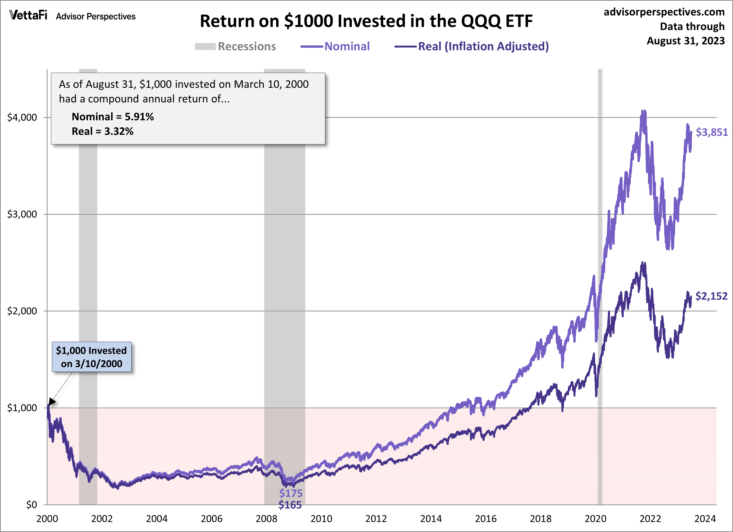
The real purchasing power of that $1,000 is currently $2,152, a real compounded annual return of 3.32%.
Originally published on Advisor Perspectives.
For more news, information, and analysis, visit the ETF Education Channel.
