By Karl Steiner
The most widely accepted measure of investment risk is volatility, which is usually calculated as the annual standard deviation of asset returns. However, I and others have pointed out that routine volatility (the daily, weekly, or monthly ups and downs) of an asset is a poor measure of the kind of risk that matters most to investors, which is the risk of a permanent loss. A permanent loss is when your invested money is not available at the time you planned to spend it, such as when retirement begins.
An Investor Story
Why is routine volatility a poor measure of the risk of permanent loss? To illustrate, let’s consider a story where I buy $1000 in an asset and sign a contract that says:
- Upon penalty of death, I will not sell the asset for 10 years, and at the end of that period, I must sell my entire stake in the asset.
Let’s also say that the day after signing the contract and buying the asset, its market value plunges by 50% as shown in this graph.
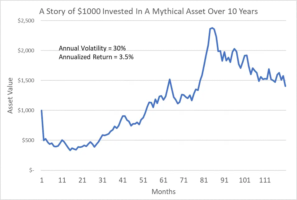
That’s not a great start, but given the alternative under the contract is death, I won’t sell my asset prematurely. Over the next 10 years, the asset takes the wild ride shown in the graph generating annual volatility of 30%, which is typically considered quite “risky”. But at the end of the 10 years, the asset has produced a modest positive annualized return of 3.5%.
In this story, the perceived risk implied by high annual volatility causes no actual risk to me (the investor) over the period of the contract. I suffered no permanent loss from the initial 50% plunge, as frightening as that may have been. And I suffered no permanent loss when I sold the volatile asset 10 years later.
I’ve used stories like this before to illustrate that the longer you invest, the less relevant routine volatility is to your investing risk. What matters most for long-term investors is the risk of a permanent loss at the end of the expected timeframe of the investment.
Simple to Say, Hard to Do
Unfortunately, the investing and financial services industry has never really offered a decent way to measure the risk of permanent loss. Cullen Roche goes so far as to say that each investor’s true risk, can’t be boiled down to one number. But because I’m the kind of person who likes quantitative measures, I always found this shrug to the risk question unsatisfying.
What’s so hard about quantifying the risk of permanent loss? Among several difficulties often mentioned by informed observers, the most important seems to be that the investing timeframe used to define a permanent loss can easily turn out to be wrong. For example, we can buy an asset with the full intention of holding it for 10 years, but unlike my death-contract story, in reality, we can sell liquid assets for reasons ranging from a dire necessity to a mere whim.
Further, I’ve presented estimates showing that life can dole out unexpected dire necessities much more frequently than you might assume. I gathered statistics on life events like under-insured home disasters, long-term disability, continuing education costs, long-term unemployment, legal problems, divorce, business bankruptcy, and others. Using average wage and actuarial data, I roughly estimated that there’s an 83% chance of having at least one of these dire necessities happen to you between the ages of 23 and 65, with an average cumulative cost of about $260,000¹. So, you might buy a $100K in stocks expecting to hold them until retirement, only to find out a few years later that you need to sell some or all of those stocks to deal with a major under-insured health problem, long-term unemployment, or something like that.
Making An Estimate
Because of life’s uncertainties, I agree that estimating a permanent loss risk that applies to every investor and situation is impossible. But by the same token, I don’t see how the widespread use of annual volatility accurately measures the risk for every investor and situation either. Rather than giving up on permanent loss risk estimates, I prefer to attempt an estimate and consider whether the associated uncertainties are any worse than the uncertainties surrounding the existing risk paradigm of annual volatility.
In my last few posts, I’ve been using historical returns data to calculate how often various types of stocks have produced inflation-adjusted losses over various investing timeframes ranging from relatively short-term (1 year) to long-term (20 years). After working on these types of statistics for weeks, it dawned on me that this was essentially a measure of permanent loss risk.
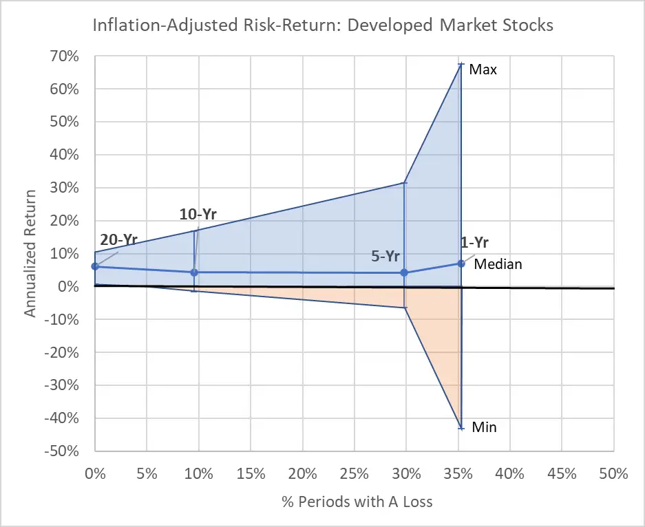
To illustrate, let’s start with a couple of examples. The following two graphs show the percent of historical periods going back to 1970² where an investor lost inflation-adjusted dollars (horizontal axis) as compared to the range of annualized returns achieved across all historical rolling³ periods (vertical axis). (For the rest of this post, all returns and loss estimates presented are on an inflation-adjusted basis.) In the graphs, each point with an error bar range represents a different rolling period including 1-year, 5-year, 10-year, and 20-year. I chose 10-Year Treasury Bonds and Developed Market (ex.-U.S.) stocks as the two example assets because they generated fairly different-looking graphs.
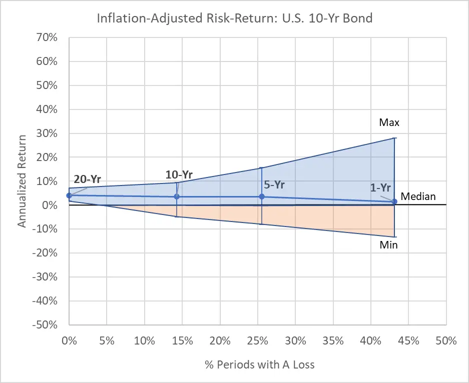
For investors in the 10-Year T-Bond (first graph) with a 1-year investing timeframe, 43% of past periods since 1970 involved a loss. And the range of 1-year returns ranged from a maximum of 28% to a minimum of -13%. But as the investing timeframe gets longer, the range of return outcomes narrows (vertical axis), and the percentage of periods with permanent losses decreases (horizontal axis). In fact, all past investors with a 20-year timeframe made at least a little inflation-adjusted money by investing in 10-Year T-Bonds.
Now, look at the second graph for Developed Market Stocks. For a 1-year timeframe, only 36% of the past periods resulted in a loss (horizontal axis), but the range of returns (vertical axis) was huge, from 68% to -43%. Nonetheless, in both graphs, we see the same pattern of a narrowing range of returns and a lower percentage of periods with a loss as the investing timeframe increases.
Permanent Loss Index
Let’s assume for a second that you don’t know what your investing timeframe is. In that case, these graphs suggest a good way to measure permanent loss risk would be to calculate the size of the area under the 0% return line, which is shown with orange shading. Consistent with basic risk analysis4, such a measure would multiply the probability of a loss by the magnitude of those losses across a range of reasonable investing timeframes based on historical precedent.
Given that chances of a loss and the return are both expressed in percents, multiplying the probability by the magnitude gives us the strange units of “square percents”. So, I think it’s best to think of this measure as a Permanent Loss Index. The meaning of an index value for one asset alone is difficult to conceptualize, but comparing index values across many assets can provide a consistent and meaningful measure of relative risk.
Here’s a graph of the “classic” risk-return graph, with annual volatility on the horizontal axis and annualized return (Compound Annual Growth Rate, CAGR) since 1970 on the vertical axis. This is followed by a graph using the Permanent Loss Index on the horizontal axis instead.
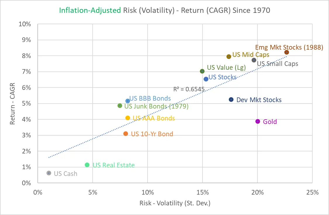
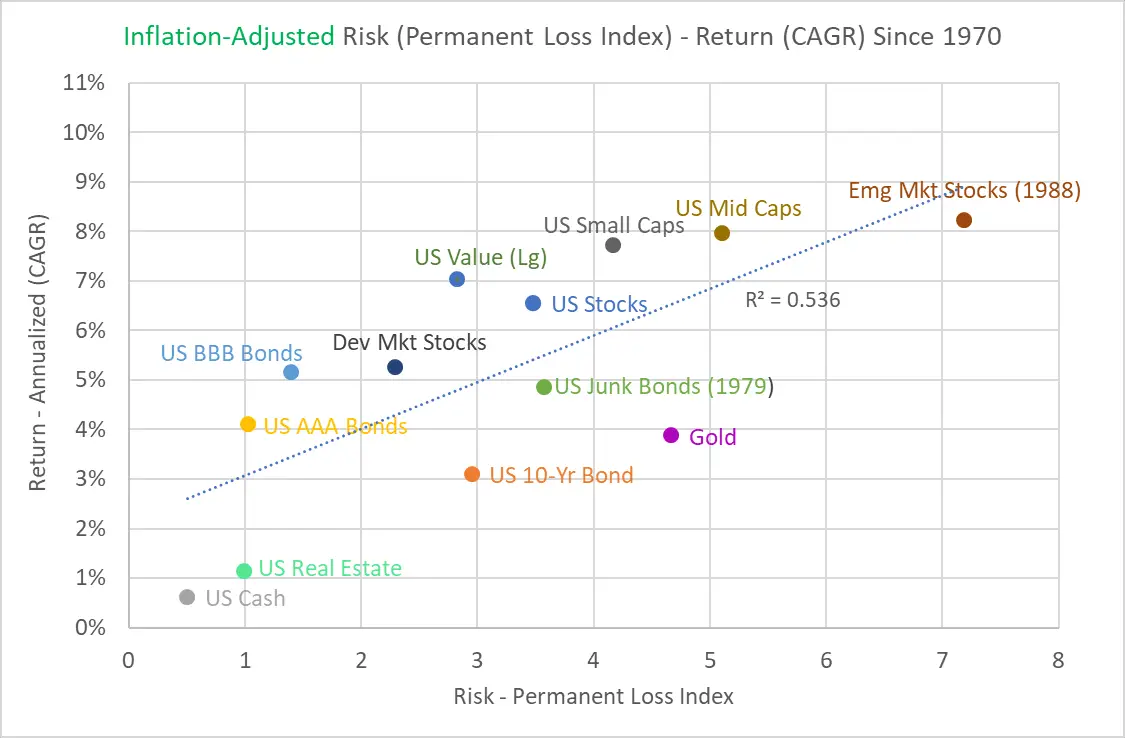
The two plots are remarkably similar, although the Permanent Loss Index interestingly indicates a lower relative risk associated with U.S. Small Caps, Developed Market Stocks, U.S. AAA Bonds, and U.S. BBB Bonds.
The similarities of the two plots aren’t too surprising because the Permanent Loss Index, which aggregates risk across all timeframes, is heavily weighted toward the short-term risk. If you look at the top two cone graphs in this post again, you can see how most of the orange area depicting losses occurs between 1 and 5 years. And annual volatility is a great measure of the potential for individual years to have steep losses, like those shown on the right side of these cone graphs.
Explicit Timeframes
Regardless of original intent, mutual fund investors hold equity funds for an average of 3.3 years and bond funds for an average of 3 years. While this is a pretty short timeframe, it means that the clear majority of investors hold assets for more than 1 year, and about half of them hold for more than 3 years. So, risk measures that focus mostly on a 1-year timeframe, like annual volatility or an undifferentiated Permanent Loss Index, could be similarly misleading for the majority of investors.
Rather than trying to smush all investing timeframes into one value for the Permanent Loss Index, we can cut up the index value based on the amount of orange loss area associated with each timeframe. That would provide the investor with more nuanced information related to their own expected timeframe. So, I measured the orange area in each cone graph that resides between 1 and 5-year periods, 5 and 10-year periods, 10 and 20-year periods, and beyond 20 years to give four separate Permanent Loss Index values.
Also, rather than calculating the annualized return (CAGR) for each asset for the entire period since 1970, I used the median annualized return from all periods for each timeframe. This is the same “median” that’s labeled on the top two cone graphs. This provides a central tendency result for a group of investors who invested throughout all possible periods since 1970 for the exact duration of each timeframe.
I plotted these risk-return values for all four timeframes for 13 different assets on the same style of risk-return graph. But just throwing the resulting 52 points on a single graph creates a confusing cloud of dots. So, here’s a simplified graph showing three purely hypothetical assets to help you interpret the graphing of the differentiated Permanent Loss Index.
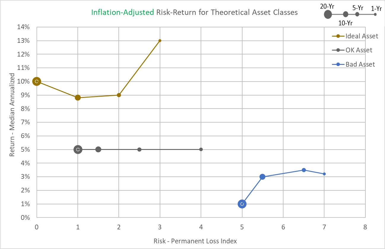
Each of the three “worms” on this graph represents one hypothetical asset. The size of each point is determined by the investing timeframe in question. So, the biggest dots are for the 20-year timeframe and the smallest dots are for the 1-year timeframe, and so forth in between.
The “Ideal Asset” has relatively low Permanent Loss Index values, even for the 1-year timeframe, and relatively high median annualized returns throughout. Further, the median annualized return goes up slightly with longer timeframes. These are all desirable attributes. In comparison, the “OK Asset” has generally higher Permanent Loss Index values and lower median returns that don’t improve with longer timeframes. And the “Bad Asset” has high relative Permanent Loss Index values and very low median returns that decline over longer timeframes. Basically, the most desirable assets reside in the upper left corner and the least desirable reside in the lower right corner, just like in a classic volatility vs. return graph.
So, here are the results, which I’ve cut up into two graphs (with consistent scales for both axes) to try to detangle the worms and provide a clear view of the results for each asset.
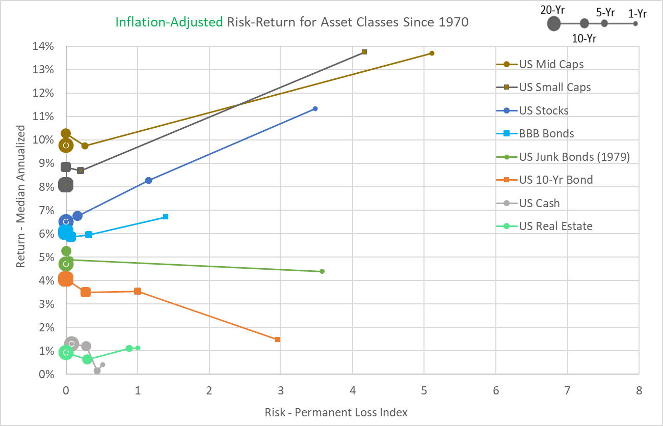
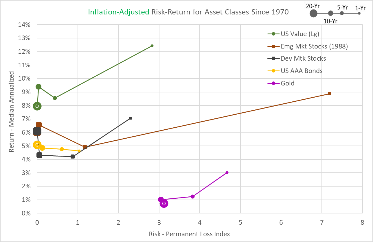
At least by this measure, the most “desirable” assets since 1970 were U.S. Small-Cap Stocks, Mid-Cap Stocks, and Large Value Stocks. And if I had to choose, I’d say that U.S. Stocks (in general) and Emerging Market Stocks are in a pretty respectable second place grouping.
But of course, these results are all predicated on half a century of results since 1970. I’ve noted many times before, that this timeframe is probably too short to predict the future or count on the persistence of “factors” based on size (small and mid-caps) or value metrics.
Conclusion: Using The Permanent Loss Index
Although it’s alluring to pick out “good” and “bad” assets based on this analysis, that’s not the main point of this post. I think betting the farm on the Permanent Loss Index based on the last 50 years of data, would be nearly as misguided as betting the farm on highly variable annual volatility statistics for the same limited period. Rather, my main point is that, within any limitations imposed by the historical dataset, we can vary the timeframe of our risk assessments to more accurately understand the risks.
For example, if I expect to have a 5-year investing timeframe, I would consider all the points between the 1-year and 5-year dots on these Permanent Loss Index graphs, to allow for unexpected dire necessities. Likewise, if I had a 10-year timeframe, I’d consider all the points between the 5 and 10-year dots. And given that most investors hold assets for an average of 3 years, few (if any) investors should focus solely on the 1-year timeframe, which is the de facto setting for annual volatility.
For another example, let’s say I was trying to decide how much of my portfolio I should devote to U.S. stocks versus U.S. 10-Year T-Bonds for the next 10 years. The top graph above shows that across the 5-year to 20-year timeframes there were no meaningful differences in Permanent Loss Index values for the two assets, but U.S. Stocks had consistently superior median annualized returns. That strongly suggests that stocks should be a big part of my portfolio, even if I can’t predict my investing timeframe exactly.
While uncertainties clearly exist for the Permanent Loss Index as a measure of risk, they don’t seem fundamentally different than the existing uncertainties surrounding annual volatility. Both risk measures rely on limited historical data to make future predictions. And both risk measures involve assumptions about investing timeframes. With annual volatility, the only available timeframe assumption is 1 year, and the applicability of this short timeframe to any given investor is routinely ignored. In contrast, the clear advantage of the Permanent Loss Index is that we can explicitly consider the uncertainties around investor timeframes and compare risks across a range of possible timeframes.
Originally published by Mindfully Investing, 4/5/21
1 – This analysis assumed that people hold an emergency fund covering 6 months of living expenses. So, I’m isolating major life events that would easily deplete a typical emergency fund and require liquidation of some additional assets. I’m not talking about things like car repairs and fixing a broken pipe here.
2 – I chose 1970 because reliable data are available for the wide range of assets over this approximate 50 years. Going back further would have severely limited the number of assets available for comparison.
3 – In this case, “rolling” means that I shifted the analysis period by one year. So, a 5-year rolling return would start with a period from January 1970 through December 1974. The next period would be 1971 through 1975 and so forth until the last 5-year period from 2016 to 2020.
4 – In basic risk analysis, a risk is defined as the probability of an event occurring multiplied by the magnitude of the event. For example, Event A has a 2% chance of occurring in any given year and would produce 100 deaths (2 probable deaths). But Event B has a 1% chance of 1000 deaths (10 probable deaths). So, we would say Event B is “riskier”.
