
For 2015, the S&P barely ended in positive territory, closing at +1.38%. Having seen strong performance the previous three years, the price action in 2015 is very reminiscent of 2011. In the following, I will compare and contrast this past year’s market action with that of 2011.
Price Moves
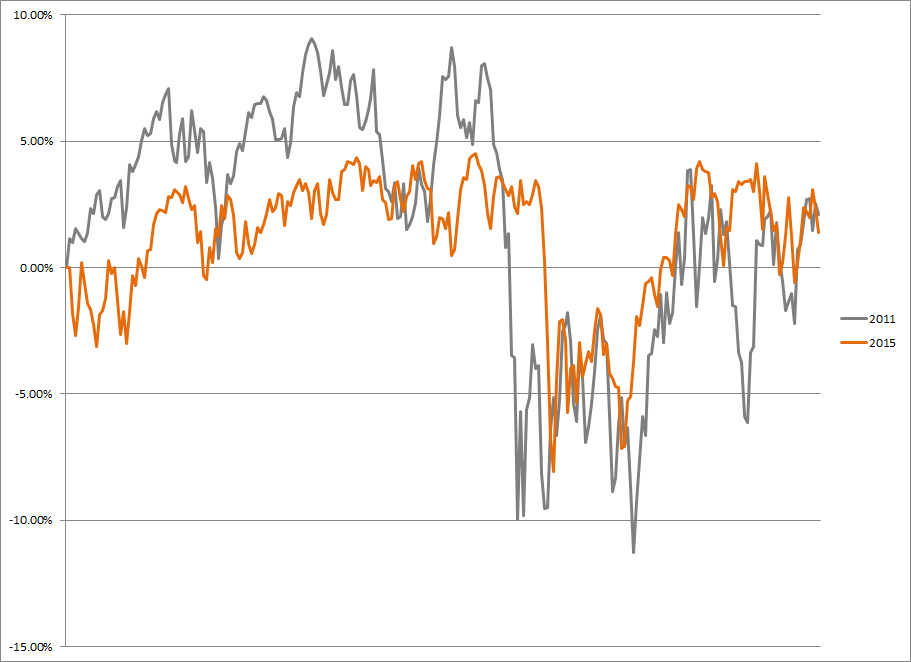
In terms of price moves, 2015 can be broken down into four periods:
- Sideways, rangebound market through August
- Sizable selloff
- Sizable recovery
- Sideways, rangebound market since
When charting this year as compared to 2011, things look similar:
The beginning of 2011 was also a sideways, rangebound market, albeit with a bit wider range and a bit more chop than in 2015. Then both saw a sizable selloff followed by a quick recovery. So strictly in terms of price, these two years look similar. However, when digging a bit deeper and looking at underlying participation, some differences start showing.
A very quick look at underlying participation is the difference between the market cap weighted index and the equal weighted index. I interpret the outperformance of the equal weight as a positive, as it shows more constituents are contributing to the performance rather than just the heavyweights. A complementary view of this is the weight of the names within the top decile of absolute performance. The same theory holds here in that if the weight is less than 10%, the smaller names are contributing and vice versa. Here are the numbers for the past six years.
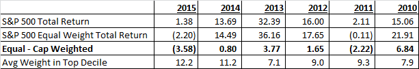
As you can see, only two years in the past six have seen the equal weight underperform 2011 and 2015. Additionally 2015 has the highest weighting in the top decile, and one of only two years where it was greater than 10%.
Another anomaly in the 2015 versus 2011 performance is the asymmetry of the underlying Sector returns.
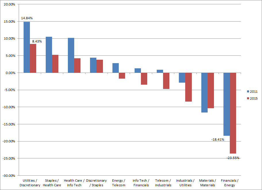
Whereas both years saw a spread of about 32% from the top to bottom performing sectors, 2015 saw a much greater skew towards the negative. Additionally, whereas 2011 sector performance had more of an interest rate correlation (with Utilities leading and Financials lagging), this year’s performance was much more commodity correlated, with Materials and Energy both at the bottom following weak performance, particularly in oil.
So where does this lead us into 2016? Following 2011’s more paltry returns, the market had three very solid years thereafter. So maybe this year was just a pause in the continuing bull market. However, in 2007 the market also saw slimmer returns with the S&P 500 at +5.49%. What followed was the unforgettable 2008 in which the S&P 500 returns were -37%. So maybe this pause is actually a market top. Additionally, with the end of the Federal Reserve’s stimulus (and some say propping up of the market), the lack of a backstop could be a negative. Only time will tell where the market goes from here.
Clayton Fresk is a Portfolio Manager at Stadion Money Management, a participant in the ETF Strategist Channel.
Past performance is no guarantee of future results. Investments are subject to risk and any investment strategy may lose money. The investment strategies presented are not appropriate for every investor and financial advisors should review the terms and conditions and risks involved. Some information contained herein was prepared by or obtained from sources that Stadion believes to be reliable. There is no assurance that any of the target prices or other forward-looking statements mentioned will be attained. Any market prices are only indications of market values and are subject to change. The S&P 500 Index is the Standard & Poor’s Composite Index of 500 stocks and is a widely recognized, unmanaged index of common stock price. It is not possible to invest directly in indexes (like the S&P 500) which are unmanaged and do not incur fees and charges. Any references to specific securities or market indexes are for informational purposes only. They are not intended as specific investment advice and should not be relied on for making investment decisions.
Founded in 1993, Stadion Money Management is a privately owned money management firm based near Athens, Georgia. Via its unique approach and suite of nontraditional strategies with a defensive bias, Stadion seeks to help investors—through advisors or retirement plans—protect and grow their “serious money.” Contact Stadion at 800-222-7636 or www.stadionmoney.com.
