I talk a lot about flows, but as the saying goes, sometimes a picture – or an interactive chart or graph – is worth a thousand words. That’s why we’re sharing these cool charts from our latest flows report that help bring to life the major trends that drove global flows of exchange traded products (ETPs) in the fourth quarter and 2012.
An Emerging Story:
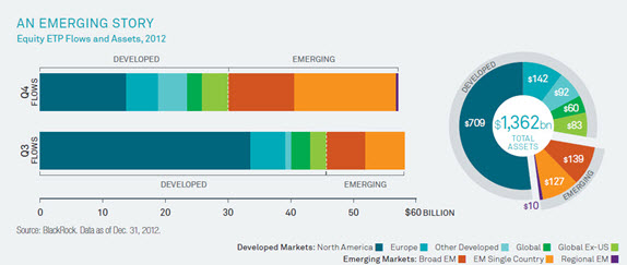
Inflows into emerging market (EM) equity funds hit a record $27.1 billion in the fourth quarter — more than double the amount in the previous quarter. Check out the sharp shift in flows from developed market equities – North American equities in particular — into emerging market equities in the fourth quarter.
The quarter saw a tripling of flows into China-focused ETPs. All told, EM equity funds took in nearly $55 billion in 2012 — a record.
What Happens to ETP Flows When Rates Back Up?
It’s the question on everyone’s mind: Are we witnessing the long-awaited rise in interest rates? Russ Koesterich says the answer to that question is a qualified yes, and he believes rates will rise slowly, erratically and the yield on the 10-year Treasury would back up to about 2.25%.
So, what happens to fixed income ETP flows when yields rise? As history and the chart below shows — not a heck of a lot. Yield spikes influence rate-sensitive sectors like US Treasury ETPs, but credit sensitive ETPs like high yield have been less affected so far. Inflation-protected ETPs saw inflows of $12.9 billion in the first period, but recorded some outflows in the second.
