
By Rob Bush, DWS
In a previous blog on the topic of attribution (Contribution and Attribution – Where You Won, and Why, Part I) I argued that contribution to return was a useful metric for evaluating a fund’s performance. However, I also pointed out a situation where I think it was arguably concealing interesting information. In this second part on attribution I plan to discuss Brinson attribution, a method for taking sector and stock level analyses to the next level.
As a quick reminder, take a look at Figure One which shows the same hypothetical attribution table that I used in the last blog. The point made then was that a focus on active contribution to return (the difference between portfolio, and benchmark, contribution to return) would leave one believing that nothing of interest was happening in the Health Care sector. After all, the sector contributed 0.50% to both the portfolio and the benchmark. So the manager’s performance in Health Care was of little interest, right?
Figure One: A hypothetical attribution table with example numbers
![]()
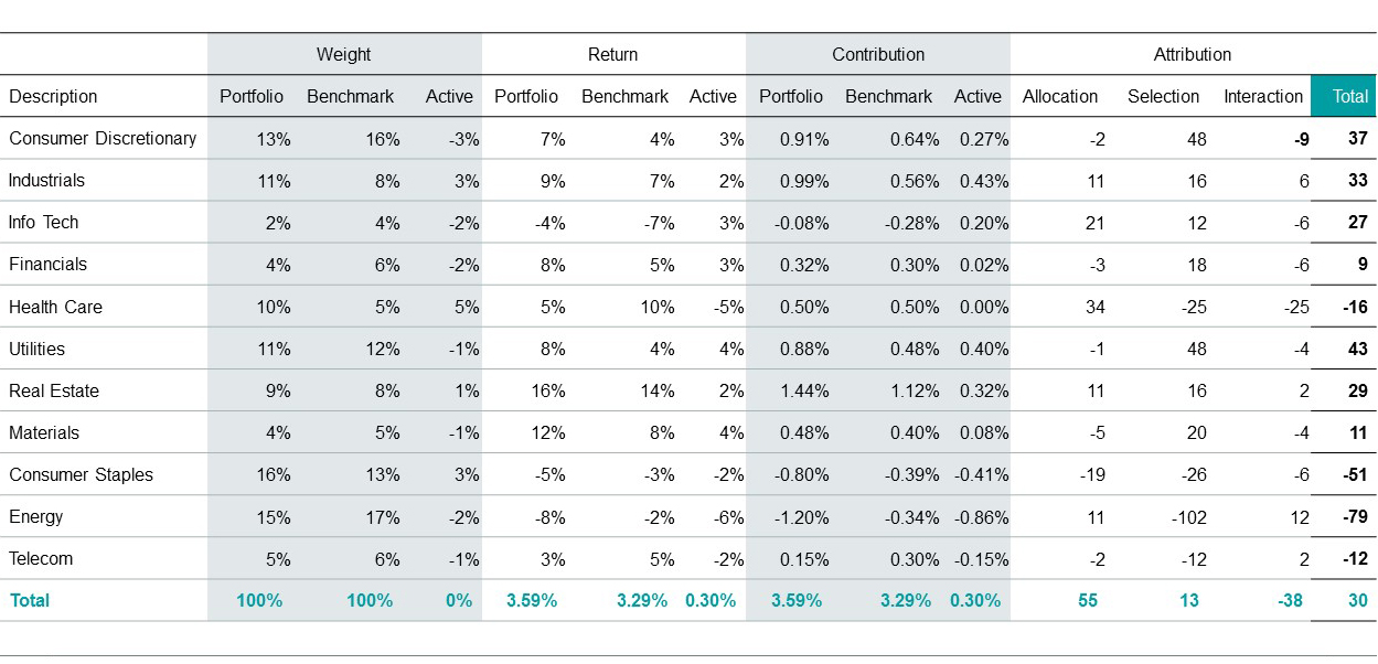
Hypothetical illustration only. Not representative of any specific products.
Well, it turns out that probably isn’t the case. In fact, digging a little deeper, it actually transpires that there were a number of interesting things going on in the Health Care sector – they just needed to be properly picked out, and by a different approach than contribution to return. The answer, it turns out, can lie in three levels of Brinson attribution – Allocation, Selection, and Interaction. Let’s look at each in turn to see why this method can add insights. We’ll use the performance of the Health Care sector by way of example.
Allocation
The Allocation level shines a spotlight on what was happening at the sector level in the portfolio. The formula used in the above table is the sector’s benchmark excess return (you can also use total return), multiplied by the active weight in the sector. So, for Health Care, the math is 10% (benchmark sector return) minus 3.29% (the return of the benchmark) which gives 6.71%. And that excess return is then multiplied by the portfolio’s active weight in the sector which, again for Health Care, was 5%. The total is the positive 34 basis points shown under the Allocation column, and the intuition is this – that the manager has chosen to be significantly overweight (indeed their largest active overweight) in a sector that has beaten the market. For that, they should earn some credit, and the positive Allocation score shows that. Note, the information is already different from contribution to return, and insightful. The manager chose well to overweight the Health Care sector which had a strong performance relative to the overall market during the period in question.
Selection
However it’s not all good news unfortunately. Take a look at the Selection column which, for Health Care, shows a negative performance of 25 basis points. Selection takes the analysis one level deeper, and talks to the stock picking ability within a sector, and here, of course, a negative number indicates bad news. The math for this number is the active weight in the sector, multiplied by the active return, so it combines information about how big of a position the manager took, versus how right they were. In the hypothetical case above, the manager placed a large position (5% active weight) but generated a poor performance via stock picking (returning 5% less than the benchmark by virtue of security selection). Multiplying those two numbers gives the negative 25 basis points shown for Health Care under the Selection column. Here, the intuition is that the manager’s stock picks ended up underperforming the stocks that were already in the benchmark – so they did not do a good job of selecting stocks in this sector over this time period. Again, also interesting information.
Interaction
The final part of the attribution is Interaction, and, though this sometimes gets lumped in together with Selection, we actually feel that breaking it out again provides color around what was going on in the portfolio. The math for Interaction is simply Active weight multiplied by Active return (here the product of 5% and -5% which is -25bps). But it’s the intuition which is more interesting. We like thinking of it as an indicator of the degree of confidence, misguided or otherwise, that the manager had in a particular sector. Effectively, it rewards managers for having the prescience to underweight sectors where their stock selection was bad (or overweight sectors where it was good), and punishes them for an overweight in a sector where their stock selection was bad (or an underweight in a sector where it was good). In the case of Health Care, the negative 25bps is saying: “given how poor your Health Care stock selection was, you shouldn’t have been overweight in the sector”, or, paraphrasing, “scale down, not up, your conviction in a sector where you didn’t show the ability to pick stocks.”
Conclusion
Both contribution to return, and Brinson attribution, can enable investors to take very granular looks at a portfolio’s performance against its benchmark. We actually like the use of both for the reasons described above, that one can provide insights where another can’t. At the start of the last blog, I compared portfolio analysis to the constant self-evaluation process that great athletes undergo. Using two forms of attribution takes it to another level. Perhaps we can stretch the analogy to taking on a second coach. If one spots flaws that the other didn’t, and vice versa, then surely both become worth one’s attention.