
By Karl Steiner
In January of 2019 and 2020, I published year-in-review posts on the returns performance of various asset classes. But I have to say, I found those posts distinctly unsatisfying. For example, in 2020, U.S. large-cap growth stocks were the best performer of any asset class with a remarkable total annual return of 40%. The next best performers, were U.S. small-cap growth stocks (35%), mid-cap growth stocks (34%), U.S. micro-cap stocks (25.5%), gold (25%), and the total U.S. stock market (21%).
But is this information useful? Because mindful investors are long-term investors, I certainly wouldn’t replace my moderately diversified all-stock portfolio with concentrated bets on U.S. growth stocks or gold because of last year’s results. On the contrary, mindful investors know that the relative performance of asset classes will almost always ebb and flow over time. And history has shown that chasing the performance of the recent “hot asset” is pretty much doomed to failure.
The Ranks Come to Attention
One of the most common ways to depict the ebb and flow of annual returns is with a so-called “periodic table” of assets. The Callan Institute provides this example table that ranks the annual returns for several asset classes from 2001 through 2020.
 The rank order of each asset class jumps around from year to year, which you can kind of see by scanning vertically for the colors assigned to each asset class. If you instead step back and view the table as a whole, the erratic color patterns don’t convey much more meaning than your typical modern art painting. These sorts of depictions support simple platitudes about the benefits of a diversified portfolio, such as “You never know which asset will perform best”. But because mindful investors already know that diversification is no guarantee of anything, periodic tables of asset ranks offer few surprises.
Another Look at Asset Ranks
I figured there had to be a better way to find some signals buried in all the noise generated from the annual shuffling of ranked asset returns. So, I took historical annual return data from all my usual sources¹ and ranked each asset’s return performance for every year going back to 1995. Readily available data are missing for some important asset classes (particularly emerging market stocks) prior to 1995. So, limiting my window to 1995 through 2020 gave me the most diverse set of 13 asset classes to compare. I ranked nominal (not inflation-adjusted) total returns for the asset classes for each year.
Instead of a periodic table, I thought this graph shows the long-term changes in asset ranks much better.
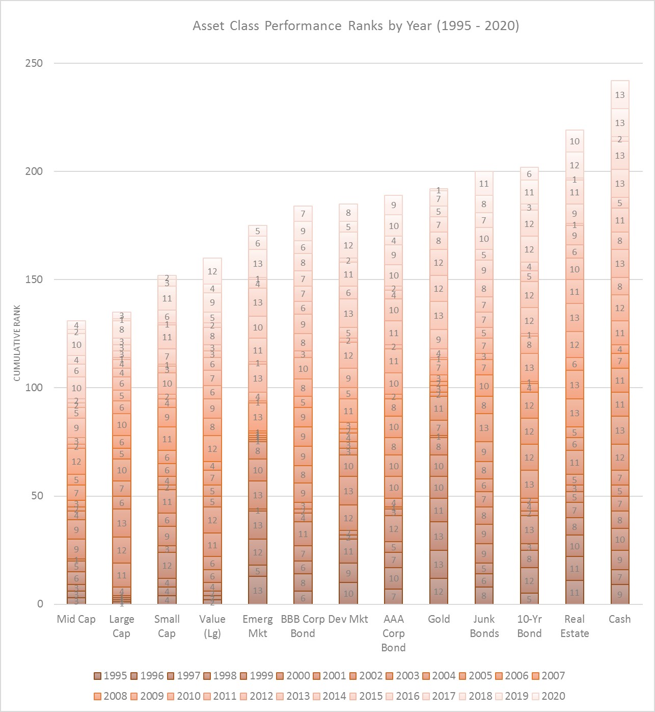
In this type of graph, shorter bars indicate better returns because, in any given year, the top-ranked asset gets a value of 1 and the bottom-ranked asset gets a value of 13. Higher ranks are shown by proportionally thinner blocks within each bar, and lower ranks are shown by proportionally thicker blocks.
The graph shows that U.S. mid-cap stocks had the best (lowest) cumulative rank, which is the sum of ranks across all 26 years. Cumulative rank gives us a way to see how various assets ranked over the entire period, rather than focusing on one year at a time. After U.S. mid-cap stocks, U.S. large-cap, small-cap, and large-cap value stocks had the best ranking history. And cash and real estate had the worst ranking history. (Note that real estate returns here are measured by changes in the Shiller U.S. home price index; they are not real estate stock [REITs] returns.)
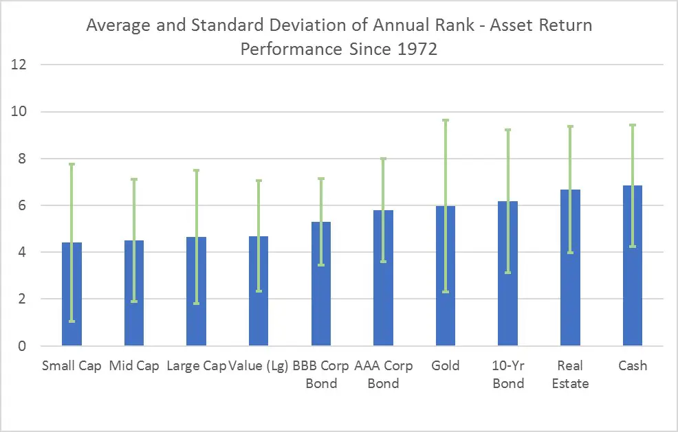
The annual building blocks in each bar of the above graph provide some sense of how ranks have varied over time for each asset. We can further quantify that variability with this graph showing the average (blue bars) and standard deviation (green error bars) of the annual ranks for each asset.

Because average rank is just the cumulative rank divided by 26 years, this second graph produces the same order of performance for the assets as the first graph. But the standard deviation depicted by the green error bars shows that some assets had greater ranking variability than others.
Diversification Clues
Ranking variability provides a measure of which assets tend to zig when the others zag, which is an important benefit of diversification. This table shows some simple ranking statistics for the four assets with the highest standard deviation of ranks over the past 26 years.
| Asset | Standard Deviation of Ranks | Years at No. 1 Rank | Years at No. 13 (Last) Rank | % of Time In Top Half of Ranks (Ranks 1-6) |
| Emerging Market Stocks | 5.14 | 9 | 7 | 54% |
| U.S. 10-Yr T-Bond | 4.47 | 2 | 3 | 46% |
| Gold | 4.19 | 3 | 3 | 35% |
| Develop. Market Stocks | 4.08 | 0 | 2 | 50% |
Erratic emerging market stocks ranked first 9 times and last 7 times while residing in the top half of ranks more than half the time! The rank histories of the other three assets were a bit less extreme but still highly variable. In contrast, U.S. large-cap stocks had a lower standard deviation of 3.62, ranked first 6 times but last only 1 time, and spent 73% of the last 26 years in the top half of the ranks.
These statistics suggest that if you want to increase your portfolio’s diversification potential, emerging market stocks and 10-year bonds (or more generally intermediate-term bonds) offer the greatest potential bang for the buck. And to a lesser degree, gold and non-U.S. developed market stocks offer similar potential benefits.
These observations are generally supported by the asset correlation statistics from Portfolio Visualizer covering the period from 2008 to 2020. Specifically, of all stock types, emerging market stocks had the lowest correlation (0.81) with U.S. stock returns. And U.S. intermediate bonds had the second-lowest correlation (-0.32) with U.S. stocks of all asset classes included in Portfolio Visualizer’s analysis.
The Emotions of Relative Ranks
I would say that it’s human nature to look at any kind of performance in relative (rank) rather than absolute terms. For example, Olympics fans tend to pay more attention to the medal counts than the number of world records their nation’s athletes bring home. Or if you prefer football, most fans will be ecstatic when their team gets into the playoffs, even if that team barely made the wildcard spot due to a mediocre regular-season record.
Likewise, in bad economic times, most investors take comfort in knowing that they were invested in an asset that performed better than most of the rest, even if their absolute returns were meager. So, ranks and ranking variability imply substantial emotional content for most investors.
In the past, I’ve made the argument that investors often fear stock volatility (variability) without considering the positive emotions that come with the superior long-term returns usually provided by stocks. I even created an “Investometer” that gauges the positive and negative emotional reactions to asset returns over time to show that stocks, more than any other asset, offer the best potential to feel “happy”, rather than “crappy”, about our investments.
So, what do asset ranks tell us about the “best” assets from an emotional standpoint? Clearly, the ranks analysis above suggests that stocks are generally the best performers. And this graph confirms that idea with a comparison of the average ranks to the nominal annualized return (compound annual growth rate; CAGR) for each asset over the same period.
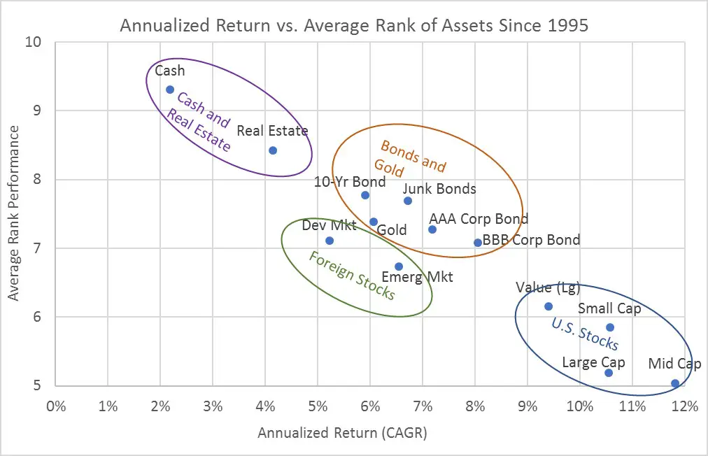
Indeed, buried in the rankings is yet another verification that U.S. stocks have been the best performers in the past 26 years. And that’s regardless of whether you look at it in rational terms (the highest annualized returns) or in more emotional terms (the best overall annual rankings). For the same reasons, we can say that bonds and gold produce intermediate returns and likely intermediate emotional reactions for those who hold them. That is, bond and gold investors will likely fret about their middling long-term returns but feel vindicated in years when stocks crash and perform relatively poorly.
To me, the most intriguing assets on the graph are foreign stocks from both emerging and developed markets. At least over this one period, foreign stocks performed more like bonds than stocks, both in terms of relative ranks and annualized returns. I’ve previously argued that an all-stock portfolio with some moderate international diversification is mindful. But the mediocre performance of foreign stocks going back to 1995 is yet another reminder that diversification doesn’t guarantee anything.
Validating with Another Period
We’ve seen plenty of evidence that asset returns and ranks dance and even leap around over time. The variable nature of asset returns means that you can support almost any investing hypothesis by cherry-picking just the right period to backtest.
So, I thought it would be prudent to check the above findings against a longer time period. Specifically, the history of consistently measured returns for 10 of these asset classes goes back to 1972. If we look at this longer period, with a smaller set of asset classes, do we see the same relationships?
Here are the same two graphs of (1) average ranks and (2) a comparison of average ranks to nominal annualized returns that cover the period from 1972 to 2020.
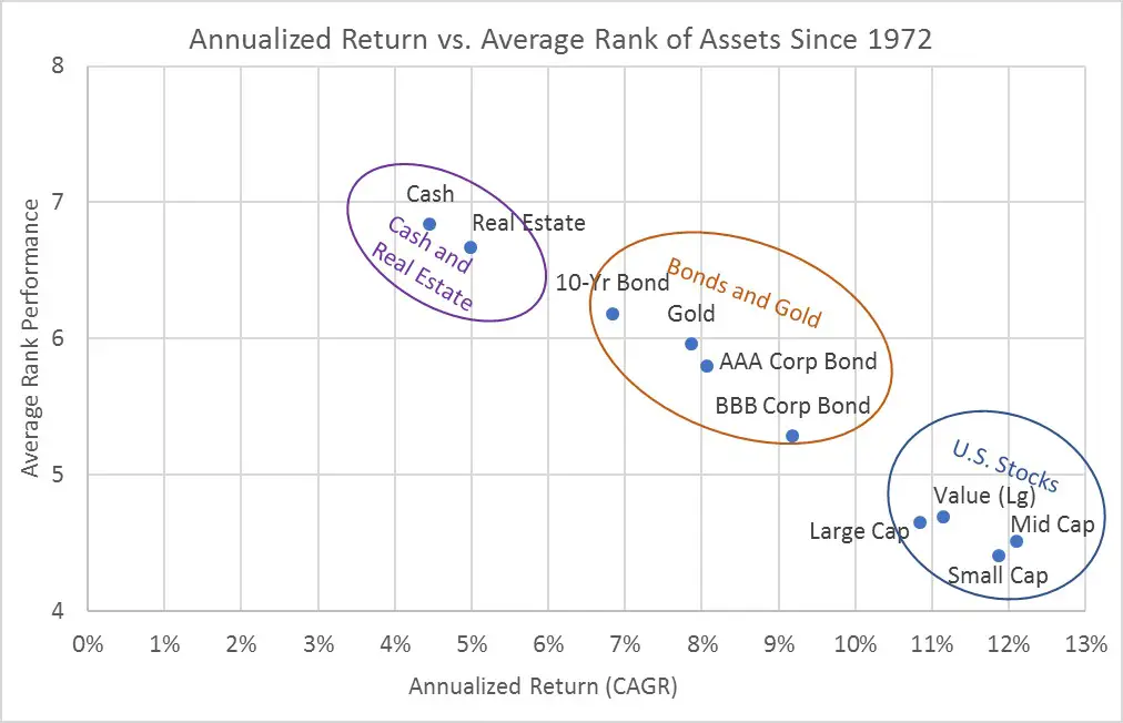
The average ranks of U.S. stocks are a bit different in the longer versus shorter period, but U.S. stocks come out as the top performers in all of these graphs. And as the last graph shows, the pattern of average ranks and annualized returns are very consistent whether you look back to 1972 or just to 1995.
Given that the 1972 analysis excludes foreign stocks, we’d expect to see a different set of assets with the highest potential for diversification benefits. But this table of rank statistics back to 1972 shows that gold and the U.S. 10-Year bond once again show up with two of the three highest standard deviations of ranks².
| Asset | Standard Deviation of Ranks | Years at No. 1 Rank | Years at No. 10 (Last) Rank | % of Time In Top Half of Ranks (Ranks 1-5) |
| Gold | 3.66 | 13 | 16 | 45% |
| U.S. Small-Cap Stocks | 3.35 | 14 | 6 | 65% |
| U.S. 10-Yr T-Bond | 3.05 | 4 | 7 | 43% |
Also, U.S. small-cap stocks are known for their relatively high volatility, which is probably part of the reason why they had the second-highest standard deviation of ranks going back to 1972.
Conclusions
If you’re looking to maximize long-term diversification, the results over both periods suggest that partial allocations to emerging market stocks, U.S. intermediate-term bonds, gold, and U.S. small-cap stocks are the best bets, if history is any guide for the future. And because today’s post focused on rank statistics, we shouldn’t forget that the diversification benefits from these four assets may turn out to be mostly emotional benefits.
You may “feel better” about your portfolio by adding some of these four assets, particularly at times when they react positively (or less severely in a negative direction) to market gyrations as compared to other assets in your portfolio. However, the ranking statistics also show that some of these assets (gold and 10-year bond in particular) spend a lot of time in the bottom half of the ranks, which will be frustrating, particularly when it happens for many years.
The long-term returns (and ranks to some extent) also confirm that, if we set emotions aside, the most rational portfolio for long-term investors is almost any mixture of primarily U.S. stocks. And because mindful investors favor investing on rational, rather than emotional terms, rank statistics don’t support the idea of placing substantial bets on bonds or gold.
Originally published by Mindfully Investing, 1/22/21
1 – These include Robert Shiller stock and real estate data, Aswath Damodaran bond and cash data, and Portfolio Visualizer asset class data.
2 – Because this table comes from a list of just 10 assets going back to 1972, the standard deviations of ranks are necessarily lower, and aren’t directly comparable to the standard deviations in the first table that presented results for 13 assets going back to 1995.