
By Henry Ma, Julex Capital Management, President and CIO
Since the Great Recession in 2008, the economic recovery has been particularly slow, especially when compared to the historical norm.
Between 1947 and 2016, the average growth rate during economic expansion periods was 4.19%, but during the current expansion between 2009 and 2016, the GDP growth was merely 2.12%, half of the long term average (see Table 1).
Normally, we would expect a V-shape recovery after a deep recession, but this recovery is more like a L-shape. Many economists attributed the slow growth to structural reasons such as aging population or slow productivity growth, but we believe cyclical and policy factors may have more impacts here.
Table 1: The Growth Rates of GDP and Its Components (Q2, 1947-Q4, 2016)
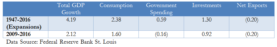
Table 1 shows the comparison of the average growth rates of GDP and its components between the most recent expansion and all the expansion periods after WWII. Consumption, investments and government spending all underperformed the historical averages. Moreover, the government spending had a negative contribution to the GDP growth. We may be able to explain the slow growth of each component and total GDP with the following three charts.
1. High household leverage hampered consumption as households had to save more in order to reduce debt burden. Figure 1 shows that after reaching its highest level of 95.5%, the household debt-to-GDP ratio declined to 78.8% as saving rates increased.
Figure 1: House Debt-to-GDP Ratio and Personal Savings Rate