
Related: An Equation to Identify the Next Market Bubble?
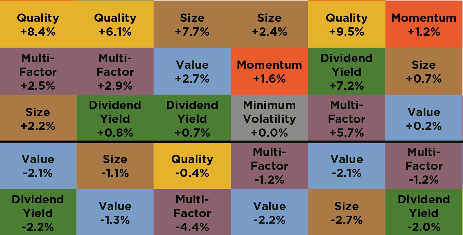
Second, and here’s the twist that differentiates it from the standard Callan Chart, the center black line represents the overall market return. So if a factor is above the black line, it shows the factor outperformed the overall market. If the factor is below, then it underperformed. What stands out about this table is the “batting average” (i.e., how often the factors outperform the market) on a calendar year basis. Yes, factors don’t work every year (nothing does in the markets), but they usually do, and over time, they really do. The average outperformance on an annual basis going back 25 years is more than 2 percent per year.
Finally, and this is a big one that hides in the data, the chart illustrates factors’ performance in down markets. In short, the overall record of factors is even better in those years. For investors emphasizing risk management, and attempting to lose less in down markets, factor investing should help.
Related: The Bayesian View to Multi-Factor ETF Investing
So when I present this chart, not only do I get to show off the moving boxes of color, I also get across to investors that factor investing should help enhance returns over time, and especially in down markets. That’s worth a little “busyness” to me.
This information is prepared for general information only. Information contained herein is derived from sources we believe to be reliable, however, we do not represent that this information is complete or accurate and it should not be relied upon as such. All opinions expressed herein are subject to change without notice. The graphs and charts contained in this work are for informational purposes only. No graph or chart should be regarded as a guide to investing.
Rusty Vanneman is the Chief Investment Officer at CLS Investments, a participant in the ETF Strategist Channel.