What happens to other commodities when oil prices spike? On one hand, if oil rises so much that an economic slowdown overpowers the tax-break effect, then commodities might fall. However, oil is a main input to produce many other commodities so prices of goods can rise when oil prices increase. The latter scenario is more likely given the historical relationship of energy to inflation and to other commodities.
One of the hallmarks of diversification in commodities is how lowly correlated they are to each other from the individual supply and demand models. Notice the highest correlation between any two sectors in the chart below is 0.27.
The source of return that mainly drives the correlation between commodities to be unrelated is expectational variance or supply shocks. When oil price falls, it may be demand or supply driven but most of the time the weakness has come from demand drops. When this happens, the correlation is higher between commodities at about 0.40 on average. However, the recent moves (both down and up) have been more driven by supply than demand, as the case has been in many historical oil price spikes.
This can be observed with the lower correlation of about 0.2 between oil and other commodities during oil price spikes, but despite the lower correlation, all commodities rise with rising oil. A supply driven oil bull is the best because it pulls other commodities up with it but with very low correlation, a measure of lockstep but not magnitude.
Since the concept of a strong upward force on commodities as oil prices rise but with low correlation can be difficult to explain and understand, below is a quick correlation refresher with a few hypothetical and real illustrations.
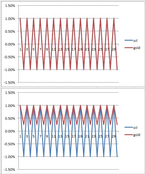
For example, both of these charts below show a perfect correlation of +1.0. However, the top chart on average has a down month of -1.0% for each oil and gold. The bottom chart has an average down month for oil of -1.0% but while oil is down gold only drops on average 25 basis points.
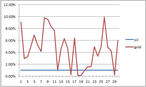
The next hypothetical chart shows zero correlation but a directional pull. Both oil and gold are always up. Oil is up 1% every month on average while gold is up 4.6% on average. They are always both up at the same time but there is little control of lockstep despite a directional relationship.