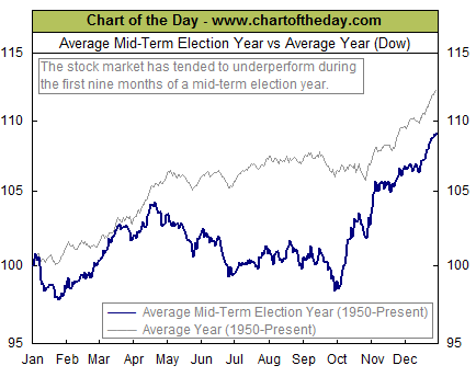
Today’s chart illustrates how the stock market has performed during the average mid-term election year. Since 1950, the first nine months of the average mid-term election year have tended to be subpar (see thick blue line).
That subpar performance was then followed by a significant year-end rally. One theory to support this behavior is that investors abhor uncertainty.
To that end, investors tend to pull back prior to an election when the outcome is unknown. Beginning in early October, however, the outcome of the election becomes increasingly apparent and investors respond by positioning their portfolios accordingly.
This chart appears courtesy of Chartoftheday.com